What to Look for over Time
You look at time every day. It’s on your computer, your watch, your phone, and just about anywhere else you look. Even without a clock, you feel time as you wake up and go to sleep and the sun rises and sets. So it’s only natural to have data over time. It lets you see how things change.
The most common thing you look for in time series, or temporal, data is trends. Is something increasing or decreasing? Are there seasonal cycles? To find these patterns, you have to look beyond individual data points to get the whole picture. It’s easy to pick out a single value from a point in time and call it a day, but when you look at what came before and after, you gain a better understanding of what that single value means, and the more you know about your data, the better the story that you can tell.
For example, there was a chart the Obama administration released a year into the new presidency, reproduced in Figure 4-1. It showed job loss during the tail end of the Bush administration through the first part of Obama’s.
Figure 4-1: Change in job loss since Barack Obama took office
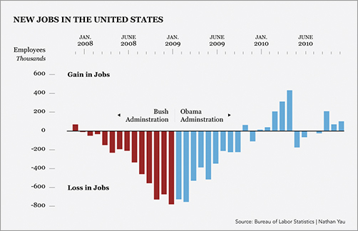
It looks like the new administration had a significant positive effect on job loss, but what if you zoom out and look at a larger time frame, as shown in Figure 4-2? Does it make a difference?
Figure 4-2: Change in job loss from 2001 through 2010
Although you always want to get the ...
Get Visualize This: The FlowingData Guide to Design, Visualization, and Statistics now with the O’Reilly learning platform.
O’Reilly members experience books, live events, courses curated by job role, and more from O’Reilly and nearly 200 top publishers.

