9.3. Uncovering Relationships
As suggested by the Visual Six Sigma Roadmap (Exhibit 3.30), Mi-Ling begins her analysis of the Wisconsin Breast Cancer Diagnostic Data Set by visualizing the data one variable at a time, two variables at a time, and more than two at a time. This provides her with the knowledge that there are strong relationships between the 30 predictors and the diagnosis into benign or malignant masses.
9.3.1. One Variable at a Time
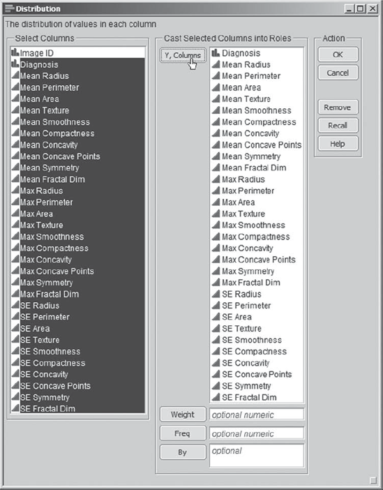
Mi-Ling opens the data table CellClassification_1.jmp. As a first step, she obtains distribution reports for all of the variables other than ImageID, which is simply an identifier. She notes that each variable other than Diagnosis has a name beginning with Mean, Max, or SE, indicating which summary statistic has been calculated—the mean, max, or standard error of the mean of the measured quantity. She selects Analyze > Distribution and populates the launch dialog as shown in Exhibit 9.3.
Figure 9.3. Launch Dialog for Distribution Platform
Upon clicking OK, she sees 31 distribution reports, the first four of which are shown in Exhibit 9.4. The vertical layout for the graphs is the JMP default. Mi-Ling knows that she can change this either interactively or more permanently in File > Preferences, but she is happy with this layout for now.
Figure 9.4. First 4 of 31 Distribution Reports
The bar graph corresponding to Diagnosis indicates ...
Get Visual Six Sigma: Making Data Analysis Lean now with the O’Reilly learning platform.
O’Reilly members experience books, live events, courses curated by job role, and more from O’Reilly and nearly 200 top publishers.

