18. A Renaissance for Today: Creating a Forward-Looking Logo That Reflects the Past
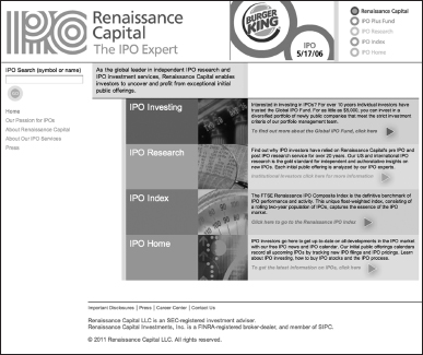
The original business card had “Renaissance Capital” spelled out in an Old English typeface—the kind you see on the mastheads of newspapers like the New York Times. It looked old, so it must be from the Renaissance, right? Turns out the design was just old. Kathleen Shelton Smith, William Smith, and Linda Killian, the founders of the Connecticut-based research firm Renaissance Capital, named their firm for the entrepreneurial spirit of innovation and invention embodied by da Vinci and Michelangelo. They believed that the founders of new companies like Google, eBay, and Facebook were the Renaissance people of today. After 15 years in business, the timing was right for Langton Cherubino Group to create a brand that supported the mission of the founders.
Why It Works
Shelton Smith insisted that the logo say “I-P-O,” the financial shorthand for “initial public offering.” They are IPO experts and are frequently quoted in the Wall Street Journal and seen on CNBC. But evoking the spirit of an IPO is an impossible task. “It's not a universal theme or concept like stability or trustworthiness that we could build a design around,” says design director Jim Keller. So the design team sought to capture the themes of innovations and inventiveness while building upon the classical forms of Renaissance art and architecture. ...
Get Visual Marketing: 99 Proven Ways for Small Businesses to Market with Images and Design now with the O’Reilly learning platform.
O’Reilly members experience books, live events, courses curated by job role, and more from O’Reilly and nearly 200 top publishers.

