Chapter 67. Primary and Secondary Buttons
Users can click or tap many things in your design. Some of those actions are helpful to your goals, and some aren’t.
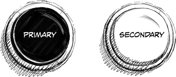
This example shows two button examples (don’t tap them). As a general guideline, you will need only two button styles because most user actions fall into one of two categories:
Primary Actions that are helpful to our goals.
Secondary Actions that are not.
Primary Buttons
Some actions that are available to the user are productive, like registering, buying, submitting content, saving, sending, sharing, and so on. They produce things that didn’t exist before. Those are primary actions, or things that we want the user to do as often as possible.
Buttons that execute primary actions—primary buttons—should be as visible as possible. We do that by using the principles we learned earlier in the course.
- Primary style
High contrast compared to the background (very different color or shade).
- Position in layout
On or near the Axis of Interaction so users notice them first, by reflex.
Secondary Buttons
Some actions that are available to the user are counterproductive, like canceling, skipping, resetting, declining an offer, and so on. They remove or stop the creation of new things. Those are secondary actions, or things we don’t want the user to do, but we provide the option for the sake of usability.
Therefore, buttons that execute secondary options—secondary ...

