Chapter 55. Alignment and Proximity
The last design principle you will learn about is how to add order and meaning to elements of your design without adding any more elements. It might sound subtle, but it affects everything you see, every day.
Alignment
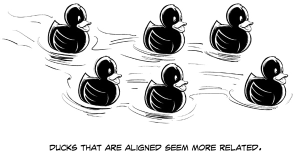
In the first image you see a group of six stunningly beautiful ducks, but you also see a lot of relationships, because of the way they are aligned:
We see two rows.
The far-left and far-right ducks seem to be separated.
The two center ducks seem the most organized.
All ducks seem to be going in the same direction.
If you see motion, the far-left duck might be falling behind.
If you see motion, the far-right duck might be leading.
Those six ducks are identical. Only the alignment creates these perceptions. Buttons with similar functions can be aligned. Different levels of content can be aligned. Information can be in a grid of rows and columns like a spreadsheet to create complex meaning.
Proximity
The closeness or distance between two objects creates a feeling of those objects being related or unrelated. That distance is called proximity.
In the second image, you see six identical ducks that are not aligned horizontally or vertically, but you definitely see two groups. The ducks in each group seem together, like a team or a family. The only thing creating that perception is their proximity.
In your designs, put related elements closer together ...
Get UX for Beginners now with the O’Reilly learning platform.
O’Reilly members experience books, live events, courses curated by job role, and more from O’Reilly and nearly 200 top publishers.

