Chapter 51. Visual Weight (Contrast and Size)
This lesson is the first of five visual principles that will help you direct the user’s attention. Some parts of your design are more important than others, so we have to help users notice the important stuff.
The idea of visual weight is fairly intuitive. Some things look “heavier” than others in a layout. They draw your attention more easily. And that idea is valuable to a UX designer. Your job is to help users notice the things that matter. And it is equally important not to distract the users from their goals.
By adding visual “weight” to certain parts of your design, you increase the chance that a user will see them and you change where their eyes will go next. Remember: visual weight is relative. All visual principles are about comparing a design element to whatever is around it.
So, without further ado, I would like to introduce you to the stars of the UX Crash Course: The Rubber Ducks! *applause here*
Contrast
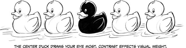
The difference between light things and dark things is called contrast. The more distinguishable a light thing is compared to a dark thing, the “higher” the contrast.
In UX, you want to give important things higher contrast, like the duck in the center. In this case, most of the image is light, so a dark duck is more noticeable. If the image were mostly dark, the lighter duck would be more noticeable.
If these were buttons, more ...
Get UX for Beginners now with the O’Reilly learning platform.
O’Reilly members experience books, live events, courses curated by job role, and more from O’Reilly and nearly 200 top publishers.

