
Figures and Special Effects
This chapter discusses a variety of formatter requests that you can use to draw figures and achieve special effects like overstriking and vertically stacked text. It also dissects some of the most complex macros we’ve seen so far, so it should advance your knowledge of how to write macros as well as your knowledge of its explicit subject matter.
▪ Formatter Escape Sequences ▪
Preprocessors like tbl and pic draw boxes, lines, and simple figures using an underlying library of formatter escape sequences that you can also use directly. The eqn preprocessor also uses many of these escape sequences, as well as others that are more appropriate for creating special effects with text characters.
The escape sequences are listed in Table 15-1. As you can see, there are quite a few! Fortunately, many of these need not be learned by the average user. The various preprocessors often allow a user to achieve the same effect more easily. Although tbl or eqn might seem difficult to learn, they are far simpler than the formatter commands they replace. For example, an eqn construct like 10% sup 5% is easier to learn and type than an equivalent troff construct like:
10\s-3\v'-3p'5\v'3p'\s0
When it comes to drawing lines and figures, things get even more complex.
For this reason, many of the escape sequences we are about to discuss are not often used by the average person trying to achieve special effects. However, they are extremely useful to a developer of macros.
In this chapter, we’ll cover the sequences for local vertical and horizontal motions and line drawing, because these requests are most commonly used in macros. In addition, we will show several large macros that do line drawing in order to demonstrate both the use of escape sequences and techniques for writing complex macros.
TABLE 15-1. Formatter Escape Sequences
| Escape | Description |
|---|---|
\v' distance′ |
Move distance vertically down the page. Precede distance with a minus sign to move back up the page. |
\h' distance′ |
Move distance horizontally to the right. Precede distance with a minus sign to move back to the left. |
\u |
Move ½ em up (½ line in nroff). |
\d |
Move ½ em down (½ line in nroff). |
\r |
Move 1 em up (1 line in nroff). |
\c |
Join next line to current output line, even across a break. |
\P |
Cause a break, and adjust current partial output line. |
\x' distance′ |
Add extra line space for oversize characters. |
| \(space) | Move right one space (distance determined by .ss). |
| \0 | Move right the width of a digit in the current font and size. |
| \ | | Move right 1/6 em (ignored in nroff). |
| \^ | Move right 1/12 em (ignored in nroff). |
\w' string′ |
Interpolate width of string. |
\kx |
Mark current horizontal place in register x. |
\o' xy′ |
Overstrike characters x and y. |
\zc |
Output character c without spacing over it. |
\b' string′ |
Pile up characters vertically (used to construct large brackets, hence its name). |
\l' Nc′ |
Draw a horizontal line consisting of repeated character c for distance N. If c isn’t specified, use _. |
\L' Nc′ |
Draw a vertical line consisting of repeated character c for distance N. If c isn’t specified, use |. |
\D' l x,y′ |
Draw a line from the current position to coordinates x,y (ditroff only). |
\D'c d′ |
Draw a circle of diameter d with left edge at current position (ditroff only). |
\D'e d1 d2′ |
Draw an ellipse with horizontal diameter d1 and vertical diameter d2, with the left edge at the current position (ditroff only). |
\D'a x1 y1 x2 y2′ |
Draw an arc counterclockwise from current position, with center at x1,y1 and endpoint at x1+x2,y1+y2 (ditroff only). |
\D'~ x1 y1 x2 y2 ...′ |
Draw a spline from current position through the specified coordinates (ditroff only). |
\H' n′ |
Set character height to n points, without changing the width (ditroff only). |
\S' n′ |
Slant output n degrees to the right. Negative values slant to the left. A value of zero turns off slanting (ditroff only). |
Many of the escape sequences in Table 15-1 take arguments that must be delimited from any following text. The delimiter character is most often ′ or ^G (CTRL-G), but it can be any character. The first character following the escape sequence will be taken as the delimiter, and the argument list will be terminated when that same character is encountered a second time.
▪ Local Vertical Motions ▪
There are a number of escape sequences for local vertical motions. They are so called because they take place within a line, without causing a break or otherwise interrupting the filling and justification process.
However, this is not to say that the motions they cause are limited. For example, you can use \v, the vertical motion escape sequence, to move anywhere on the page, just as you can with the .sp request. However, the remainder of the line that has been collected in the formatter’s internal buffers will be output in the new location just as if the motion had never taken place.
To make this point clearer, let’s look at three examples of input text that use different types of vertical motion.
What happens with .sp:
Input lines:
Especially in troff, it is sometimes uncanny the way that

vertical motions can occur

.sp 12p

independently from the output of the text.
Especially in troff, it is sometimes uncanny the way that vertical motions can occur
independently from the output of the text.
What happens with 'sp:
Input lines:
Especially in troff, it is sometimes uncanny the way that

vertical motions can occur

'sp 12p

independently from the output of the text.
Output lines:
Especially in troff, it is sometimes uncanny the way that vertical motions
can occur independently from the output of the text.
What happens with \v' 12p':
Input lines:
Especially in troff, it is sometimes uncanny the way that

vertical motions can occur \v' 12p'

independently from the output of the text.
Output lines:
Especially in troff, it is sometimes uncanny the way that vertical motions can occur
independently from the output of the text.
As you can see, .sp causes a break as well as a downward movement on the page. The partially collected line is output before the movement takes place. With ′ sp, the line currently being collected is completely filled and output before the spacing takes place. With \v, the motion is completely independent of the process of filling and justification.
It is also independent of traps, as we discovered once when trying to put a pointing finger ( ) at the bottom of a page to indicate that the subject was continued on the overleaf. We used a macro invoked by the page bottom trap to print the finger. At first, we made the mistake of using .sp −1 to move back up the page to place the finger. Unfortunately, this put troff into an endless loop around the trap position. The \v escape sequence, on the other hand, did the trick nicely. Since it does not change the current baseline spacing, it will not trigger a trap.
Long-winded examples aside, that is why \v is considered a local motion. In general, \v escape sequences are used in pairs to go away from, and then back to, the current vertical position.
A superscript is a good example of vertical motion using \v. For example, you could create a simple superscript macro like this:
.de SU

\\$1\s-2\v'-3p'\\$2\v' 3p'\s0\\$3
This macro
![]() prints its first argument;
prints its first argument;
![]() reduces the point size;
reduces the point size;
![]() makes a 3-point reverse vertical motion;
makes a 3-point reverse vertical motion;
![]() makes a 3-point vertical motion to return to the original baseline;
makes a 3-point vertical motion to return to the original baseline;
![]() restores the original size;
restores the original size;
![]() prints an optional third argument immediately following. (This allows punctuation to be introduced immediately following the superscript, rather than on the next line. If no third argument is supplied, this argument interpolation will be ignored.)
prints an optional third argument immediately following. (This allows punctuation to be introduced immediately following the superscript, rather than on the next line. If no third argument is supplied, this argument interpolation will be ignored.)
This macro could also be implemented using the \u (up) and \d (down) escape sequences, which use a fixed ½-em distance. If you did this—or if you specified the distance for the \v escape sequence in a relative unit like ems, instead of a fixed unit like points—it would be essential to have both of the vertical motions either inside or outside the font size change. For example, assuming that the current font size was 10 points:
.de SU

\\$1\u\s-2\\$2\d\s0\\$3

..
would produce an unbalanced effect, because the upward motion would be 5 points (½ em at 10 points), while the downward motion would be only 4 points (½ em at 8 points). This caution holds true whenever you mix font and size changes with local motions.
▪ Local Horizontal Motions ▪
Much of what has been said about local vertical motions is true for local horizontal motions. They take place independently of the process of filling and justification, and so, if improperly used, can result in horrors like:
![]()
which was produced by the line:
Look what happens when \h' -3m' you make a mistake with \h!
Horizontal motions are not as likely to take place in pairs as vertical motions. For example, there are cases where you want to close up the space between two special characters, or open up additional space on a line. For example, ≫, produced by >\h' -1p' >, looks better than ≫.
In addition to \h, there are a number of escape sequences that affect horizontal motion in specific ways.
For example, “ \ ” (it’s quoted so you can see the blank space following the backslash) will space over to the right by exactly one space. That sounds trivial, but it isn’t. When it justifies a line, troff feels free to expand the spaces between words. (The default space size is normally 12/36 of an em, but can be reset with the .ss request using units of 36ths of an em). The “\ ” escape sequence makes sure that you get exactly one space. This is generally thought of as the unpaddable space character and is used when you want to keep two words together. However, it can also be used simply as a horizontal motion sequence.
Another useful sequence is \0. It provides exactly the width of a digit in the current font and size. (Unlike alphabetic characters, all digits are always the same width on the standard fonts, to allow them to line up properly in numeric displays.) The \0 sequence is most useful when you want to line up spaces and digits manually.
The two escape sequences \ | and \^, which give, respectively, a 1/6 em and 1/12 em space, are useful when you want to create just a little bit of fixed space between two characters. (The normal space size created by an actual space character is 1/3 em, so these two characters give you, respectively, one-half and one-quarter of the normal interword spacing.) You may remember that we used \^ in Chapter 12 to create a little bit of space before and after the em dashes we were introducing into our files with sed.
▪ Absolute Motions ▪
As you’ve probably gathered from the preceding discussion, you can specify the distance for a horizontal or vertical motion using any of the units discussed in Chapter 4. The values can be given explicitly, or by interpolating the value of a number register. In addition, as discussed in Chapter 4, you can use a vertical bar ( | ) to indicate absolute motion relative to the top of the page or the left margin.
This is not as simple as it first appears. For vertical motions, you pretty much get what you expect. For example, .sp | 2i, \v'; | 2i' will move you to a position 2 inches from the top of the page. Depending on where you are on the page before you issue the command, the generated motion will be either positive or negative.
For horizontal motions, things are a little more ambiguous. The absolute position indicator doesn’t move you to an absolute position based on the output line, but on the input line. For example:
This is a test of

absolute horizontal motion\h' |li' _
produces:
This is a test of absolute horizontal motion
But:
This is a test of
absolute horizontal motion\h' |li' _
produces:
This is a test of absolute horizontal motion
What is really supplied as an argument to \h when you use the absolute position indicator is the distance from the current position on the input line to the specified position. Even though it looks the same, the argument will have a different value, depending on the length of the input line. And again, as with vertical motions, the actual movement may be positive {to the right) or negative (to the left), depending on the relationship between the current position and the absolute position specified.
It may appear odd to have these motions relative to the input line. However, as we will see (especially in line drawing), there is a method to the madness.
▪ Line Drawing ▪
Now we come to the fun part. Moving around on the page is of little use unless you plan to write something at the point you’ve moved to. Superscripts, subscripts, and overprinting provide some application of local motion, but local motions are most useful with the escape sequences for drawing lines and curves.
Applications range from underlining words in troff, to boxing single words (if you are writing computer manuals, this is very useful for showing the names of keys to be pressed), to drawing boxes around whole blocks of text, just like tbl does.
The \l sequence draws a horizontal line; \L draws a vertical line. Both escape sequences take two arguments, the second of which is optional. Both arguments should be enclosed together in a single pair of delimiters.
The first argument is the distance to draw the line. A positive value means to draw a horizontal line to the right, or a vertical line downward (depending on whether \l or \L is used). A negative value means to draw a line back to the left, or back up the page.
When you draw a line back to the left, either by explicitly specifying a negative value, or by specifying an absolute value (such as | 0) that results in a negative movement, troff first moves back to the specified position, then draws the line from left to right. It is as if the line is drawn from the specified distance to the current position.
For example:
\l' 3i' |
draws a line 3 inches to the right |
\l'-3i' |
draws a line from a position 3 inches to the left |
\L' 3i' |
draws a line 3 inches down |
\L' -3i' |
draws a line 3 inches up |
\L' |3i' |
draws a line to a position 3 inches from the top of the page |
The optional second argument is the character with which to draw the line. By default, a horizontal line is drawn with the baseline rule—a horizontal line that is aligned with the bottom of the other characters on a line. However, if you want to underline text, be sure to use the underscore, which is printed in the space allotted for characters that descend below the line:
These_words_are_separated_by_baseline_rules.

These_words_are_separated_by_underscores.
The underscore is usually generated by the underscore character that appears above the hyphen on most keyboards. However, to be on the safe side, you should refer to it by its special character name in troff—\ (ul. (The baseline rule can be specified with the sequence \ (ru.)
Vertical lines are drawn by default with a character called the box rule (which can be generated by the \ (br escape sequence or the vertical bar character on most keyboards). The box rule is a zero-width character—that is, when troff draws the box rule, it does not space over as it does with other characters. This allows troff to form exact corners with horizontal lines drawn with underrules. However, as you will see, it may therefore require you to manually specify additional space to keep it from crowding previous or succeeding characters.
Except in the case where you draw a line to the left, as described previously, the current position at which text output will continue is changed to the endpoint of the line. In drawing a box, you will naturally find yourself returning to the starting point. However, if you are drawing a single line, you may need to use \v or \h to adjust the position either before or after the line is drawn.
Let’s look at a couple of examples. A simple macro to underline a word in troff might look like this:
.de UL

\\$1\l' | 0 \ (ul'\\$2
This example prints its argument, backs up a distance equal to the length of the argument on the input line, then draws a line from that point to the current position. The optional second argument allows you to specify punctuation without separating it with the space that is required if it were entered on the next input line. (This reverse motion is implicit in the negative value generated by the absolute position request | 0—that is, the distance from the end of the word to the beginning of the line. Lines drawn with \1 and a negative distance generate a negative horizontal motion for the specified distance. The line is then drawn in a positive direction back to the current position.)
That is:
.UL Hello

,
produces:
Hello,
and:
.UL Hello
,
produces:
Hello,
(In nroff, you can underline simply by using an italic font switch, or the .ul request, because italics are represented in nroff by underlines.)
A macro to enclose a word (like the name of a key) in a box might look like this:
.de BX

\(br\|\\$1\|\ (br\l' | 0 \ (rn'\l' | 0 \ (ul'\^\\$2

..
For example, the input text:
Press the

.BX RETURN

key.
will produce the line:
Press the ![]() key.
key.
This macro prints a single box rule (\ (br), spaces over 1/6 em (\ |), prints the argument, spaces over another 1/6 em space, and prints a concluding box rule. Then it draws two horizontal lines back to 0 (the beginning of the input line—that is, the width of the argument plus the two requested 1/6-em spaces).
The first horizontal line is drawn not with \ (ul but with another special character, the root en (\ (rn). This character is used when drawing equations to produce the top bar in a square root symbol, but it is just as useful when you want to draw a line over the top of some text without moving back up the page. The second horizontal line is drawn, as usual, with \ (ul.
Both lines can be drawn back to zero without compensating horizontal motions because, as we have already noted, horizontal lines drawn backwards actually generate a reverse horizontal motion followed by a line drawn back to the current position.
The macro concludes with an additional 1/12-em space (\^) and an optional second argument, designed to allow you to specify punctuation following the box.
A macro to box multiple lines of text (like this paragraph) is more complex. It requires the use of a diversion to capture the text to be boxed. The diversion can then be measured, and the lines drawn to fit. And when you are using diversions, you need two macros, one to start the diversion, and one to finish it, as in the following macros:
.de BS              \" Box Start

.br                 \" Space down one line; cause break

.di bX              \" Start diverting input to macro bX

..

.de BE              \" Box End

.br                 \" Ensure partial line is in bX

.nr bI 1n           \" Set "box indent"--space between

.                   \" box and text

.di                 \" End diversion

.nr bW \\n(dlu      \" Set "box width" to diversion width

.nr bH \\n(dnu      \" Set "box height" to diversion height

.ne \\n(bHu+\\n(.Vu \" Make sure bH plus one line is

.                   \" left on page
.nr fI \\n(.u \" Set fI to 1 if text is filled
.nf \" Specify no-fill before printing bX
.ti 0
.in +\\n(bIu \" Add "box indent" to any other indent
.bX \" Output the text stored in macro bX
.in -\\n(bIu \" Subtract bI to restore prev indent
.nr bW +2*\\n(b \" Add 2x "box indent" to "box width"
.sp -1 \" Compensate for baseline spacing
\l'\\n(bWu\(ul'\L'-\\n(bHu' \l' |0\ (ul '\h' |0' \L' \\n(bHu'
. \" Draw box
if \\n(fI .fi \" Restore fill if prev text was filled
.sp \" Space down 1 line after box is drawn
..
There are a number of interesting things about these macros. First, they provide a good illustration of the use of diversions. Note that the macro causes a break (with either .br or .sp) before the diversion is started and before it is terminated. Note also how the predefined read-only registers dn and dl are used to measure the height and width of the diversion and therefore set the dimensions of the box. (The contents of these registers are not used directly when the lines are drawn because the registers are read-only, and the width needs to be adjusted to account for a small amount of spacing between the box rule and the text contained in the box.)
Second, because these macros are complex, they use quite a few number registers. We want to use register names that are mnemonic, but not use up names that might be useful for user-level macros. We get around this problem by using names that combine lowercase and uppercase letters. This is entirely a matter of convention, but one that we find preferable to mm′s use of completely obscure internal register names like ;p.
Third, there is the actual line drawing—the point of this presentation. Let’s look at this aspect of these macros in detail.
As we’ve discussed, bH and bW have been set to the height and width, respectively, of the diversion. Because the box rule is a zero-width character, however, the macro needs to allow a small amount of space between the sides of the box and the text it encloses. It does this by specifying a 1-en indent (which is added to any existing indent, in case the box occurs in a block of text that is already indented). When the diversion is output, it will thus be indented 1 en.
After the diversion is output, the indent is reset to its previous value. However, twice the value of the indent is added to the box width. The box will thus be drawn 2 ens wider than the text it encloses. The text will start in 1 en; the right side of the box will be drawn 1 en beyond the right margin.
The actual line to draw the box:
\l'\\n(BWu\(ul'\L'-\\n(BHu'\l'|0\(ul'\h'|0'\L'\\n(BHu'
draws a horizontal line using \ (ul from the left margin to the distance specified by bW (box width), which, as we have seen, now includes a small extra margin. It then draws a line back up the page to the height specified by bH, and back across the page to the left margin again.
At this point, even though we have drawn the bottom, right, and top sides of the box, we are still at the top right corner of the box. The macro needs to move horizontally back to the left margin, because horizontal lines to the left are actually drawn from the left, and leave the current position the same as it was before the line was drawn. In this case we actually want to move to the left as well. Therefore, we must do so explicitly, by following the \l' | 0\ (ul' request with a \h' | 0'. Finally, the box is closed by drawing a vertical line back down the left side.
The current position is now at the start of the last line of the contents of the box, so the macro issues an .sp request to move down one line. Alternatively, you could write this macro in such a way that it leaves no additional space above and below the box, but lets the user leave space by issuing some kind of spacing or paragraph request.
By default, the box is drawn just long enough to surround the text it contains. (The number register dl, which is used to set the box width, contains the width of the text in the diversion.) For short lines in no-fill mode, the box will also be shorter:
Here are some short lines of text in no-fill mode.
Let’s see how they come out.
This raises the idea that it might be nice to center a box that is shorter. A more complete set of box macros will do this, as well as let the user change the default box indent (the distance between the text and the edge of the box):
.de BS                   \" Box Start

.sp

.di bX

.nr bC 0                 \" Clear centering flag

.nr bI 0                 \" Clear box indent

.if "\\$1"C" .nr bC 1    \" Set flag if user wants centered

.if !"\\$2"" .nr bI \\$2n\" Set box indent if specified

..

.de BE                   \" Box End

.br

.if !\\n(bI .nr bI ln    \" Set bI if not already set

.di

.nr bW \\n(dlu

.nr bH \\n(dnu

.ne \\n(bHu+\\n(.Vu

.nr fI \\n(.u

.nf

.ti 0

.nr iN \\n(.iu           \" Save current indent

.if \\n(bC .in +(\\n(.lu-\\n(bWu)/2u

.                        \" If centering, adjust indent

.in +\\n(bIu

.bX

.in -\\n(bIu

.nr bW +2*\\n(bIu
.sp -1
\l'\\n(bWu\ (ul'\L'-\\n(bHu'\l' |0\(ul'\h'|0'\L'\\n(bHu'
.if \\n (fI .fi
.in \\n(iNu \" Restore original indent
.sp
..
Using the full macro, and specifying .BS C 5n, the box now looks like this:
Here are some short lines of text in no-fill mode.
Let’s see how they come out with .BS C 5n.
These macros also provide insight into how to use number registers. For example, B1 takes C as a possible argument to indicate that the box should be centered. Because the B2 macro controls the output, there must be some way to communicate the user request for centering between B1 and B2. The B1 macro sets number register BC to 1 as a signal, or flag, to B2 to do the centering. (Note that BC is first zeroed, to make sure that centering is not propagated into the current environment from a previous invocation of the box macros.)
Likewise, BQ is set as a flag to indicate whether justification is enabled. The box is drawn in no-fill mode, but the macro must reset filling if it was previously enabled. The read-only number register .u is nonzero if filling is in effect, so the lines:
.nr BQ \\n(.u

         .

         .

         .

.if \\n(BQ .fi
will execute the .fi request only if justification was previously in effect.
Changing Line Weight
You may occasionally want to change the weight of a line you are drawing. The way to do this is simple: change the point size with either the .ps request or the \s escape sequence before drawing the line. For example:
\l' 3i'
will produce:
![]()
and:
\s20\l' 3i'\s0
will produce:
![]()
(This trick only works with \l and \L. It will not change the weight of lines drawn with any of the \D escape sequences.) You might also want to consider the text size when you are drawing boxes around text. For example, if you are using a macro like .BX (shown previously) to draw boxes around the names of keys, you might want to set the text 2 points smaller, either by specifying the font-switch codes as part of the argument:
.BX "\s-2RETURN\s0"
or by modifying the macro so that they are built right in:
.de BX

\(br\|\s-2\\$1\s0\|\(br\l'|0\(rn'\l'|0\(ul'\^\\$2

..
If either of these things were done, our earlier example would look like this, which is even better:
Press the ![]() key.
key.
Drawing Curves
The previous line drawing escape sequences work in nroff and otroff as well as ditroff. There are also additional drawing sequences that only work in ditroff. These escape sequences allow you to draw circles, arcs, ellipses, splines (curved lines between a series of coordinates), and straight lines.
Table 15-2 summarizes these sequences. The syntax of the escape sequences is familiar—an initial escape code is followed by a series of arguments enclosed in single quotation marks or some other user-supplied delimiter. In this case, though, all of the escape sequences begin with the same code—\D—with the type of item to be drawn (circle, arc, ellipse, spline, or straight line) given by the first argument.
TABLE 15-2. ditroff Escape Sequences for Drawing
| Escape | Description |
|---|---|
\D' l x,y′ |
Draw a line from the current position to coordinates x,y. |
\D' c d′ |
Draw a circle of diameter d with left edge at the current position. |
\D' e d1 d2′ |
Draw an ellipse with horizontal diameter d1 and vertical diameter d2, with the left edge at the current position. |
\D' a x1 y1 x2 y2′ |
Draw an arc counterclockwise from the current position, with center at x1,y1 and endpoint at x1+x2,y1+y2. |
\D' ~ x1 y1 x2 y2 ...′ |
Draw a spline from the current position through the specified coordinates. |
Learning the geometry used by these escape sequences is best accomplished by example. Although we have shown the arguments to the line, arc, and spline sequences as if they were x, y coordinates, they are in fact troff’s usual vertical and horizontal distances. Read x as horizontal distance, and y as vertical distance. You can get very confused if you treat them as a true coordinate system.
Let’s start simple, with individual fixed-size figures. The following input will produce the output shown in Figure 15-1:
.sp li

.in .5i

The circle starts here\D'c li' and ends here.

.sp li

The line starts here\D'l li -1i' and ends here.

.sp li

The ellipse starts here\D'e 2i li' and ends here.

.sp li

The arc starts here \D' a .5i 0 0 .5i' and ends here.

.sp li

The spline starts here

\D'~ .5i -.5i .5i .5i .5i .5i .5i -.5i' and ends here.

.sp .5i

.in 0
As you can see, arcs and splines are the most difficult figures to construct. Instinct cries out for the ability to draw an arc between two endpoints with the current position as the center of the arc. Instead, for consistency with the other figures, drawing begins at the current position, and the first set of values specify the center of the arc. This takes a little getting used to.
With splines, the problem is that distances are additive, and relative to the previous position, rather than to the initial position. Our familiarity with x, y coordinate systems leads us to think that the spline should be produced by a request like this:
\D'~ .5i -.5i li 0 1.5i .5i 2i 0'
(in which the x value increases relative to the origin rather than to the previous point) instead of by the request shown previously.
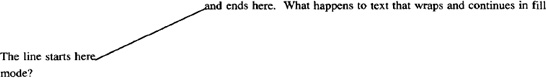
You may also have noticed something rather odd. Text continues right after the endpoint of the figure, yet the .sp li requests seem to give us 1 inch of space from the original baseline, regardless of the endpoint of the figure. This is most obvious with the line, which clearly moves back up the page. Yet the next figure is also spaced down 1 inch. This fact becomes even more obvious if we do this:
.sp li

The line starts here\D'l 1i -.5i' and ends here.

What happens to text that wraps and continues in fill mode?
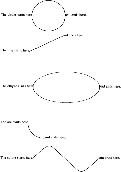
Fig. 15-1. Some Simple Figures
The current baseline has not been changed. This is a major contrast to lines drawn with \L or \l. As you play with lines, you’ll also find that lines drawn to the left with \D really do move the current position to the left, and you don’t need to add a compensating horizontal motion if you are drawing a complex figure.
You’ll have to experiment to get accustomed to drawing figures. One other problem is to get figures to start where you want. For example, to get the endpoints of arcs with various orientations in the right place, you may need to combine arc drawing requests with vertical and horizontal motions.
You could use these requests to create a box with curved corners similar to the one done with pic in Chapter 10. The box is drawn starting with the lower left corner (so it can be drawn after the text it encloses is output) and will look like this:

The box was drawn using the following drawing commands. These commands are shown on separate lines for ease of reading. To make them draw continuously, we need to add the \c escape sequence to the end of each line. This escape sequence joins succeeding lines as if the line feed were not there. Warning: using fill mode will not achieve the same result, because the formatter will introduce spaces between each drawing command as if it were a separate word.
To build a complete macro to enclose examples in a simulated computer screen, we can adapt the .Bl and .B2 macros shown previously:
. de SS                 \" Start Screen with

.                       \" Curved Corners

.sp .5v

.ie !"\\$1"" .nr BW \\$1\" Get width from first arg

.el .nr BW 4i           \" or set default if not specified

.ie !"\\$2"" .nr BH \\$2\" Get height from second arg

.el .nr BH 2.5i         \" or set default if not specified

.br

.di BB

..

.de SE \" Screen End

.br

.nr BI 1n

.if \\n(.$>0 .nr BI \\$1n

.di

.ne \\n(BHu+\\n(.Vu

.nr BQ \\n(.j

.nf

.ti 0

.in +\\n (BIu

.in + (\\n(.lu-\\n(BWu)/2u

.sp .5

.BB

.sp +(\\n(BHu-\\n(dnu)

.in -\\n(BIu

.nr BH -.5i

.nr BW +2*\\n(BIu

.nr BW -.5i

\v' -.25i'\c

\D'a .25i 0 0 .25i'\c

\D'l \\n(BWu 0'\c
\D'a -.25i 0 0 -.25i'\c
\D'l -\\n(BWu 0'\c
\D'a 0 -.25i .25i 0'\c
\D'l 0 -\\n(BHu -\c
\v' .25i'
.sp -1.5
.if \\n(BQ .fi
.br
.sp .5v
..
Because a screen has a fixed aspect ratio, we don’t want the box to be proportional to the text it encloses. Hence, we give the user of the macro the ability to set the box width and height. If no arguments are specified, we provide default values.
Because the box size is fixed, there are some additional steps necessary in the closing macro. First, we must decrement the specified box width and height by the distance used in drawing the curves, so that the user gets the expected size. Second, because the box is drawn from the lower left corner back up the page, we must make sure that the lower left corner is correctly positioned before we start drawing.
To do this, we again need to use a diversion. We measure the height of the diversion, then add enough additional space (.sp + (\\n(BHu-\\n(dnu)) to bring the starting point for drawing low enough so that the box is not drawn back over the text that precedes the invocation of .SS. (If you don’t understand why this was done, delete this line from the macro, and watch the results.)
We’ve also centered the screen by default, and added a half-line of vertical spacing above and below the box. (As an exercise, modify the .BX macro to produce a key-cap with curved comers.)
▪ Talking Directly to the Printer ▪
Depending on the output device and postprocessor you are using, you may be able to send specialized control commands directly to your printer. For example, you may be able to embed raster graphics images (such as a file created on an Apple Macintosh with MacPaint) directly in your output. Or if you are using a PostScript-driven printer, you can integrate figures done with MacDraw, or issue PostScript commands to print grey screens over your text.
These capabilities are provided by the two requests \! and .cf, copy filename [to standard output] (ditroff only).
The \! request is the transparent output indicator. Any text following this escape sequence on a line is placed directly into the output stream, without any processing by troff. This makes it possible to insert control lines that will be interpreted by a postprocessor or an output device. (As mentioned in the last chapter, transparent output is also useful for embedding control lines in a diversion, to be executed when the text in the diversion is output.)
Likewise, the contents of the file specified as an argument to .cf are placed directly on standard output, without processing by ditroff.
Unfortunately, there is a catch! PostScript is a page-description language that resides in the printer. Before you can talk directly to the printer, you must get through the postprocessor that translates ditroff output into PostScript. If the postprocessor mucks with the data you send out, all bets are off.
As of this writing, Transcript, Adobe Systems? own troff-PostScript converter, does not allow you to use \!. However, with Pipeline Associates? devps, any lines beginning with ! are ignored by the postprocessor, and go directly to the printer. This allows you to use transparent output by entering the sequence \! ! followed by the appropriate PostScript commands. Or, if you are sending a PostScript file created on the Mac, use an editor to insert an exclamation point at the beginning of each line.
In any event, this is not a job for the novice, since you must learn PostScript as well as troff. Experiment with your printer and postprocessor, or ask around to see if other users have solutions you can adapt to your situation.
▪ Marking a Vertical Position ▪
There are many cases, both in macros and in the body of your text, where you may want to mark a spot and then return to it to lay down additional characters or draw lines.
The .mk request marks the current vertical position on the page; .rt returns to that position. This is useful for two-column processing. To give a simple example:
Two columns are useful when you have a linear list

of information that you want to put side-by-side, but don't

want to bother rearranging with the cut-and-paste programs.

.sp .5

.ll 2.5i

.nf

.mk

Item 1

Item 2

Item 3

.ll 5i

.in 2.75i

.rt

Item 4

Item 5

.in 0

.sp
This example produces the following output:
Two columns are useful when you have a linear list of

information that you want to put side-by-side, but

don't want to bother rearranging with the cut-and-paste

programs.

Item 1                            Item 4

Item 2                            Item 5

Item 3
Notice that it is entirely your responsibility to make sure that the second column doesn’t overprint the first. In this example, we did this by manually adjusting the indent and the line length. In addition, because the second column is shorter than the first, a concluding .sp is necessary to return to the original position on the page. If this had not been done, subsequent text would overprint the last line of the first column.
Proper two-column processing for an entire document requires a much more complex setup, which must in part be handled by the page bottom macro. We’ll look at that in detail in Chapter 16, but this example should be enough to give you the idea.
The .mk request can take as an argument the name of a number register in which to store the vertical position. This allows you to mark multiple positions on a page, and return to them by name. The .rt request always returns to the last position marked, but you can go to a position marked in a register using the .sp request:
.mk Q

.sp |\nQu
or (more to the point of the current discussion) with \v:
\v' | \nQu'
In addition, .rt can take as an argument a distance from the top of the page.
That is:
.rt 3i
will return to a point 3 inches from the top of the page. The .mk request need not be used in this case.
▪ Overstriking Words or Characters ▪
There are a number of escape sequences that allow you to overstrike words or characters to create special effects. These include
![]() boldfacing an entire font by overstriking;
boldfacing an entire font by overstriking;
![]() marking and returning to a specific horizontal position;
marking and returning to a specific horizontal position;
![]() calculating the width of a word and backing up over it;
calculating the width of a word and backing up over it;
![]() centering two characters on top of each other;
centering two characters on top of each other;
![]() stacking characters vertically.
stacking characters vertically.
Boldfacing a Font by Overstriking
The .bd request specifies that a font should be artificially boldfaced by overstriking. The request has two forms, one for ordinary fonts and one for the special font.
A request of the form:
.bd font offset
will overstrike all characters printed in font by overprinting them, with the second strike offset from the first by offset-1 basic units. The following:
.bd S font offset
will overstrike characters printed in the special font, while font is in effect. And:
bd font

.bd S font
will restore the normal treatment of the font.
This request is particularly useful when you are boldfacing headings and want to account for special characters or italics in arguments supplied by the user. (This assumes that you don’t have an explicit bold italic font.) Especially at sizes larger than 10 points, the stroke weights of bold and italic fonts can be quite different.
For example, assume that you had a macro that produced a boldface heading for a table:
.de Th  \" Table Heading

.ft B

.ce

Table \\$1: \\$2

.ft P

..
If the user supplied italics or special characters in the arguments to the macro, the contrast between the different character weights might not be as pleasing as it could be. For example:
.Th "3-1" "Special Uses for \(sr in \fItroff\fP"
would produce:
Table 3-1: Special Uses for ![]() in troff
in troff
If the macro had .bd requests added like this:
.de Th  \" Table Heading

.ft B

.bd I 3

.bd S B 3

.ce

Table \\$1: \\$2

.ft R

.bd I

.bd S

..
the output would look like this:
Table 3-1: Special Uses for ![]() in troff
in troff
Another example is provided by the constant-width (CW) font used in this book. Because the font is optimized for the Laserwriter, where the ink bleeds slightly into the paper, the font is very light on the typesetter. Throughout this book, we have emboldened this font slightly, with the requests:
.bd CW 4

.bd S CW 4
This sentence shows how the constant width font looks without these requests.
Marking and Returning to a Horizontal Position
Just as you can mark a vertical position, you can also mark and move to a specific horizontal position. This is chiefly useful for overstriking characters.
Just as you use a value stored into a register with the .mk request to indicate a fixed vertical location on the page, you mark a horizontal location with \k. Then, you can use the absolute position indicator | to specify the distance for \h.
To borrow an example from Kernighan’s Troff Tutorial:
\kxword\h' | \nxu+2u'word
will artificially embolden word by backing up almost to its beginning, and then overprinting it. (At the start of word, \k stores the current horizontal position in register x. The \h' | \nxu+2u' sequence returns to that absolute position, plus 2 units—a very small offset. When word is printed a second time, an overstriking effect is created.)
This sequence might be useful if you were using a font that had no bold equivalent, and in circumstances where the .bd request could not be used because the special effect was not desired for all instances of that font on the same line. And, to be really useful, the sequence should probably be saved into a macro.
The Width Function
The \w escape sequence returns the length of a string in units. For example:
\w' Hi there'
will tell you the length of the string Hi there.
This sequence returned by \w can be used as an argument with \h or with any horizontally oriented request (such as .in). This has many uses, which we’ll introduce as we need them.
To give you an idea of how to use \w, though, we can rewrite the example used with \k as follows, to produce the same effect:
.de BD      \" Artificially embolden word

\\$1\h'-\w'\\$1'-2u'\\$1

..
This macro prints its first argument, then backs up the width of that argument, less two units. Then it prints the argument a second time— at a two-unit offset from the first. Hint: to avoid awkward constructions involving nested \w sequences, first read the width into a number register. For example, the previous macro could be rewritten like this:
.de BD      \" Artificially embolden word

.nr WI (\w'\\$1' -2u)

\\$1\h'-\\n (WIu'\\$1

..
In this case, the difference isn’t so great; however, at other times the sequence can become too confusing to read easily.
Overstriking Single Characters
Although \k provides a good method for overstriking an entire word, there are also more specialized functions for overstriking a single character.
The \o sequence takes up to nine characters and prints one on top of the other. This is most useful for producing accents, and so forth. For example, \o' e^' produces ê.
You can also produce other interesting character combinations, although you may need to tinker with the output to get it to look just right. For example, we once tried to simulate a checkmark in a box with the sequence: \o'\ (sq\ (sr'. (Note that the special character escape sequences are treated as single characters for the purpose of overstriking.) This example produced the following output:
![]()
The square root symbol is too low in the box, so we tried to introduce some local motions to improve the effect, like this:
\o'\(sq\v'-4p'\(sr\v'4pr' '
Unfortunately, this didn’t work. Although you can nest most escape sequences inside each other (as long as you use the correct number and order of delimiting quotation marks), local motions do not work with \o. However, there was a solution.
The \z sequence also allows overstriking, but in a different way. The \o sequence knows the width of each character, and centers them on top of each other. The \z sequence simply outputs the following character, but does not space over it. That means the current position after printing the character is the same as it was before the character was printed. A subsequent character will have its left edge at the same point as the character immediately following the escape sequence. Because \z does allow you to mix vertical motions with overstriking, it solved our problem.
Because all these escape sequences can be a bit much to type, we defined the checkmark in a box as a string:
.ds CK \z\(sq\\v'-4p' \(sr\\v' 4p'
After we did that, simply typing \* (CK will produce ![]()
Stacking up Characters
The \b sequence also does a kind of overstriking—it stacks the characters in the following string. It was designed for use with eqn. There are special bracket-building characters that are meant to stack up on top of each other. See Table 15-3.
TABLE 15-3. Bracket-Building Characters
| Character | Name | Description |
|---|---|---|
\(lt |
Left top of big curly bracket | |
\(lb |
Left bottom | |
\(rt |
Right top | |
\(rb |
Right bottom | |
\(lk |
Left center of big curly bracket | |
\(rk |
Right center of big curly bracket | |
| | | \(bv |
Bold vertical |
| ⌊ | \(lf |
Left floor (left bottom of big square bracket) |
| ⌋ | \(rf |
Right floor (right bottom) |
| ⌈ | \(lc |
Left ceiling (left top) |
| ⌉ | \(rc |
Right ceiling (right top) |
A typical invocation looks like this:
\b'\(lt\(lk\(lb'
which produces:
![]()
When you’re creating a tall construct like this, you need to allow space so that it doesn’t overprint preceding lines. You can create space above or below the line with .sp requests. However, this will cause breaks. Although 'sp might do the trick, it is sometimes hard to predict just where the break will fall.
The troff program has a special construct designed to solve just this problem of a tall construct in the middle of filled text. The \x request allows you to associate extra interline spacing with a word. A positive value specifies space above the line; a negative value specifies space below the line. So, when illustrating the previous bracket-building function, we could have shown the results inline, like this ![]() , rather than in an example broken out by blank lines. Typing the sequence:
, rather than in an example broken out by blank lines. Typing the sequence:
\b'\(lt\(lk\(lb'\x'9p'\x'-9p'
gives us the result we want.
The \x sequence is also useful when you want to allow extra space for an oversized letter at the start of a paragraph. (You’ve probably seen this technique used in some books on the first paragraph of a new chapter. It was commonly used in illuminated manuscripts.)
An application of \b that you might find useful is to create vertically stacked labels. For example, consider the following macro, which will put such a label in the outside margin of a book:
.de SL

.mk        \" Mark current vertical position

.ft B      \" Change to bold font

.cs B 24   \" We'll explain this later

-PO -.25i  \" Shorten the page offset by 1/4 inch

.lt +.5i   \" Extend the title length used by .tl

.          \"  This request will be explained later

.if e .tl '\b:\\$1:'''  \" Use .tl to put stacked label

.if o .tl '''\b:\\$1:'  \"   in the margins

.lt -.5i   \" Restore original title length

.PO +.25i  \" Restore original page offset

.cs B      \" We'll explain this later

.ft        \" Restore original font

.rt        \" Return to original vertical position

..
Clever trikci
So, for example:
.SL "Clever Trick!"
will produce the effect shown in the margin.
▪ Tabs, Leaders, and Fields ▪
We discussed tabs in Chapter 4. However, there are a couple of additional points that need to be covered. When you enter a tab on a typewriter, the typing position shifts over to a predefined position, or tab stop. In nroff and troff, what is actually generated is the distance from the current position on the input line to the next tab stop.
What this means is best illustrated by an example that will not work. Suppose you want to create a table of contents in which one entry (the page number) is all the way over to the right margin, and the other (the heading) is indented from the left, like this:
You might be tempted to code the example as follows (where a tab is shown by the symbol | ________| ):
.ta 6.5iR

Getting Started |________| 1-1

.in .5i

Turning On the Power |_______| 1-2

Inserting Diskettes |________| 1-3
This will not work. Indents cannot be combined with tabs. A tab character generates the distance from the current position on the input line to the tab stop. Therefore, the page number will be indented an additional half-inch-extending out into the right margin-instead of staying where you put it.
The way to achieve this effect (in no-fill mode) is to use either spaces or tabs to manually indent the first text string.
When you use right or center-adjusted tabs, the text to be aligned on the tab is the entire string (including spaces) from one tab to the next, or from the tab to the end of the line. Text is aligned on a right-adjusted tab stop by subtracting the length of the text from the distance to the next tab stop; text is aligned on a center-adjusted tab stop by subtracting half the length of the text from the distance.
Using Leaders
A leader works like a tab; however, it produces a character string instead of horizontal motion. A single character is repeated until a specific horizontal position is reached. There is actually a leader character, just as there is a tab character. But there is no key for it on most keyboards, so it is not obvious how to generate it. The magic character is ^A (CTRL-A), and you can insert it into a file with vi by typing ^V^A (CTRL-V, CTRL-A).
If you insert a ^A into your file where you would normally insert a tab (incidentally, the tab itself is equivalent to ^I, and will show up as such if you display a line with ex’s : l command), you will generate a string of dots. For example:
.nf

.ta li 2.5i 3.5i

|_______| First^ASecond^AThird

.fi
will produce:
First .................................... Second ............ Third
You can change the leader character from a period to any other single character with the .lC request. For example, you could create a fill-in-the-blanks form like this:
.nf

.ta li 3iR

.lc _

Signatuse:|________| ^A

Date:|______| ^A

.fi
This example would produce the following output in troff:
| Signature: | ________________________ |
| Date: | ______________________ |
As you can see from the example, tabs and leaders can be combined effectively to line up both ends of the underlines.
A second way to create leaders is to redefine the output of the tab character with .tc. This request works just like .lC, only it redefines what will be output in response to a tab character. For example, if you issue the request:
.tc .
a tab character (^I) generates a string of repeated dots, just like a leader (^A). However, you will then lose the ability to intermix tabs and leaders on the same line, as in the previous example.
Issuing a .tc request without an argument will restore the default value, which generates motion only. (Incidentally, the same is true of .lc—that is, .lC without an argument will cause leaders to generate motion only, just like tabs. To reset the leader character to its default value, you need to request .lC .).
Using Fields
In addition to tabs and leaders, nroff and troff support fields, which are blocks of text centered between the current position on the input line and the next, or between two tab stops.
The .fc request allows you to specify a delimiter that indicates the boundaries of the field, and a second character (called the pad character) that divides the contents of the field into subfields. A blank space is the default pad character. The .fc request without any arguments turns off the field mechanism. This request is a little difficult to explain, but easy to illustrate. The requests:
.nf

.ta li 3i

.fc #

|_____| #Hi there#

|_____| #Hi how are you#

.fc

.fi
will produce the following output:
| Hi | there | ||
| Hi | how | are | you |
Within the field, the pad character (a space by default) is expanded so that the text evenly fills the field. The first line contains only a single space, so the two words are adjusted at either end of the field. The second line contains three spaces, so the words are evenly spaced across the field.
By specifying a pad character other than a space, you can achieve fine control over spacing within the field. For example, if we modify the input like this:
.fc # ^

|_____| #Hi^how are^you#

.fc
we’ll get this result:
| Hi | how are | you |
What’s this good for? To return to our fill-in-the-blanks example, the construction:
.nf

.ta .5i 2i 2.5i 4i

.fc # ^

.lc _

|_____|^A|____|^A

.sp .5

|_____|#^Signature^#|______|#^Date^#

.fc

.lc .

.fi
would produce the following output:
| ____________________ | ____________________ |
| Signature | Date |
You should also know that .fc, like many other advanced formatter requests, is used by the tbl preprocessor to create complex tables. It is wise to avoid using it inside a table.
Using Tabs and Leaders in Macros
Within a macro definition, tabs and leader characters are not interpreted. They will take effect when the macro is used, not when it is defined. Within a macro definition, you can also specify tabs and leaders with the escape sequences \t and \a. These sequences are also not interpreted until the macro is used, and can be substituted for the actual tab or leader characters whenever interpretation is to be delayed.
▪ Constant Spacing ▪
One font that you may frequently encounter, especially in the ditroff environment, is called CW (constant width). It is the font used in this book for examples. It has become something of a convention in computer books to print all “computer voice” examples—input from the keyboard, the contents of a file, or output on the screen—in a constant-width font. (This convention is based on the fact that in many computer languages, precise indentation is syntactically or at least semantically significant, and the Variable-width typesetting fonts cannot preserve the alignment of the original text.) When you use a constant-width font, you are essentially asking troff to act like nroff—to work in a realm where all characters, and all spaces, are of identical width.
To use the constant-width font in ditroff, request it like any other font, using either the request .ft CW or the escape sequence \f (CW. In otroff, depending on the output device, you could use constant width by using a preprocessor called cw, which got around the four font troff limit by handling the constant-width font in a separate pass. See the description of cw in your UNIX Reference Manual if you are interested in the details. (There are other ways to do this as well, depending on the output device and the postprocessor you are using to drive it. For example, we used otroff with TextWare International’s tplus postprocessor and the HP LaserJet. To get around the font limit, we set a convention in the postprocessor that 11-point type was actually constant width, and then used the .cs and .ss requests to give troff the correct spacing.)
There is also a request that allows you to simulate the effect of a constant-width font even when you are using a variable-width font. The .cs request tells troff: “Use the spacing I give you, even if it doesn’t match what you’ve got in your width tables.” The request takes up to three arguments. The first two arguments are the most commonly used. They are the font to be so treated and the width to be used, in 36ths of an em. By default, the em is relative to the current type size. By using the optional third argument, you can use the em width of a different type size. So, for example:
.cs B 21

Space the bold font at 21/36 of an em.

.cs B 21 12

Space the bold font at 21/36 of a 12-point em.
Let’s see what we get with these requests:
Space the bold font at 21/36 of an em.

Space   the   bold  font   at  21/36 of a 12

POint   em.
To return to normal spacing for the font, use .cs without a width argument. For example:
.cs B
will return control of spacing for the bold font to troff’s width tables.
Although the results are not always aesthetically pleasing, it may be necessary to use this request if you have a real need to represent constant-width text. It is also useful for special effects. For example, you may have noticed that in the headings of each chapter of this book, the word Chapter is broadly and evenly spaced, and the boxes underneath align with the letters. This was done with the .cs request.
The .cs request is also useful when you are creating vertically stacked labels, as shown earlier in this chapter. Normally, characters are positioned with their left edge at the current position on the output line. When constant spacing with .cs is in effect, the left corner of the character box is placed at that position, and the character itself is centered in the box. You can see the difference between this graphically in the following example:
.sp .7i

.ft B

.in li

.mk

\b' Variable'

.in 3i

.rt

.cs B 24

\b' Constant'

.br

.cs B

.ft

.in 0

.sp .7i
which produces:
V |
C |
| a | o |
r |
n |
i |
s |
| a | t |
b |
a |
I |
n |
| e | t |
The .ss request is a closely related request that sets the space size. The default size of an interword space in troff is 12/36 of an em; for true constant-width effects, you should set it to the same size as the font spacing you have set with .cs.
▪ Pseudo-Fonts ▪
Using the .bd request to create a bold italic is not the only way to simulate a nonstandard font, at least in ditroff. In ditroff, there are two new escape sequences, \S and \H. The \S sequence slants characters by a specified number of degrees. (Positive values slant characters to the right; negative values slant characters back to the left.) For example:
\s' 15'
will slant characters 15 degrees to the right. This can be used to create a pseudo-italic font. The \S sequence without an argument turns off slanting.
\H sequence sets the character height to a specified point size without changing the width. For example, if type is currently being set at 10 point, the construct:
\H' 12'
will create characters that are 12 points high, but only 10 points wide (assuming you are at the default 10-point size). A height value of 0 turns off the function.
These escape sequences will only work on certain output devices. You’ll have to experiment to find whether or not they’ll work in the setup you’re using.
▪ Character Output Translations ▪
“Garbage in, garbage out” is a truism of computer science. You get out of a computer what you put in. However, there are cases in nroff and troff in which what you put in is not the same as what you get out.
The first of these cases is only true for troff. It involves a special class of characters called ligatures. As we’ve previously discussed, typeset characters have different widths. Even so, when two narrow characters are printed together, such as a pair of f’s, or an f and an i, there is excess space between the characters.
To get around this problem, there are special characters called ligatures, which are really single characters designed so that they appear the same as a pair of narrow characters. (These are truly single characters, defined as such in troff’s character set.)
The ligature characters and the equivalent individual characters are:
| Input | Ligature | Equivalent Characters |
|---|---|---|
\ (fi |
fi |
fi |
\(fl |
fl |
fl |
\(ff |
ff |
ff |
\ (Fi |
ffi |
ffi |
\ (Fl |
ffl |
ffl |
The troff formatter automatically converts any of these groups of characters to the equivalent ligature, although all ligatures are not supported by every output device. (For example, fi and fl are the only ones in the standard PostScript fonts.) You can turn this conversion off with the request:
.lg 0
and restore it with:
.lg
Normally, you won’t need to do this, but there are special cases in which it may hang you up, and you’ll need to know what to do. We’ll get to one of them in a moment.
The .tr (translate) request provides a more general facility for controlling output character conversions. It takes one or more pairs of characters as an argument. After such a translation list has been defined, troff will always substitute the second character in each pair for the first, whenever it appears in the input.
Let’s look at some examples. First, consider the case encountered throughout this book, in which we illustrate the syntax of various requests without actually executing them. For example, we want to show a period at the start of a line or the backslash that starts an escape sequence, without actually having them executed.
We could simply insulate the special characters from execution. For example, we can put the zero-width character \& in front of a period that begins a request, and we can double all backslashes (\\ will appear as \ in the output) or use the \e escape sequence, to print \.
However, this grows tedious and hard to read in the input file. Another approach is to do a character translation:
.tr #. %\\ \" Translate # to ., % to \
(As usual, we have to double the backslash.) Now, whenever # appears in the input, . appears in the output, and whenever % appears in the input, \ appears in the output. So, in our examples, we can actually type:
#sp li %" Space down one inch
But what appears on the page of this book is:
.sp li \" Space down one inch
The translations are built into the example start and end macros. (The end macro resets the characters to their normal values.)
If you translate characters with .tr, be sure to restore their original values correctly when you are done. To reset the previous translation to the normal character values, the request is:
.tr ##%% \" Translate # to #, % to %
In addition, the translation must be in effect at the time the line is output. If you translate characters without first causing a break, any partially filled line will be affected by the translation.
It is also possible (and recommended in some of the troff documentation) to use .tr to substitute some other character (usually ~) for a space. This creates an equivalent to the unpaddable space.
This will allow you to type single characters for unpaddable spaces; your input text will be more readable and will line up properly on the screen.
Yet another application of .tr, and one that you will find useful in designing macros for chapter headings and so on, is to translate lowercase input into uppercase, and then back again:
.de UC  \" Translate input to uppercase

.tr aAbBcCdDeEfFgGhHiIjJkKlLmMnNoOpPqQrRsStTuUvVwWxXyYzZ

\\$1

.br

.tr aabbccddeeffgghhiijjkkllmmnnooppqqrrssttuuvvwwxxyyzz

..
(The break is important. These character translations must be in effect at the time the line is output, not when it is read into the buffer.)
It is in this last case that you may have trouble with ligatures. If the .UC macro were defined as shown in the previous example, the line:
.UC troff
might produce the following output:
TROff
To have the macro work correctly, we would need to turn ligatures off (.lg 0) for the duration of the translation.
▪ Output Line Numbering ▪
Do you remember the treatment of the proof shell script in Chapter 12? It was such a long example that it required line numbers that could be referred to later in the text. The nroff and troff programs provide requests that allow you to automatically number output lines as was done in that example.
The .nm (number) request turns numbering on or off. The request:
.nm [±]N
will turn numbering on, with the next line numbered N. For example, the next paragraph is numbered with .nm 1.
| 1 | A 3-digit arabic number followed by a space is placed at the start of each line. |
| 2 | (Blank lines and lines containing formatter requests do not count.) The line length is |
| 3 | not changed, so this results in a protruding right column, as in this paragraph. You may |
| 4 | need to decrease the line length (by \w* 0 0 0 ' u) if you are numbering filled text |
| 5 | rather than an example in no-fill mode. (Be sure to notice the space following the three |
| 6 | zeroes.) We’ll do that from now on, so only the current paragraph will protrude. |
.nm 1 2
| 6 | every second line would be numbered, as was done at the start of this paragraph. |
The .nn (not numbered) request allows you to temporarily suspend numbering for a specified number of lines, as was done for this paragraph using the request nn 4. The specified number of lines is not counted. This could be useful if you were interspersing numbered lines of code with a textual discussion.
To turn numbering off entirely, use .nm without any arguments. We’ll
| 8 | do that now. |
The last line number by .nm is saved in the register ln, and it is possible to restart numbering relative to that number by preceding the initial line number you give to .nm with a + or a −. For example, to restart numbering at exactly the point it was turned off, you can use this request:
.nm +0
| Let’s do that now. As you can see, numbering resumes just where it left off, with | |
| 10 | the same step value and indent, as if no intervening lines had been present. After this line, we’ll turn numbering off entirely. |
When using .nm in fill mode, you have to watch for breaks. Because .nm itself does not cause a break, it make take effect on the output line above where you expect it. You may need to force an explicit break before .nm to make sure numbering starts on the next line.
▪ Change Bars ▪
The .mc (margin character) request allows you to print “change bars” or other marks in the margin, as was done with this paragraph. This is especially useful if you are revising a document, and want to indicate to reviewers which sections have changed.
You can specify any single character as the margin character—so don’t restrict yourself to change bars when thinking up uses for this request. For example, you could use an arrow, or the left-hand character (\ (lh) to draw attention to a particular point in the text, like this. (These characters are oddly named. The right-hand character (\ (rh) is a left-hand that points to the right (![]() ); the left-hand character (\
); the left-hand character (\ (lh) is a right hand that points to the left (![]() ). These characters are mapped onto arrows on some output devices.)
). These characters are mapped onto arrows on some output devices.)
You can control the distance the mark character appears from the margin with an optional second argument. If no argument is given, the previous value is used; if there is no previous value, the default distance is 0 .2i in nroff and 1m in troff.
Incidentally, on many UNIX systems, there is a version of diff, called diffmk, that will compare two versions of a file, and produce a third file containing .mc requests to mark the differences. Additions and changes are marked with a bar in the margin, as shown previously. Deletions are marked with an asterisk.
In our business, we find this very useful for producing interim drafts of technical manuals. We archive the first draft of the manual, as it was turned in to our client. Then, after review changes have been incorporated, we use diffmk to produce an annotated version for second draft review:
$ diffmk draft1 draft2 marked_draft

$ ditroff ... marked_draft
This could also be done by manually inserting .mc requests as the edits were made. But, as stated in Chapter 12, why not let the computer do the dirty work?
▪ Form Letters ▪
No formatter would be complete without the ability to create form letters that merge existing text with externally supplied data. The nroff and troff programs are no exception in providing requests to handle this type of problem.
The .rd (read) request allows you to read from standard input. This request prints a prompt on standard error (the user’s terminal) and reads input up to a pair of newlines. For example, you could have a form letter constructed like this:
.nf

.rd Enter_the_person's_name

.rd Enter_the_company

.rd Enter_the_street

.rd Enter_the_city,_state,_and_zip

.SP

.fi

Dear

.rd Enter_the_salutation

.SP

      .

      .

      .
Unfortunately, .rd terminates the prompt at the first space, and does not recognize quotation marks to delimit an entire string as the prompt. As a result, for a wordy prompt, you must tie the string together using an unobtrusive character like an underscore, as was done here.
Here’s what would happen when this letter is formatted:
$ nroff letter | lp


Enter_the_person's_name:  Tim O'Reilly


Enter_the_company:   O'Reilly & Associates, Inc.
Enter_the_street: 981 Chestnut Street
Enter_the_city,_state,_and_zip: Newton, MA 02164
Enter_the_salutation: Tim:
Note that a colon is appended to the prompt, and that the RETURN key must be pressed twice after each response. If no prompt is specified, .rd will ring the terminal bell when it expects input.
In addition, the input need not come from the keyboard. It can come from a pipe or from a file. There are two other requests that come in handy to create a true form letter generation capability.
The .nx (next) request causes the formatter to switch to the specified file to continue processing. Unlike the .so request discussed in Chapter 4, it doesn’t return to the current file. The .ex request tells the formatter to quit.
You can put these requests together with .rd. First, create a list of variable data (like names and addresses) either in a file or as the output of a database program. Then pipe this file to the formatter while it is processing a letter constructed like this:
.nf

.rd

.rd

.rd

.SP

.fi

Dear

.rd
Body of letter here
Sincerely,


Jane Doe

.bP

.nx letter
The .nx request at the end of the form letter causes the file to reinvoke itself when formatting is complete. Assuming that the standard input contains a sequence of name, street, city (et al), and salutation lines, one line for each .rd request, and address block, in the data file, that are each separated by pairs of newlines, you can generate an endless sequence of letters.
However, be warned that formatting will continue in an endless loop, even when the standard input has run out of data, unless you terminate processing. This is where .ex comes in. By putting it at the end of the list of names coming from standard input, you tell the formatter to quit when all the data has been used.
The command line to produce this marvel (assuming a form letter in a file called letter and a list of names followed by an .ex request in a file called names) would be:
$ cat names | nroff letter | lp
or:
$ nroff < names | lp
It is possible to imagine a more extensive data entry facility, in which a variety of blank forms are constructed using troff, and filled in with the help of a data entry front end.* To generalize the facility, you could associate the various fields on the form with number register or string names, and then interpolate the number or string registers to actually fill in the form.
This approach would allow you to reuse repeated data items without having to query for them again. Even more to the point, it would allow you to construct the data entry facility with a program other than troff (which would allow features such as data entry validation and editing, as well as increased speed). The data entry front end would simply need to create as output a data file containing string and number register definitions.
▪ Reading in Other Files or Program Output ▪
In addition to .nx, don’t forget the .so (source) request, which allows you to read in the contents of another file, and then return to the current file.
We’ve mentioned this request briefly in the context of reading in macro definitions. However, you can also use it to read in additional text. In our business, we’ve found it very useful in certain types of manuals to break the document into many separate files read in by .so. For example, we often need to write alphabetically-ordered reference sections in programming manuals. Unfortunately, the developers often haven’t finalized their procedure names. If the section consists of a list of .so requests:
.so BEGIN_MODULE

.so BUFFER

.so CONFIGURE

     .

     .

     .
the job of reorganization is trivial—all you need to do is change the filenames and realphabetize the list.
The only caution, which was mentioned previously in Chapter 8, is that you can’t include data that must be handled by a preprocessor, such as tables and equations. A quick look at the command line:
$ tbl file | nroff
will show you that the preprocessor is done with the file before the formatter ever has a chance to read in the files called for by the .so request. Some systems have a command called soelim that reads in the files called for by .so. If you use soelim to start the file into the pipeline, there is no problem.
One useful tip: if you are using soelim, but for some reason you don’t want soelim to read in a file because you would rather it were read in by troff, use ′ so rather than .so to read in the file. The soelim command will ignore the ′ so request.
Another interesting request is .sy. This request executes a specified system command. If the command has output, it is not interpolated into the troff output stream, nor is it saved. However, you can redirect it into a file, and read that file into troff with .cf (or with .so, if you want it processed by troff instead of sent directly to the output stream).
______________
*For this idea, I am indebted to a posting on Usenet, the UNIX bulletin board network, by Mark Wallen of the Institute for Cognitive Science at UC San Diego (Usenet Message-ID: <203@sdics.UUCP>, dated June 13, 1986).
Get UNIX° TEXT PROCESSING now with the O’Reilly learning platform.
O’Reilly members experience books, live events, courses curated by job role, and more from O’Reilly and nearly 200 top publishers.

