Communicating Your Ultimate Dashboard
You already know what a great dashboard looks like if you happen to drive a car. When you are considering how to design your dashboard, keep your car’s dashboard in mind. It’s simple. It gives you important information by scanning it quickly. It tells you when there is danger or when you should accelerate. Great dashboards are visual representations of data used to make important decisions.
Making a great dashboard is not easy. There are people who dedicate their entire lives to representing data clearly, elegantly, and simply. For an in-depth look at different ways of representing your data, explore Edward Tufte’s books, including The Visual Display of Quantitative Information (www.edwardtufte.com), and W. Bradford Paley’s work seen at http://textarc.org. These will give you a few ideas on how to represent and clearly communicate your data:
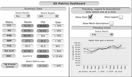
Stoplights. Stoplights are a traditional project manager’s tool to convey risk in projects. Using red, yellow, green highlights on your metrics can immediately communicate visually how the organization is performing against goals without much need for explanation on the page, which make them ideal for a dashboard. Figure 15.1 shows an example of the stoplight approach as applied to Intel’s HR metrics (see Chapter 13 for more on Intel’s dashboard).
Progress Against Goals. ...
Get Ultimate Performance: Measuring Human Resources at Work now with the O’Reilly learning platform.
O’Reilly members experience books, live events, courses curated by job role, and more from O’Reilly and nearly 200 top publishers.

