THE WORD31 Hierarchy using color
STRONG COLOR CREATES “POP.” While black and white provide the highest level of contrast, a piece of text in a burst of color can become more prominent in the hierarchy of elements that are present (depending on other factors such as size, weight, typestyle, and position).
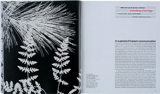
ProjectEye on Europe
CompanyPure+Applied
ClientMuseum of Modern Art
The modest typography adds just a bit of color for emphasis; this is very effective because of the restrained palette of the spread.
ProjectGreat British Food
Design DirectorJoseph Luffman
DesignerJoseph Luffman
ClientBritish Food Fortnight / The Type Museum
The entire joke rests ...
Get Typography Essentials now with the O’Reilly learning platform.
O’Reilly members experience books, live events, courses curated by job role, and more from O’Reilly and nearly 200 top publishers.

