THE PAGE99 Floating in space
THINK OF THE TYPOGRAPHY as a person, who needs a certain amount of personal space to feel “comfortable.” How much space should be left so that there is a feeling of enough separation? This may depend as much on the circumstances as on the type of person (or content).
ProjectFacing Fascism: New York and the Spanish Civil War
CompanyPure+Applied
ClientMuseum of the City of New York
This handsome page of body copy with its massive initial cap, with the image on the opposite page of the spread, feels balanced on the page.
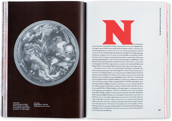
ProjectFeature spread
CompanyFB Design
Creative DirectorFlorian Bachleda
PhotographerIan Spanier
Get Typography Essentials now with the O’Reilly learning platform.
O’Reilly members experience books, live events, courses curated by job role, and more from O’Reilly and nearly 200 top publishers.

