THE LETTER20 Heavy flourishes
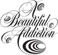
WHEN USED IN MODERATION, such as a single letter or mark, elaborate flourishes create an effect of complexity, luxury, antiquity, or timelessness. Flourishes work best when paired with very simple typographic elements or design to counterbalance their ornate character.
ProjectA Beautiful Addiction logo
Design DirectorsPaul Sych and Sam O’Donahue
ClientEstablished
This logo’s tight flourishes draw the viewer into a hypnotic spiral, visually reinforcing the word Addiction.

ProjectDescendants Cover
Art DirectorRobbin Schiff
DesignerRoberto de Vicq de Cumptich
ClientRandom House
This clever use of flourishes representing ...
Get Typography Essentials now with the O’Reilly learning platform.
O’Reilly members experience books, live events, courses curated by job role, and more from O’Reilly and nearly 200 top publishers.

