THE LETTER15 Emphasis using contrasting sizes
A BROAD RANGE OF SIZES is an easy way to indicate emphasis; however, other factors come into play (see “Theory of Relativity I” on page 56). Weight, size, and character width (compressed versus expanded, for example) can affect the level of emphasis as well.
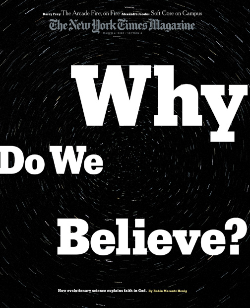
ProjectCover
Art DirectorArem Duplessis
Art Director, DesignerGail Bichler
DesignerGail Bichler
ClientThe New York Times Magazine
The contrasting sizes of the words of the headline highlight the Why, the key word in the title.
ProjectSingle page
Design DirectorCarla Frank
DesignerChloe Weiss
ClientO, The Oprah Magazine
The emphasis is on BALANCE ...
Get Typography Essentials now with the O’Reilly learning platform.
O’Reilly members experience books, live events, courses curated by job role, and more from O’Reilly and nearly 200 top publishers.

