Chapter 1. Introduction
The Interface that Killed Jenny
Stories of deaths caused by badly designed interfaces, objects, or experiences are everywhere. One, in particular, inspired us to write this book.
Jenny, as we will call her, was a young girl diagnosed with cancer. She was in and out of the hospital for a number of years, then was finally discharged. A while later she relapsed and had to start a new treatment with very potent medicine. This treatment was so aggressive that it required pre-hydration and post-hydration for three days through intravenous fluids. After the medicine was administered, the nurses were to be responsible for entering all the required information into the charting software and using this software to follow up on the patientâs status and make appropriate interventions.
Although the attending nurses used the software diligently, and even though they cared very well for Jenny in every other way, they missed the critical information about her three-day hydration requirements.
The day after her treatment, Jenny died of toxicity and dehydration.
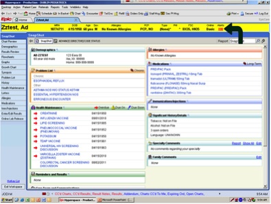
The experienced nurses made this critical error because they were too distracted trying to figure out the software. Looking at screenshots (see Figure 1-1) of the software they used is infuriating. It violates so many simple and basic rules of usability, it is no wonder why the nurses were distracted. First, the density of information is so high that itâs impossible to scan for critical information quickly. Second, the colors selected, aside from being further distracting, prevent any critical information from being highlighted. Third, any critical treatment or drug information should receive special treatment so it is not missed, which is not what we see in this interface. Lastly, the flow of recording the information after each visit, known as âcharting,â requires too much time and attention to complete in a timely manner.
As design professionals, learning about these stories is heart-wrenching. How can a critical, life-or-death service be employing such horrible software? Isnât a personâs life and well-being worth putting the appropriate resources into good design? Itâs almost impossible not to ask ourselves if we could have made a difference in preventing Jennyâs death, had we been involved in the design process.
Healthcare in the United States is facing a crisis. In 1999 a landmark report titled âTo Err Is Humanâ[1] concluded that 44,000 to 98,000 people a year die from medical errors, at a cost of $17â29 billion per year. A more recent study puts the estimate at 100,000â400,000 deaths per year.[2] Hereâs a quote from the latter:
In a sense, it does not matter whether the deaths of 100,000, 200,000 or 400,000 Americans each year are associated with PAE (Preventable Adverse Effects) in hospitals. Any of these estimates demand assertive action.
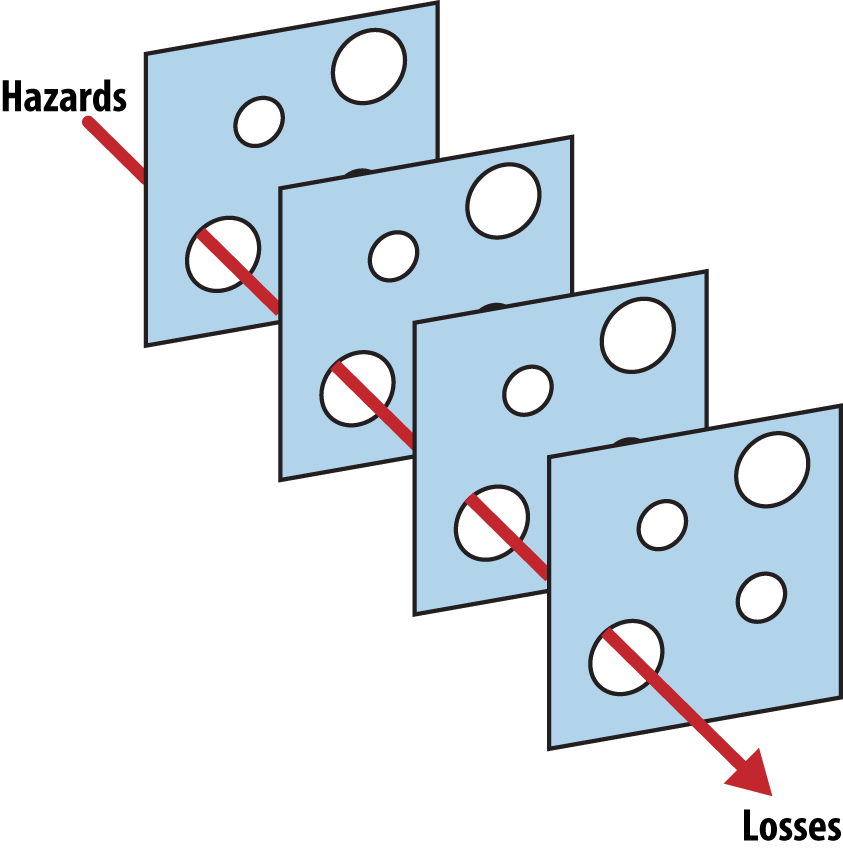
Jennyâs story is, unfortunately, not uncommon. These situations happen every day, and not only in the US. However, itâs important not to blame the nurses, or we miss the entire context that led up to these grave mistakes. Thereâs a concept used in the healthcare field called the Swiss Cheese model of accident causation. This model (see Figure 1-2) compares human systems to multiple slices of holed cheese.
There may be multiple layers to pass through before a mistake affects the patient. For example, when there is a medication error, the source of the error can occur in any of these âlayersâ: the doctorâs prescription, the pharmacist filling it, the medication being stocked correctly, the nurse preparing and giving it, and the mechanism used to administer it to the patient. Each layer has its own holes (flaws in the preventative measures), but together they reduce the chances of an error happening. In our example, nurses were the last layer of defense, so itâs easy to blame them for the mistake that happened. But in fact, interface design should act as the last layer in that model. It usually accomplishes that by reducing the cognitive load required to complete a task, thus allowing more resources to be dedicated to error prevention. Unfortunately, in the healthcare industry, it instead leads to making more holes.
Cognitive capacity is the total amount of information the brain is capable of retaining at any moment. This amount is limited and canât be stretched. In the case of Jenny, the software was most likely overloading the nursesâ cognitive capacity by forcing them to figure out how to use the interface to chart the patientâs care and make the appropriate orders. Nurses (and all medical staff, really) are working in an environment and with tools that are working against them. With thousands of medical errors happening every year, it is apparent that there is more to this problem than negligence. The system is broken, and design should be doing its part in repairing it.
It is important to note that a better user interface alone is not the solution. Since itâs our area of concern, however, we should study its role and improve that layer as best we can. Technology and design in healthcare should be used as a protective layer, to ensure mistakes donât happen. In the case of Jenny, technology was instead a key factor in a tragic error.
The Role and Responsibilities of Designers
If you ask 10 designers what their role is, chances are you will get 10 completely different answers.
Design, as Jared Spool so succinctly put it, is âthe rendering of intent.â[3] While that is a very correct, logical, and concise way of boiling it down, for user experience designers it misses one important element: people. We would define design, especially in the sense of designing products and software people will use, as âthe planning of a productâs interaction with people.â
Good designs are the ones that are transparent, delightful, and/or helpful. Therefore, bad designs are the ones that collide with human behaviors and cause undesired friction. When we create things without the end users in mind (or with some vague sense of them as customers), we almost always end up creating bad designs. Badly designed products serve their creator (or sponsor) first and the users second. Good design attempts to understand the intended users and create an experience that serves their needs. A good design is a worthwhile one; one whose existence isnât a burden on its users, but instead makes their lives better in some way. Fortunately, good design isnât just a bunch of goodwill and pleasant feelingsâitâs good business too. Spending resources on design is a worthwhile investment. Some professionals go as far as saying that every dollar spent on user experience brings up to $100 in return.[4] If one product serves its creator first and its competitor serves the customers, then itâs most likely that the customers will choose the latter. In todayâs technology landscape, itâs easier than ever for competitors to match features and scale up to millions of users. Thus, user-centered design, because of its accessible nature, becomes the main differentiator.
The Client Paradox
Designers often, and rightfully, claim credit for the success of a product. Wouldnât it be fair to blame them for unsuccessful products too?
There are many blogs that specialize in cataloging examples of bad design. When we witness such examples, it seems natural to blame the designers (and laugh, letâs be honest) for their poor work, lack of empathy, or basic skills. However, this doesnât paint the complete picture. The reality is often that the designer answers to a client. Tim Parsons, in his book Thinking Objects: Contemporary Approaches to Product Design (AVA Publishing), criticizes this aspect of the design practice. The paradox comes from the fact that designers arenât always in charge, since they get paid by a client that has a vision, business needs, objectives, etc., and not by the users that will end up using the design. This places the designers in a rather awkward position. We have heard countless times, âI ended up doing what the client wanted.â Unfortunately, there is no magical solution to this issue.
When commissioned with a project that âfeels wrongâ to them, designers should do everything in their power to educate their client. It might take more time, but the responsibility falls on them. If they have the means, they can simply refuse to do the work, but that is quite idealistic, and we understand that only privileged designers and design firms can take such a drastic stand. Moreover, if one refuses to do the work, a less scrupulous designer may end up doing it, and probably cause even more damage.
We know that, at some point in our careers, we all have to make tough calls. Sometimes we have to choose our clientâs needs over the usersâ needs. When this is acceptable and when it is not is a difficult line to draw. Many occupations have established codes of ethics that are taught in school and enforced by their professional orders. These guiding principles help in making fair decisions in complex situations, while protecting the clients, the users, and the professionals doing the work. Several codes for graphic design exist, but none are widely distributed or enforced. While the International Council of Designâs model of a code of conduct (http://www.ico-d.org/database/files/library/icoD_BP_CodeofConduct.pdf) is a good start, we feel itâs incomplete and wonât help in making a fair decision in many of the situations cited in this book. The best code of conduct, in our humble opinion, was written by a group of students and professors and is called âEthics for the Starving Designerâ (http://www.starvingforethics.com). The first principle is a great starting point:
Finding the most ethical course of action will sometimes be difficult, but that difficulty will not deter me from striving to find the most ethical solution to any problem I may encounter. If I find myself in a situation where I have made a decision that I am unhappy with, I will instead endeavour to make an ethical decision for myself and for others in the future. While some circumstances may force me to compromise at times, I will not resign to turning to compromise in future situations, and will face my next ethical decision with a renewed determination to find the best outcome.
Every designer should write down what they stand for, what they think is acceptable or not. Having this âwill never doâ list will help you make difficult decisions when they arise.
Understanding and Identifying Hidden Costs
Often, those of us who are passionate about technology get caught up in the science and exploration of it. We gawk over all the possibilities it enables, and rarely stop to think about the âwhyâ of it. We are responsible for what we bring into this world, in the same way that parents are responsible for their children. Yet we often create at a whim, chasing the next idea, the next dollar, the next trend. Asking if what we are building should even exist is important not only from a philosophical or moral standpoint, but also from a business perspective. Furthermore, we must ask ourselves: is our success coming at a hidden cost? For some companies that might be at the cost of the environment; for others, it can be at the cost of their own employeesâ well-being or their customersâ trust. We are often fooled into thinking that what we made was successful, when in reality the cost is hidden or externalized. Failing to identify all of the hidden costs and the impact of our designs on the world around us can lead us to blindly and unintentionally cause harm to others.
In order to identify and avoid these potential hidden costs, we suggest creating lists of âgoals,â ânon-goals,â and âanti-goalsâ (also called âhazardsâ). They can be added to the product brief or creative brief, if your company uses these. While the concept of âgoalsâ is pretty straightforward, the two latter sections are rarely found in product design briefs. The list of ânon-goalsâ aims at setting objectives that are explicitly out of scope for the current effort. While this might sound unnecessary, in our experience there is value to being explicit about things that are out of scope, in case there is ambiguity about the boundaries around one or more goals, or any tendency toward âscope creep.â The third section, âanti-goals,â is used to describe things you really, really donât want to happen. This section should be followed by descriptions of how you will make sure the anti-goals donât happen, with precise test objectives. We call these âsafeguards.â
For example, hereâs what a brief for a new subscription page on a website might look like with the three types of goals outlined:
Goals (this feature will):
Allow customers to sign up to the service.
Make the subscription flow seamless to make sure we donât lose conversions in the process.
Highlight all the benefits of our service by comparing them to our competitor.
Non-goals (this feature shouldnât):
Impact the content on the home page.
Change the login and password validation.
Impact the first page seen once logged in.
Anti-goals (this feature will not):
Confuse the potential customers with a hidden pricing structure.
Hide the fact that the service charges automatically unless they unsubscribe from it.
Make the cancellation flow more complex.
Have an impact on the amount of customer service tickets.
Safeguards:
We will test that the potential customers understand the pricing structure and the subscription model before they sign up. We will do this through user testing.
We will monitor customer service calls and will offer modifications to the page, should we notice confusion.
Conclusion
Without good design, technology quickly turns from a help to a harm. It can kill, but that isnât the only negative effect. It can cause emotional harm, like when a social app facilitates bullying. It can cause exclusion, like when a seeing-impaired person doesnât get to participate in socializing on a popular website because simple accessibility best practices have not been attended to. It can cause injustice, like nullifying someoneâs vote, or simply cause frustration by neglecting a userâs preferences.
Designers are gatekeepers of technology. They have a critical role to play in the way technology will impact peopleâs lives. It is up to us to ensure the gates are as wide open and accessible as possible.
In the following chapters, you will read testimonials from people generously recounting how technology impacted them negatively. We also have interviews with great designers who all try, in their own way, to benefit society through their work. We will dig deep into stories of how bad design interferes with peopleâs lives in very real ways. We will explore extreme examples, as well as more common ones that designers may face in their careers. While we do our best to add practical pieces of advice about how we can tackle these difficult issues, we donât claim to have all the answers. Our main goal is to shed light on these areas, to call attention to how bad design affects peopleâs lives. Thatâs the most important step to solving any big problem: highlighting it.
Key Takeaways
Blaming the last people involved in a process for making a costly mistake is not productive. They are generally just one of the multiple layers of the Swiss Cheese model.
Good visual design reduces the cognitive load required to complete a task.
Badly designed products serve their creator (or sponsor) first and the user second.
Designers are not always in charge, since they often answer to a client. When confronted with design solutions they are not comfortable with, designers have the responsibility to educate their clients.
Hidden costs often fool us into thinking that what we made was successful, when in reality the cost is hidden or externalized. Failing to identify all of the hidden costs and the impact of our designs on the world around us can lead to blindly and unintentionally causing harm to others.
Designers are gatekeepers of technology. They have a critical role to play in the way technology will impact peopleâs lives. It is up to us to ensure the gates are as wide open and accessible as possible.
[1] Kohn, Linda T., Janet M. Corrigan, and Molla S. Donaldson, eds. âTo Err Is Human: Building a Safer Health System.â Washington, DC: The National Academies Press, 2000.
[2] James, J. T. âA New, Evidence-Based Estimate of Patient Harms Associated with Hospital Care.â Journal of Patient Safety 9:3 (2013): 122â128. doi:10.1097/pts.0b013e3182948a69
[3] Spool, Jared M. âDesign Is the Rendering of Intent.â UIE, December 30, 2013, https://articles.uie.com/design_rendering_intent.
[4] Spillers, Frank. âMaking a Strong Business Case for the ROI of UX [Infographic].â Experience Dynamics, July 24, 2014, http://bit.ly/1t6a1rk.
Get Tragic Design now with the O’Reilly learning platform.
O’Reilly members experience books, live events, courses curated by job role, and more from O’Reilly and nearly 200 top publishers.

