Chart 52
Inflation—The American Experience
You've heard stories of how cheap things were in your grandparents' day, but do you really know how much inflation has developed in our history? This clean, simple chart provides a visual perspective that few have ever seen or known. The original version showed 190 years of the Consumer Price Index (CPI) from 1790 until 1980. The index stopped at 252. By the beginning of 1986, the CPI had risen another 30.5 percent, raising the total to 329, so I've tacked on the last five years in pencil.
Interestingly, low rates of inflation have generated big absolute gains over history. It's another expression of the power of compound interest—the same phenomenon that lets small contributions to a pension plan become big bucks within a lifetime (see Chart 39).
In recent years, the highest rate of inflation was 13.5 percent in 1980. But looking back over a longer time frame, the results look more mellow. My financial calculator computed compound annualized rates of inflation from this chart, for various time periods. They are:
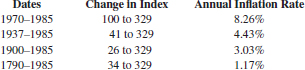
So, all told, the CPI rose 8.26 percent annually since 1970, and has risen 10-fold since 1790.
But that 10-fold increase was at an amazingly low annual rate of 1.17 percent. Does that conflict with your remembrance of steeply rising prices since grandpa's day? If so, in part it is because humans don't naturally think in terms of ...
Get The Wall Street Waltz: 90 Visual Perspectives, Illustrated Lessons From Financial Cycles and Trends, Revised and Updated Edition now with the O’Reilly learning platform.
O’Reilly members experience books, live events, courses curated by job role, and more from O’Reilly and nearly 200 top publishers.

