CONTRAST
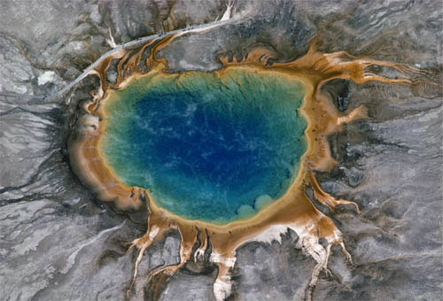
Grand Prismatic Spring, Yellowstone National Park, 1978
Much of the color so far in this chapter has been in some way similar, but in life the opposite is just as common—different colors in the same image. Going back to our color cylinder, what counts as different for our perception is actually just the hue and not the dark against light or gray against saturated. If a color theme, as on pages 146–147, is all from the same wedge of the circle, different colors are from opposite wedges. With the hues arranged around a circle like this, it’s easy to see where the greatest contrasts are. Orange against blue, red against green, yellow against ...
Get The Photographer's Eye: Graphic Guide now with the O’Reilly learning platform.
O’Reilly members experience books, live events, courses curated by job role, and more from O’Reilly and nearly 200 top publishers.

