A SCREAMING SHORT
I first saw this chart (Figure 10.11) on Sunday, April 11, 2010 while teaching a class in New York. There were two Australians in the room, and I pulled up a chart of iShares MSCI Australia Index (EWA)—the Australian ETF, which I had never traded before. The weekly chart flashed exciting signals—a year-long rally off the March 2009 bottom appeared to be ending. EWA was forming a double top, just a few cents above the point where the weekly Impulse system would turn blue. If that came to pass, we would have a trifecta of weekly bearish divergences—MACD-Histogram, MACD Lines, and the Force Index. I turned to the daily chart shown in Figure 10.12.
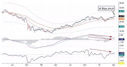
EWA weekly with two EMAs and an Autoenvelope
MACD Lines, MACD-Histogram and Force Index
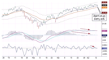

EWA weekly with two EMAs and an Autoenvelope
MACD Lines, MACD-Histogram and Force Index
The daily signals looked very similar to the weekly, and on Tuesday, after the Impulse system turned blue, I went short. With a stop above the recent peak, my risk per share was just pennies, allowing me to short thousands of shares ...
Get The New Sell and Sell Short: How to Take Profits, Cut Losses, and Benefit from Price Declines, Expanded Second Edition now with the O’Reilly learning platform.
O’Reilly members experience books, live events, courses curated by job role, and more from O’Reilly and nearly 200 top publishers.

