Chapter 12
Multimedia and Your Interface
With your interface goals, structure, and content worked out, you have all the information you need to start building your site. But before you click to open your authoring program, there’s still one more vital question to answer: What exactly is this thing going to look like? To answer that question, consider another: What attracts you to a Web site or digital interface? The color scheme (figs. 12-1 and 12-2)? The layout? The music? The animation? You may add any or all of these components to your portfolio interface, but to do so effectively, you must understand both the positive impact and inherent limitations of each.
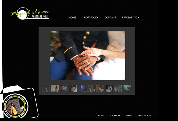
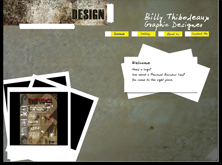
Figs. 12–1 and 12–2: As photographers and designers, Miguel Chaves and Billy Thibodeaux both use a set of neutral grays to showcase their artwork.
Each extra component that you include in your interface will either add to the user experience or subtract from it. Too many bells and whistles will overwhelm the project. Too basic an interface will be boring. Your goal is to impress viewers, so that they will spend quality time with your portfolio. The digital experience you create isn’t just about readability and navigation but about style. In short, your portfolio should encompass all facets of interface design. To that ...
Get The Graphic Designer's Guide to Portfolio Design, 3rd Edition now with the O’Reilly learning platform.
O’Reilly members experience books, live events, courses curated by job role, and more from O’Reilly and nearly 200 top publishers.

