19.4 Design 2: Layout
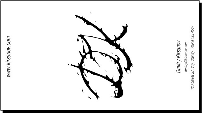
Naturally, such a piece of distortion art deserves the central place on the card, with the rest of the stuff being placed symmetrically around it. I used a plain, slanted, very light sans serif font (Helvetica Condensed Light) which does not distract from the artwork in the center. The horizontal layout may not be the best here—the card seems to be cramped. Rotating everything on its side (press ![]() ) gives ample space to the art and allows the text to float to the edges so it does not interfere:
) gives ample space to the art and allows the text to float to the edges so it does not interfere:

Figure 19-7. Laying out the card around ...
Get The Book of Inkscape now with the O’Reilly learning platform.
O’Reilly members experience books, live events, courses curated by job role, and more from O’Reilly and nearly 200 top publishers.

