CASE STUDY: TAPBOTS
Tapbots is a company and brand that has developed a “suite” of practical and paid apps branded around one theme — cute robots that each performs a core feature exceptionally well, and usually with a highly polished, intuitive interface.
Let's take a look at some of the design strategies Tapbots has used to be successful in its niche with generally exceptional reviews. Specifically, let's look at its current latest app, “Tweetbot,” released April 2011. You might think that with all of the Twitter clients available, the niche could be overly saturated already, but Tapbots makes use of its existing brand and reputation to break into a popular niche.
High-Contrast Branding
Taking a look at the Tapbots web page as shown in Figure 9-7, you see an Apple-like simplicity and branding with grays and whites against vibrant color, placing the importance on the product. This is not uncommon for Apple-related or OS X–related web pages, and shows that it can be applied to app branding as well.
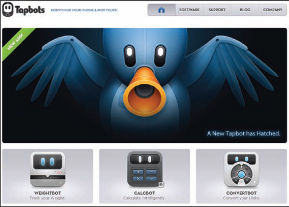
FIGURE 9-7: The high-contrast and user-friendly web page for Tapbots demonstrates the professional type of app you would be buying
Figure 9-8 shows an array of the icons for current apps offered by Tapbots, each (except for “Pastebot”) recognizable for being branded around the Tapbots robot theme. Having a tight, unified brand provides consumer comfort that if you enjoy the current selection, ...
Get The Art of the App Store: The Business of Apple Development now with the O’Reilly learning platform.
O’Reilly members experience books, live events, courses curated by job role, and more from O’Reilly and nearly 200 top publishers.

