Quantifying the classification models
To make sure that we're on the same page, let's start by looking at an example of an ROC curve and the AUC score. The scikit-learn documentation has an example code to build an ROC curve and calculate AUC, which you can find at http://scikit-learn.org/stable/auto_examples/model_selection/plot_roc.html.
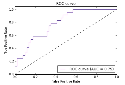
This ROC curve was built by running a classifier over the famous iris dataset. It shows us the true positive rate (y-axis) that we can get if we allow a given amount of false positive rate (x-axis). For example, if we were good with a 50 percent false positive rate, we would expect to see somewhere around a 90 ...
Get Test-Driven Machine Learning now with the O’Reilly learning platform.
O’Reilly members experience books, live events, courses curated by job role, and more from O’Reilly and nearly 200 top publishers.

