Here is how to use matplotlib to plot the regression loss functions:
x_array = sess.run(x_vals)
plt.plot(x_array, l2_y_out, 'b-', label='L2 Loss')
plt.plot(x_array, l1_y_out, 'r--', label='L1 Loss')
plt.plot(x_array, phuber1_y_out, 'k-.', label='P-Huber Loss (0.25)')
plt.plot(x_array, phuber2_y_out, 'g:', label='P-Huber Loss (5.0)')
plt.ylim(-0.2, 0.4)
plt.legend(loc='lower right', prop={'size': 11})
plt.show()
We get the following plot as output from the preceding code:
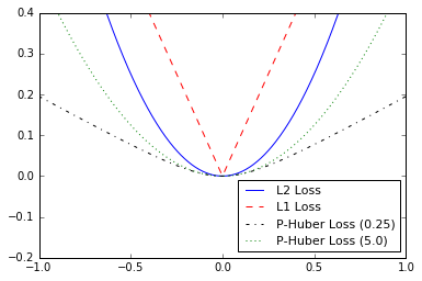
Figure 4: Plotting various regression loss functions
And here is how to use matplotlib to plot the various classification loss functions:
x_array = sess.run(x_vals) ...

