Chapter 4. Get Organized
STRUCTURING YOUR APP THE APPLE WAY
AS YOU BEGIN PLANNING your app’s design, set aside the pixel-by-pixel nitty-gritty of your app’s buttons and colors and icons. Let go of the look of your app, and consider how it works—its big-picture organizational design. When you pull way back to look at your app from a high level, you’ll see that its essential operation depends on easy movement from screen to screen. All but the most simple iPhone apps are collections of multiple screens, each one dedicated to an individual task or to specific content. How you choose to string those screens together determines how people will steer their way through your app, and it’s one of the most fundamental choices you’ll make when planning your design.
This chapter tours the iPhone’s navigation styles to explore the options for arranging your app’s content and tools. Specifically, you’ll get an overview of the several prefab organizational approaches that are baked into the iPhone SDK, the coding toolkit developers use to build apps. You’re not obliged to use any of these methods to build your app—you’ll explore custom alternatives in Chapter 6—but leaning on the built-in navigation models gives your audience a structure that’s instantly familiar. It helps your app blend both visually and organizationally with other apps. Blend in? Of course you want your app to bloom like a unique flower, and it will, but you’re not operating in a vacuum. Designing for the iPhone, like designing for any platform, means respecting the norms and conventions of its operating system. An iPhone app should look like an iPhone app. Adopting one of the stock organizational structures (and choosing the right one) is a fundamental way to do that.
The best apps have a design that fits in as if designed by Apple itself. That familiar feel is helped along by savvy use of the standard navigation methods and interface controls. This chapter begins to explore these standard presentation methods, starting with navigation and organization, and the next chapter surveys individual controls. The goal of these two chapters is to help you design apps the Apple way. Before we get started, here’s one recipe for doing that—at every interface decision point, ask yourself this question:
WWJD: What Would Jobs Do?
Apple co-founder Steve Jobs built an entire brand around impeccable taste, quality, and ease of use. There’s much to be learned by carefully studying Apple’s own app designs and following the company’s example. At the simplest level, Apple makes pretty things; if you’re going to ape an aesthetic, Apple’s a good choice. (That’s true not only for what Apple puts into its built-in iPhone apps, but for what the company leaves out, too. As you’ve seen in previous chapters, tapworthy apps winnow features and limit controls for efficiency and ease; Apple’s apps are refined examples of disciplined moderation.)
But this is about more than just style and looks. Apple’s design decisions set the standard for the device, the frame in which all apps are considered and understood. The iPhone is like a celebrity red carpet: there’s plenty of room for individuality, but ultimately you still have to wear an evening gown. Don’t let your app wear a hobo costume to a formal ball. Following the dress code makes your app consistent with other apps, which in turn makes it easy for your audience to make sense of your app and understand how to make the thing go.
The remarkable consistency of third-party interfaces on the iPhone is a significant reason for its ease of use. This level of app affinity is unusual for any software platform, especially one that’s so new, and it didn’t happen accidentally. As a company, Apple is famously opinionated in matters of design. Rather than leave developers’ interface choices to chance, the company created detailed rules for designing iPhone apps and codified them into a document called the iPhone Human Interface Guidelines, commonly known as the HIG. The HIG delivers Apple’s design commandments, the company’s definition of what it means to be a good iPhone citizen. Most operating systems, including Windows and Mac OS X, have a similar HIG to outline software best practices and behaviors. Like the device itself, however, the iPhone HIG feels different than that of other operating systems. It’s an accessible read for regular folks, not just developers and is an essential document for everyone involved in your app’s design. Download the HIG at http://developer.apple.com/iphone.
The HIG surveys the iPhone’s toy chest of standard controls and views and explains the right way to use them to do what users expect them to do: use this interface gizmo to do this, use that widget to do that. This chapter, along with the next, introduces those gizmos and widgets, building on the HIG’s basic concepts. These chapters offer examples and best practices, as well as warn you away from problem areas so that you can make smart decisions about when, where, and why to use the various controls and navigation options.
While the HIG focuses on interactive behavior more than visual design, it nevertheless has visual implications. The standard collection of buttons, controls, and views that Apple provides in its code toolkit strongly suggests how things should look on the iPhone, not just behave. The controls come in standard colors, many lodge automatically in certain parts of the screen, and the absence or inclusion of certain types of controls in the SDK implicitly encourages certain design choices. Apple doesn’t provide checkbox controls, for example, so the iPhone’s checkmark accessories and on/off switches become the norm instead (see Table Views Are Lists on Steroids and Yes and No: Switches respectively).
Pay attention to these guidelines. More than just informed and battle-tested suggestions, Apple’s interface guidelines are also criteria for App Store approval. Misuse a toolbar icon or bobble an activity indicator and you risk having your app kicked back to you for a fix before Apple’s reviewers will accept it into the App Store. Avoid trouble by favoring standard controls in your app and abide by the guidelines in the HIG and in this chapter. Aside from the threatening stick of App Store rejection, there are also some tasty carrots in it for you when you use standard controls. Apple’s guidelines reflect the sensibility of the interaction designers who created the iPhone interface, undeniably a bright bunch of people, and the conventions they’ve developed are good ones. Let’s take a look.
Getting Around: Apple’s Navigation Models
There are any number of ways to organize an app, but the iPhone code kit provides three ready-made navigation models that you can drop into your app. They cover the needs of a huge swath of apps and they’ll be immediately familiar to any iPhone user. Each one comes with specialized toolbars and controls that your audience will use to hop from screen to screen. The next few sections explore each of these navigation styles in detail, but here’s the quick rundown:
Flat pages. This method targets relatively simple apps that have a single main screen—usually a highly graphical, no-scroll display like that of the built-in Weather app. The apps might have multiple versions of that main screen (forecasts for different cities, for example), and you can swipe through these “pages” like a deck of cards, optionally flipping them over to change the app’s basic settings.
Tab bar. The tab bar is a set of buttons at screen bottom that lets you switch among the app’s main functions. Tap a button to jump to a new screen.
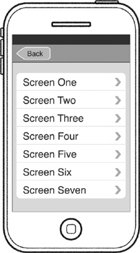
Tree structure. Drill down through a hierarchy of categorized options or content (like folders on a desktop computer) and then easily pull back up to the surface.
There’s also the “none of the above” option—what Apple calls an immersive app. These are typically full screen, highly graphical apps that dispense with standard controls and navigation schemes to create their own custom environment. Most games fit this category, as do other apps that use their own interface metaphors for users to explore. If you go this route you’ll create your app’s entire interface from scratch. You’ll see some examples of these anything-goes interfaces in Chapter 6 (page 182). For now, start off by getting a handle on the three common navigation models.
Flat Pages: A Deck of Cards (or Just One)
The flat pages navigation method is especially suited to utility apps, which provide tidy spoonfuls of simple, focused content in screens presented like cards. The main info appears on the card’s “front,” and it flips over to show basic settings on the “back.” As you saw in the last chapter (page 77), utility apps often feature bold, splashy graphics designed to pass the glance test, an easy read at arm’s length. At their simplest, utility apps consist of just a single card, like a Dashboard widget in Mac OS X, and are even sometimes just a one-sided card without any settings offered on the back. There’s not much guesswork involved in figuring out how to get around a one-screener like that—no navigation required— and if that’s your app, congrats, your navigation work is complete. Move along, nothing more to see here.
As you add additional screens to a flat-page app, however, it becomes a deck of cards, and you swipe left or right to flip through the screens. So why “flat pages”? Information architecture nerds call this style of organization a flat list, because there’s no hierarchy of information, no organizational scheme at all. The screens aren’t grouped into categories, but are instead presented in one big pile that you page through one after another—a “flat” collection of pages.
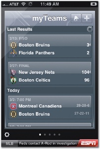
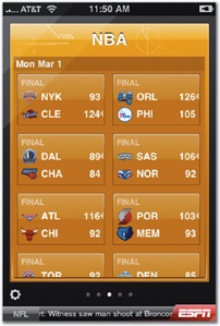
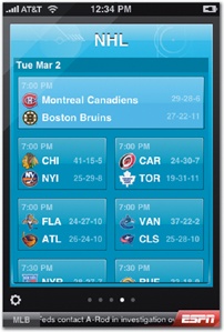
This method is best suited for browsing and discovery, ambling through many variations of the same screen. For example, the built-in Weather app uses flat pages to show a forecast for a different city on each screen; the layout is the same for each page, but the forecast for each is city-specific. ESPN ScoreCenter similarly uses flat pages to show sports scores for specific teams or leagues on each screen; different colors provide visual cues, but the fundamental role of each screen remains the same. Both of these apps allow you to configure the screens and content to show in the app—cities in Weather, or leagues and teams in ESPN ScoreCenter—and you tap a settings button to flip the screen and choose the pages to include. Not only do flat-page apps work like a deck of cards, but they often let you choose and shuffle those cards, too, adding or removing from the deck as you like. In this scenario, where the number and content of screens is always changing, the flat-pages method is a better choice than the tab-bar navigation model, which you’ll explore in the next section. There, the navigation options are offered as a fixed set of categories in a set order. If your app features a changeable number of screens, particularly variations on the same relatively simple display, the flat-pages navigation model is a better solution.
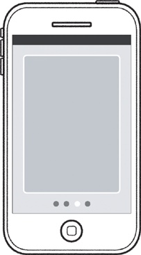
To help people keep their bearings while browsing through the stack of screens, include the standard page control, the collection of dots at the bottom of flat-page apps. The dots represent the number of pages in the collection, with the highlighted dot showing your current position in the deck. The presence of a page control gives your audience a visual hint that this is just one of several screens, and it’s also interactive. Tap on the left or right half of the control to sashay to the previous or next screen—an alternative to swiping. You might expect that tapping a specific dot would let you jump directly to the corresponding page, but alas no, the page control lets you step through only one page at a time. (Even if you could jump to a specific page, tapping just the right dot would take mighty fine finger precision; don’t forget the 44-pixel rule from page 62.)
This adds up to a thumb-throbbing downside to the flat-pages model: you can’t jump directly from the first screen to the last. You have to swipe or tap through each and every page—quite a workout with a big stack of screens—and a good reason to keep the page collection relatively small in this type of app. Screen dimensions encourage moderation, too. A page control can display only about 20 dots before those dots start spilling offscreen, clipped from view. The Weather app manages this problem by limiting its collection of forecasts to only 20 cities; try to add more and the app gently suggests that you remove another city first. Twenty screens already make for a lot of swiping, though; do the world’s thumbs a favor and use flat pages for primary navigation only in apps with about ten pages or less. (It’s no accident that the iPhone’s main display of app icons—the springboard—is limited to 11 screens, even if your phone contains many more apps.)
The inability to jump to a specific screen means flat pages aren’t ideal for apps whose screens offer very different functions or perspectives on the app’s content. For example, Phases is a gorgeous little app for tracking the phase of the moon, with each of its four screens offering a different angle on lunar activity. Phases uses flat-page navigation, but because it has a fixed set of screens aimed at providing very different information, the app’s navigation would be eased by using a tab bar instead. Rather than asking you to wax and wane through all the screens to get at specific aspects of the moon’s phases, a tab bar would let you jump directly to the screen of interest. This saves on more than extra swipes; it also saves brain cells. When a tab bar advertises each screen with a labeled button, you don’t have to remember the content and order of the cards in the deck. In Phases, the variety of subject matter and the small, fixed number of screens suggests that tab-bar navigation would make for easier navigation.
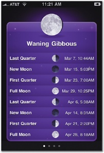
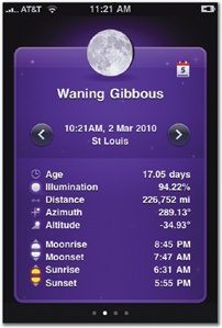
As usual in app design, however, there are competing considerations. Shoehorning a tab bar into Phases would put a tight squeeze on the displayed info. A tab bar soaks up nearly 50 pixels of screen height, while a page control takes only a sliver, with dots that are just 6 pixels tall. The app’s designers no doubt decided that asking users to flip back and forth through a modest number of screens was better than sacrificing some combination of content, readability, or the app’s tidy no-scroll display. Using flat pages here is a compromise—a tab bar makes the most sense for navigating this content collection—but it’s only a modest compromise given the small number of screens involved. The designers decided it was better to sacrifice on that point than to risk sacrificing real estate (and the principle of scroll skepticism) on the individual screens.
Striving for a no-scroll layout is always a good idea (page 77), but it’s especially important in collections of flat pages. Because the page control anchors the bottom of the screen, it abruptly and awkwardly lops off scrolling content. Compare the clean finish of the screens in Phases, for example, to the clipped screens in ESPN ScoreCenter. The deck-of-cards metaphor in flat-page apps is most successful when each page looks like a card, complete and self-contained. Even more important, adding vertical scrolling to a flat-page screen introduces an ergonomic challenge, too: you’re navigating in two directions—horizontally and vertically. It’s all too easy to swipe a few degrees askew and land on the next page when you mean to scroll, or vice versa. People are most successful at navigating the touchscreen when moving in just one dimension; adding a second requires more precision and thus, more effort, from your audience. Avoid it when you can.
|
Pros |
Cons |
|
|
Tab Bar: What’s on the Menu?
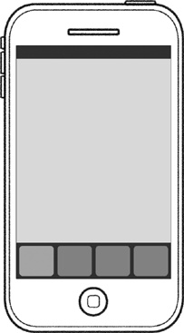
The tab bar is a dock of buttons anchored at screen bottom, giving your audience a menu of options to choose from. The result is a tidily categorized app, with its primary features explicitly listed and labeled. Unlike the undifferentiated pile of cards in flat-page apps, the tab bar’s categories divvy an app into neat silos. Tap a tab—one of the tab-bar buttons—to jump directly to the associated screen, and the tab lights up to reflect where you are in the app.
You can display anything you like behind each tab, but it’s most helpful to plan tab-bar organization around the different types of activities or information your app offers. The screens associated with each tab can (and often should) have their own independent interface style, each one tailored to fit the specific content or tools at hand. The built-in Clock app, for example, features four very different ways to work with time, each behind a dedicated tab: World Clock, Alarm, Stopwatch, and Timer. These screen designs vary widely; all of them are tuned to the specific needs of the current activity. The effect is that each of the features behind the tabs behaves almost like an independent app, a useful way to think about planning tab-bar categories.
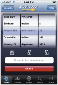
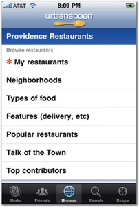
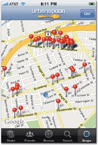
Rather than focusing on tools and functions, as Clock does, tab bars can also be used to offer different perspectives on the app’s information. Restaurant finder Urbanspoon, for example, organizes its tab bar around five different ways to browse and discover local tables. Each of these five tabs will eventually lead you to the same type of content—where to go for dinner tonight—but in very different ways. “Shake” spins the app’s slot machine to find a nearby place at random; “Browse” lets you burrow through restaurants by various criteria; “Scope” visualizes nearby eateries; and so on. Likewise, news apps frequently use tab bars to offer options for filtering articles according to various characteristics (latest, popular, saved, topics, search, and the like).
As these examples illustrate, tab-bar navigation is ideal for letting the user choose among modes of operation tailored to specific features, information, or even states of mind (“I can’t think of a restaurant, pick one for me”). A tab bar summarizes what your app does; it’s a series of miniature advertisements for how the app can help. Tab bars make for efficient navigation, since they take people directly to specific screens to perform specific actions, but they require careful planning by the designer. The tab bar should offer a set of options that match up neatly to specific and common missions your audience has in mind when they launch your app.
At its simplest, tab-bar navigation can lead to a collection of simple single-screen displays, like the Phases screens you saw in the last section. More commonly, though, tabs lead to screens that in turn lead to additional screens, which means there’s an additional layer of subnavigation nested within each tab. Urbanspoon’s Browse tab, for example, uses a scrolling list to drill down into a directory of restaurant listings—that’s tree-structure navigation within a tab. The stock navigation models aren’t mutually exclusive, in other words, and you can mix and match, even in the same screen to provide subnavigation. You’ll explore these mashup possibilities further, starting in Combining Navigation Models.
The standard code Apple provides to create tab bars comes with certain rules. The tab bar always appears at the bottom of the screen, 49 pixels high. Each button includes a text label and an icon. Design your own icon (page 194), or use one of the several stock versions that come with the operating system (page 145). The buttons vary in width depending on the number of buttons you include, expanding or compressing to fit the available space. Just don’t expect to squeeze lots of buttons in there; tab bars have a five-button limit. If you try to add six or more, the tab bar automatically sprouts a More tab in the fifth position, leaving room only for your first four tabs and bumping any additional tabs to a separate screen. Tap the More button to see the remaining buttons. This overflow screen of extras automatically comes with an Edit button, and tapping it lets you customize the first four icons shown in the tab bar. Drag an icon down to your preferred slot in the tab bar, and poof, it settles into its new home, replacing the previous icon.
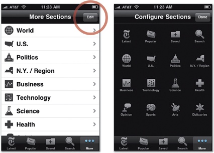
Avoid the More button. When you sweep key navigation elements behind the More button’s curtain, you add more than just an extra tap. You ask users to remember what options are back there, a brain burden that might seem trivial but will inevitably cause those hidden features to go overlooked and underappreciated. One of the tab bar’s big advantages is that it puts your app’s key features front and center—easily scanned, clearly labeled, and just a tap away from any screen. The More button undercuts that at-a-glance utility, burning one of the precious five tab slots in the process. The ability to customize the tab bar from the More screen is, in theory, a nifty trick to minimize the five-tab limitation by letting users choose their favorite tabs from the overflow. Unfortunately, testing reveals that most users don’t know about that standard feature, rarely trying the Edit button on the More screen.
Stick to the five-tab limit. Not only do you dodge the More button, but the constraint encourages you to sharpen the definition of your app and the key features it offers. Five primary navigation elements make for a manageable structure for your audience to remember and understand. Keep it easy and don’t make them think too hard about what your app does. Be frugal with the number of top-level features and screens you offer. If you find that you need more than five navigation categories, then the tree-structure navigation model may be better for your app since it adapts more gracefully to a larger number of categories.
|
Pros |
Cons |
|
|
The tab bar is a commitment. Its 49-pixel height takes up over 10 percent of the screen and typically appears on every screen of your app—a chunky piece of interface chrome. You’re not absolutely obliged to put the tab bar on every screen of your app, though. It’s appropriate to remove the tab bar on screens that need full-screen treatment—ebooks, photo slideshows, or document readers, for example—or that require additional controls that would otherwise crowd out the content, like the media controls in the iPod app’s Now Playing screen. But the tab bar’s sturdy reliability is one of its virtues, allowing fast leaps across the app’s various features, and it’s best to keep the tab bar planted on most if not all screens of your app.
Tree Structure: Let 1,000 Screens Bloom
From the Dewey Decimal System to the animal kingdom to your Aunt Rhoda’s filing system, big collections of information typically get organized into categories—and subcategories, sub-subcategories, sub-sub-subcategories, and so on. This is a tree structure, an information hierarchy whose category outline branches into an upside-down tree when you draw it like a flow chart (think corporate org charts or family trees). Tree structures are an efficient way to tuck away vast amounts of stuff and still put your hands on any one item quickly—the same dance step clerks have performed for centuries: go to file cabinet, choose drawer, open drawer of folders, pick folder, pluck out document. This file-and-folder fandango is the durable metaphor that makes desktop computing tick, letting you shuffle electronic documents among neatly nested folders.
The iPhone’s tree-structure navigation model borrows directly from this desktop legacy. In fact, the column view of the Mac OS X operating system displays files and folders in the same way most tree-structure apps list their options on the iPhone. Every screen of a tree-structure app corresponds to a column in the Mac OS X display. Because the iPhone’s not large enough to show the entire document tree, you see just one “column” at a time, each one skidding into view from the right as you tap through another level.
Tree-structure apps are ideal for managing big hoards of categorized items—emails, to-dos, expenses, photos, music tracks, contacts—but you can also use them to present large-ish sets of features. If you need to categorize your app into more than the five options you can squeeze into a tab bar, a tree structure allows longer (and more customizable) menus of options.
This style of organization and navigation lends itself to lists. An outline-style organization of categories and subcategories is, after all, a list of lists. You tap an item in one list to get to another list of items and then another until you wind up at the detail view of the item you’re looking for. So, as you might expect, the most common and efficient way to visually organize tree-structure apps is as basic text-based lists, or table views in iPhone geekspeak. The tree-structure examples shown so far have been table views, simple lists whose items you tap to move along to the next level. You’ll learn more about working with table views in Table Views Are Lists on Steroids, but there are other, more graphical ways to display options in tree-structure apps, too.
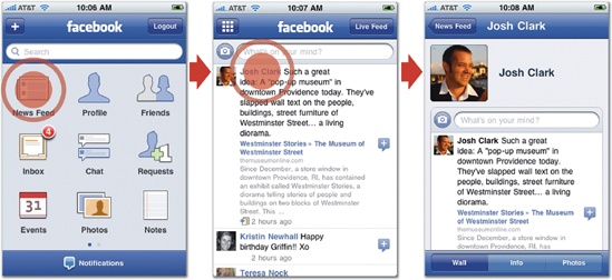
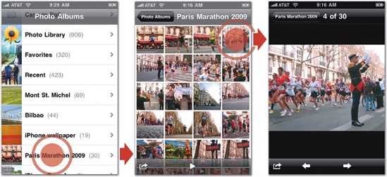
Facebook, for example, introduces its many features with a set of icons, a layout that resembles the iPhone Home screen. The approach is not only graphical and familiar but also highlights that Facebook (as both platform and iPhone app) is really a collection of mini-apps comprising news, contacts, messages, calendar events, and more. This main-screen arrangement may look different than the previous list-based examples, but it’s the same underlying organizational structure. A list of primary features leads to lists of content, and you keep tapping to drill down through these structured layers. (For more about Facebook’s design process, see First Person: Joe Hewitt and Facebook.) The built-in Photos app uses a similarly graphical presentation when you browse an album of photos. Instead of a list of photo titles—not very helpful on their own—the app gives you a pleasingly dense screen of thumbnail miniatures to choose from and then view full screen.
Whether you use lists, icons, or images for your presentation, all of these tree structure navigation examples offer similar advantages. In particular, they require very little interface chrome; the content itself is the control. This saves you space as a designer, but more important, it saves your users extra thought. When the content doubles as an app’s controls, interaction is direct and intuitive: you tap what you want to learn about, allowing for interfaces that are information-rich but dead easy to control.
|
Pros |
Cons |
|
|
Combining Navigation Models
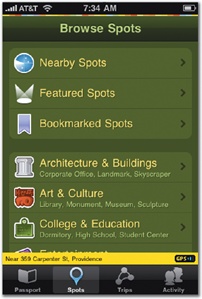
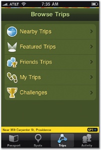
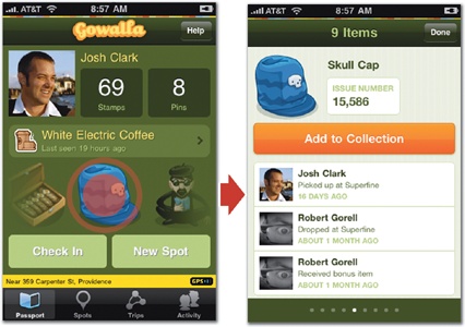
The three stock navigation models aren’t all or nothing. You can blend them together in the same app, using one model to organize the app’s primary features and the others to move around secondary screens for subnavigation. Rather than creating a hideous frankenapp, this kind of navigation mashup can help overcome the shortcomings of individual navigation methods, particularly for apps with lots of content or features to explore. An especially common design pattern uses tab-bar navigation to organize the app’s primary features but adds tree-structure navigation to one or more individual tabs. The Gowalla app, for example, uses tabs to organize its four primary app categories, with three of those tabs presenting standard table-view lists of options on their main screens. Within each tab, you drill down through a tree structure to find the information you want for that particular category.
This approach files the sharp edges off a tree structure’s big drawback, the inability to hop easily from one primary feature category to another. By lodging your app’s main features in a tab bar, people don’t have to climb all the way back to the app’s surface to switch features; just tap the feature on the tab bar instead. If you go this route, your app can and should remember the state of affairs for each tab as users move around the tab bar. In developer lingo, this is called restoring state, and the principle is simple: when someone leaves one of your app’s “rooms,” don’t redecorate while they’re away. Returning to a tab should restore its screen to the same tree-structure position, or search results, or detail view, or whatever they were last looking at. Whatever you do, don’t dump them at the top of the tab’s tree structure and make them drill their way down to find their place again. This keep-my-place politesse is important throughout the iPhone experience, and it’s a topic you’ll revisit in Chapter 7 (page 226).
Gowalla also shows how flat-page navigation can likewise be embedded inside an app at a secondary level. The app’s Passport screen shows your collected icons, and tapping one reveals its details and history, letting you flip through your collection as a set of flat-page cards by swiping left and right. The effect is like firing up a separate mini-app inside Gowalla. The view slides up from the bottom, covering the previous screen, including the app’s tab bar, so that the screen is dedicated entirely to browsing your collection. When you’re finished browsing your treasures, tap Done to dispatch the items and return to the main Passport view.
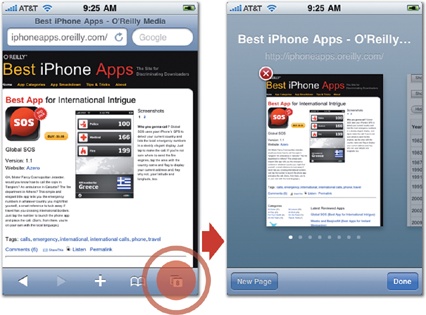
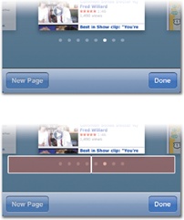
This deck-of-cards display is well-suited to layouts with few or no buttons or controls, so using flat pages for just a portion of an app’s content works best inside a dedicated view like those used by Gowalla and Safari. Extra controls tend to fight the card-flipping metaphor and muddy otherwise simple navigation from screen to screen. Better to let flat-page views temporarily take over the full screen while users swipe through the cards, save for any controls you need to dismiss the screen. (While Safari keeps its toolbar when you’re flipping through open pages, for example, the app’s typical icons are replaced by New Page and Done buttons.)
This treatment, where a screen temporarily takes over the entire app’s display, is called a modal view, a brief detour from the app’s normal operation. The important role of modal views is worth a detour of its own.
Modal Views and Navigational Cul-de-Sacs
If you think of an app’s navigation model as the road your app travels, modal views are its cul-de-sacs—single-screen pull-offs for editing, viewing, or manipulating a screen’s content. In computerese, a mode is a special circumstance where the app behaves differently than it usually does, often changing its interface in the process. Modal views are how you handle modes on the iPhone: a modal view is a screen that briefly hijacks your app’s normal operation, swooping in to cover the current screen to let you perform some task related to that screen’s content.
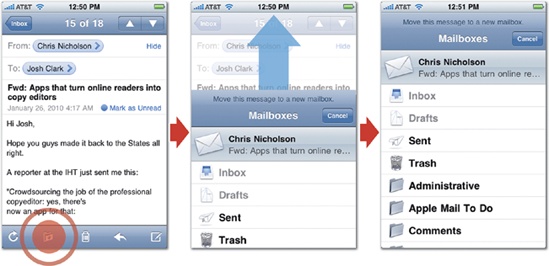
You just saw a pair of examples from Gowalla and Safari, which use modal views to browse content. Modal views are also commonly used to add or edit content. For example, the built-in Mail app uses modal views to move messages to a mailbox folder or compose new messages. These actions both summon a separate screen—the modal view—that lives outside Mail’s normal tree-structure path of accounts, mailboxes, and messages. In both cases, those screens shoot up from the bottom of the screen—standard behavior for a modal view—and cover the previous screen while you take care of business. When you’re finished, the screen retracts, letting you continue to browse and read your mail.
These task-focused, single-screen detours are full-screen examples of the hidden-door approach introduced in the last chapter for reducing interface chrome (page 85). Modal views neatly tuck away controls and interface elements that you need only occasionally for handling secondary tasks. By zooming up from the bottom to cover the current screen, modal views subtly reinforce their role as a temporary detour from the app’s normal browsing, where screens typically swap out left and right, not up and down. Make sure you make it easy for people to get back to business as usual; in addition to including all the necessary buttons and other controls to complete the task, add a Done or Cancel button to let people bail out if they change their mind.
These cul-de-sac pages hang off of individual screens, which means they sit outside the flow of the navigation models you’ve explored so far. They’re not the main cards in a stack of flat pages, and they don’t rest on the main branches of a tree structure. Instead, modal views are accessories to those primary screens; you conjure a modal view to perform some related task and then dismiss it. While that means modal views are not the main screens of a standard navigation model, it’s also true that for some apps, modal views are all the navigation you need.
Safari, for example, is essentially a collection of modal views dangling from the main browser screen. There’s no tab bar, no app categories to browse. The entire app is about the main screen of web content, with various tools popping up in modal views to change or share the content in the browser. The iPhone’s virtual keyboard springs up to help you type a Web address or search term; the Mail Link screen slides up to send an email; the Bookmark screen zips in to help navigate to a saved page; and the Windows screen lets you switch among your open web pages. The app has no formal app navigation where you flow from screen to screen. Instead, you pop in and out of these single-purpose spurs jutting off the main view.
From elaborate tree-structure cascades to Safari’s one-main-screen approach, you’ve seen lots of ways to organize the screens of your app using Apple’s standard navigation models. When planning apps that have to juggle lots of content or tools, it’s all too easy to get lost among these several options. When planning your app’s navigation flow (and its occasional side-road detours), it helps to draw a roadmap to stay on course. Before you dive into the details of the standard iPhone controls, first sketch out how you’ll put Apple’s standard navigation models to use in your app. As you do this, think of your app as a story.
A Tangled Web
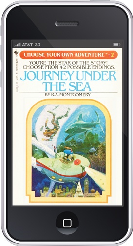
Remember Choose Your Own Adventure books? These popular kids’ books of the 1980s had pre-teens weaving their way through ghost stories, westerns, and galactic expeditions, making a decision at the end of every page to choose what happened next. To search for clues in the pantry, turn to page 31. To question the gardener, turn to page 48. The outcome of every adventure depended on how you moved through the book’s pages, with scores of possible endings. I loved these books as a kid, but with every one of them, I eventually developed the nagging feeling that I’d missed a storyline, that some combination of pages had eluded me. The real fun became finding the missing endings—it was less about the story than about figuring out how the game worked, trying to find every path and conclusion. The book was a riddle.
That’s not how you want people to experience your app. You don’t want it to have hidden corners and undiscovered territory. It should be clear and evident how to navigate to every desired conclusion—more adventure, less mystery. The way you organize your app’s screens makes all the difference.
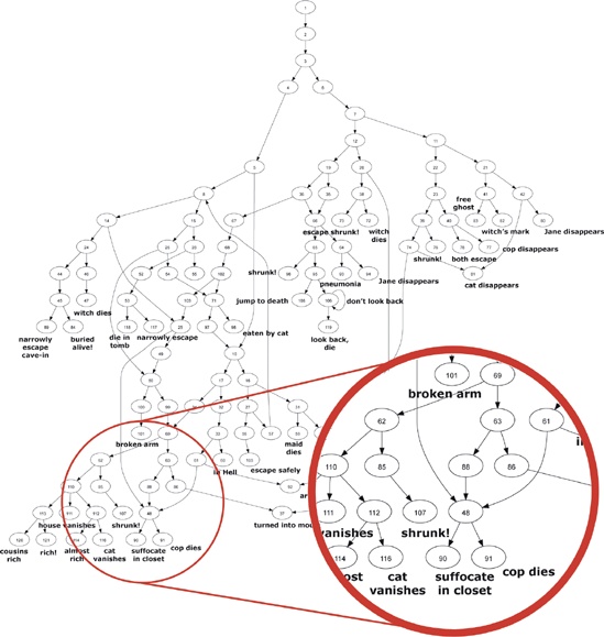
Like the books, your app has a set of pages with fixed rules for how to navigate among them. What made the books tough for nine-year olds to explore with confidence is that the narratives got tangled. Stories didn’t simply branch out, with each decision creating its own unique yarn. The plots crisscrossed and tangled with each other. You could make several different decisions but still land on the same ending (“buried alive!”). Instead of a tidy tree structure, the books were shaped more like a web, creating ambiguity and uncertainty. When you actually map the various paths of one of these books, the web reveals itself.
Don’t organize your app like a web. People should be able to flip through its screens in a straight line (flat pages), a simple set of categories (tab bar), or a neatly categorized collection (tree structure). Paths through your app should be predictable and, ideally, unique: aim to build your app according to a “one room, one door” principle so that every screen has just one approach. While you might reasonably think that adding more doors makes it easier to get around, it instead adds more complexity, challenging your audience to create twisting mental maps of the app’s layout. You want to build an app that people can explore, but you don’t want them getting lost along the way. It’s easier to remember just one path to a screen. (There are apps, of course, where the whole point is to present a web to untangle. The mission of many games, for example, is to solve puzzles, and an app that maps molecules might let you wander through a maze of atoms. In those cases, the goal is to present a riddle or a web of information—purposely creating the sense of getting lost and finding your way. If that’s not what you’re up to, though, you should use more strict organization. When it comes to figuring out your app’s features, don’t make people guess.)
Storyboarding Your App on Paper
Before you build, diagram your app’s flow of screens, like a movie director preparing storyboard sketches for every scene of a shoot. Make sure that you have clean, untangled lines through your hierarchy of pages. Every path through your app should unfold like a quick story, following a logical chain of events to an expected conclusion. Along the way, each screen should tackle just one plot element at a time, focusing on a single task or content element—one list, one detail view, one article, one photo, or one contact. Don’t try to make your screens do too much. Instead, create a deliberate pace where every screen has a clear, unambiguous role.
Everyone’s got their own creative process, but it’s almost always best to begin with paper sketches before you start slinging pixels in Photoshop or Illustrator. It’s certainly better—slow down now—than jumping straight into coding your app. Once you start designing onscreen, you fret over colors, button sizes, and pixel-perfect spacing—stuff you shouldn’t worry about until you’ve settled your app’s larger concerns. Sketching on old-fashioned wood pulp encourages a free-form mindset that keeps you from descending into overly fussy details while you do the important work of storyboarding your app.
Mapping your flow of screens helps confirm that you’ve chosen the right navigation model to accommodate all the pages of your site. If you can crisply visualize the whole thing on paper, your audience will likely find it easy to understand on the screen. The goal in these early stages is to rough out your app’s primary screens, figuring out the way people will flow through your app to accomplish primary tasks. At this point, don’t worry over the specifics of which controls to use—you’ll explore the standard iPhone controls in the next chapter. For now, your sketches should simply address the broad strokes: the screens you’ll need, the actions to take on each one, and the general visual proportions of the tools and content to include. You’re organizing your screens and prioritizing tasks at this stage—sketching, not designing.
If you’re working in a team, this is a good stage to get all the decision makers involved. Sharing sketches, or drawing them together on a whiteboard instead of paper, is a cozy way to make sure everyone has the same basic vision of the app and its goals. When your group works with sketches—basic wireframe storyboards—you’re able to talk about the bones of the app without getting distracted (or lulled) by considerations of style, color, and personality. Now’s the time to make the big decisions about how the app interface should work. Changes that you make at this stage are easy—grab the eraser—but they become harder and harder as the design and development process proceeds. Don’t wait to get sign-off until after you’ve already started applying your gorgeous graphics. Work it out on paper first.
Even though you’re just thrashing through rough concepts at this stage, it’s useful to make sure you’re working in consistent proportions and a realistic size. Sketching iPhone-sized screens on graph paper is a perfectly good homegrown approach that helps keep your screens in balance with one another. As your sketches become more refined and you start to zero in on the precise layout you plan to use, the graph paper will help to size specific elements in the right neighborhood (think 44 pixels).
If you’re doing lots of these screen sketches, you might consider splashing out with a more formal iPhone sketchpad. App Sketchbook (www.appsketchbook.com) sells spiral-bound notebooks with three life-sized iPhone templates per page, each with 20-pixel rules and title bar markings. Notepod (www.notepod.net) sells a pad of iPhone shaped pages, with correctly sized blank screens that let you sketch and tear off screens as quick as you please. There are also several download-and-print templates that fill the same role, like this PDF from the excellent “First & 20” website: www.firstand20.com/articles/iphone-graph-paper.
Put Something Ugly on Your iPhone
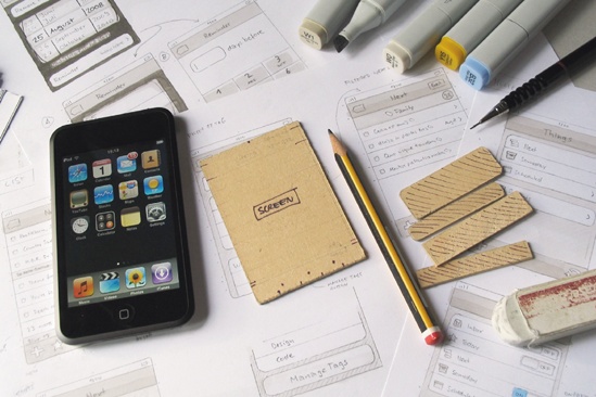
Congratulations, you’ve just built an iPhone app out of paper. Now it’s time to shuffle those pages to get your stick figures off the page and onto an actual iPhone. As you learned in the last chapter, it’s as important to make the app feel right as it is to make it look good. As soon as possible, before you start sprinkling your magic design dust on your sketches to turn them into a sparkling iPhone app, you should test how your sketches feel on an actual physical device. Don’t worry about making it pretty; get an ugly prototype onto an iPhone just to see whether your design will work. This step helps you test that your layout makes sense and the ergonomics seem right before you invest in the careful work of style and color.
This pixel prototype doesn’t have to be fancy, and it certainly doesn’t have to be a working iPhone app. Since you really just want to see how the layout looks and feels on the phone, keep it low-tech: scan or photograph your sketches and, using a graphics program, size them to the iPhone’s 320 × 480 screen. Add these images to your computer’s photo collection (iPhoto on the Mac, for example) and sync them to your iPhone, where you can flip through the sketches full screen in the Photos app. Again, nothing fancy here; this just gives you a sense to check that your design’s sizes and proportions work.
If you’re feeling more ambitious, create a simple dummy iPhone app to try out your bare-bones layout. If you’ve got an iPhone developer handy—or if you’re one yourself—you can build a quick-and-dirty app using standard buttons and controls that match up to your sketched layouts. This prototype shouldn’t do much more than flip through screens. Use fake content just to show text placement, and wire up your buttons so you can tap from screen to screen. Or take a hybrid approach: build a working prototype app that uses your screen sketches but adds tappable regions to them that respond like real working buttons to flip to new screens and views. Happily enough, developer Rob Rhyne has developed a nifty iPhone code framework called Briefs that does just that—find out more at www.giveabrief.com.
Once you’re satisfied that your rough sketches are moving in the right direction, you can start designing more polished mockups. Several developers have been kind enough to share their personal comping kits, collections of pixel-perfect iPhone elements that you can download and use in your favorite graphics program to assemble realistic layouts. Here are a few:
iPhone elements for Photoshop (Teehan+Lax): www.teehanlax.com/blog/2009/06/18/iphone-gui-psd-30
iPhone elements for Illustrator (Mercury Intermedia): www.mercuryintermedia.com/blog/index.php/2009/03/iphone-ui-vector-elements
iPhone elements for Fireworks (Blog*spark) http://blog.metaspark.com/2009/02/fireworks-toolkit-for-creating-iphone-ui-mockups
iPhone elements for Omnigraffle (Patrick Crowley) www.graffletopia.com/stencils/413
But now we’re getting ahead of ourselves. Before you start working with true-blue iPhone controls, you’ll need to know their details. Working with these tools the Apple way is the topic of the next chapter.
Touchpoints
Following conventions doesn’t make your app conventional. Embrace Apple’s design sensibility.
Apple’s built-in navigation models provide organizational solutions for most apps. Understand the pros and cons of each, and choose the best match for your app: flat pages, tab bar, or tree structure.
Storyboard your screens to plan a clear flow through your app. Do big-picture thinking on paper before jumping to pixels.
Start ugly. Begin with a primitive prototype app before starting to code with your full design.
First Person: Jürgen Schweizer and Things
The App Store is chockablock with task managers, but Things sets itself apart from other to-do list apps with its flexibility and ease. Organization systems are hugely personal and Things adapts naturally to your own approach: keep it simple with a single checklist or juggle a sprawling collection of projects, responsibilities, and contexts, staged over time. The app’s design is minimal and efficient to the point of being practically invisible. Things follows the Apple rule book scrupulously with an elegantly simple design that relies almost entirely on standard controls and colors. The result puts the focus on tasks and goals instead of the app’s own interface.

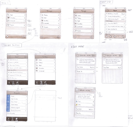
Jürgen Schweizer is founder and one of the chief developers of Cultured Code, the company behind Things. He shared the philosophy and process that went into planning the app’s features and navigation, from concept to paper to iPhone screen. (Sketches by Cultured Code designer Christian Krämer.)

Organizing the App
Jürgen Schweizer: We do a lot of work before we even start thinking about an interface. We start out by having lots of conversations, really talking through what we want the app to be. The most important thing is to understand what you’re trying to achieve at the conceptual level: what problem do you want to solve, what kind of users do you expect to have, and what are their expectations? Many designers jump ahead and start working with interface controls before they even figure out the user’s mental model—what problem they need the app to address.
Once we know what we want an app to do, we move to paper to start working on interface sketches and mockups. We build flow diagrams of every screen, with arrows drawn between them so that we can see exactly how people will move through the app (see Put Something Ugly on Your iPhone). You can really do a lot on paper, but you never know for sure whether it will work until you build it and try it with actual users. Still, we start building only after we’ve planned the whole thing because you can’t give people a half-finished app to test. You have to have a full implementation for them to try out, and that means coding an entire app before you can give it to testers. That’s why it’s so important to do these paper sketches first, to have a solid plan in place because you really don’t want to recode the whole thing over and over again.
Choosing the Navigation Style
Jürgen: We originally liked the idea of using a tab bar for navigation to allow fast browsing of all your tasks from different perspectives—projects, tags, due date, search, and so on. But we soon found that we would need more than five tabs, which meant some would have been hidden inside the More tab. Tab-bar navigation didn’t scale well enough for the features we wanted to include. We also realized that we needed a toolbar in order to provide tools to create, move, and edit list items. We decided to go without the tab bar and use tree navigation with a toolbar. The built-in navigation controls really take you a long way. The tree navigation is a powerful metaphor, and it got us really far right out of the gate.
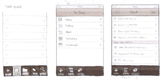
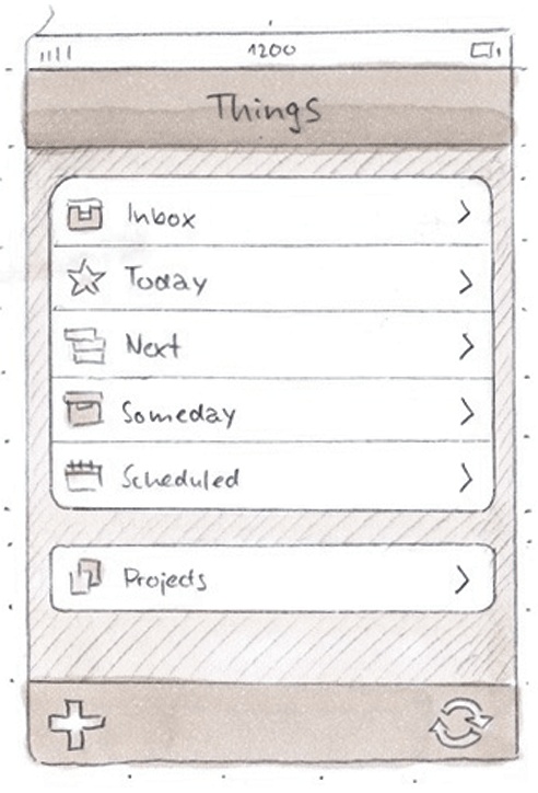
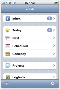
Using table views for navigation also let us use groups to communicate which lists are alike and order them to reflect workflow. When you start off with Things, the main screen shows four groups: Inbox, Today/Next/Scheduled/Someday, Projects, and Logbook. Inbox is where you collect ideas that have not yet been assigned a place in your system. That means you haven’t yet decided when you want to start the to-do. When you make that decision, the task lands in a list somewhere in the second group: today, next (as soon as possible), on a certain date, or someday in the hazy future. Projects lets you organize your tasks into separate goal-focused lists and Logbook is the archive where completed tasks wind up. So the standard table view lets us group and order lists based on when you want to start a task, and then organize those lists in a way that suggests a typical workflow.
Minimal Graphics
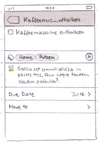
Things uses graphics sparingly, using a limited number of simple icons in carefully chosen locations to guide the eye and suggest meaning. Icons are used to label primary lists on the Home screen, for example, but not for individual to-do items themselves. This gives lists visual weight as top-level containers.
Jürgen: If you overuse icons, users will stop paying attention to them, and you’ve only added visual clutter. On the other hand, if you use icons in specific places while omitting them in others, you can use them to communicate the difference of certain parts of your interface. It’s important not to use icons just to add visual candy. You should use them only to communicate meaning. (Of course, as long as you succeed at that, it doesn’t hurt to make them beautiful as well!)
When you navigate to the detail screen for a to-do, for example, you’ll see items both with and without icons. All the items that show secondary information about the to-do—notes, tags, and so on—have icons describing each type of info. The action buttons below the info fields, however, have no icons. This has two advantages: first, the title and notes fields both use text and the icons help the user distinguish them from one another. Second, by using centered blue text instead in the buttons instead of icons, we tell the user that they are fundamentally different from the info fields. It’s easy to figure out which elements are part of the to-do item and which parts are buttons for action.
What Makes the Feature List?
Things started life as desktop software for Mac OS X. When Cultured Code started developing the iPhone version, they considered how the two versions should relate to each other. The team began with the assumption that the iPhone version of Things would be a light version of the desktop app, but they surprised themselves.
Jürgen: The first thing we thought about was how would people use Things differently on a mobile device instead of the desktop application. It turns out that for a to-do list app, people didn’t just want a satellite companion to the desktop app that would offer only a subset of features, like maybe only capturing new to-dos or showing some simplified version of your to-do lists. We found that we needed to build the full functionality of the desktop version into the iPhone app. It was the only way to give people everything they needed, and we couldn’t go with half measures. This surprised us at first, and it’s not true for all applications. The Photos app is very different from iPhoto on the desktop, for example. But for a to-do list app, we learned that we really did have to build all these features—users expected it. We were challenged with trying to figure out a way to put everything on the iPhone.
One place where we said no, however, was using the location sensor. At first, we dreamt that Things would figure out where you are and then be smart enough to tell you all the tasks you have to do at a certain location. It would just give you a fresh to-do list, like magic. But as we started thinking about it, it turned out that it’s not so obvious or easy to get that magic into the app. People would have to do a lot of setup just to associate tasks with places to teach the iPhone how to manage these location-based tasks. And then, after all that work, it wouldn’t be clear exactly how the app should suggest the tasks to do at the location. You have to be careful how much you impose the app’s logic on what people want to do at any given time. At best you can give small hints about available tasks, but then are small hints really worth all the work users would have to invest? In the end, we decided that we couldn’t really solve it in a way that resulted in a satisfying experience.
For developers it’s not easy to not do things. Apple gives you this great technology, and they want you to use it, and your users want you to use it. But unless you can really make it work in a satisfying way, you have to resist that temptation. It’s hard to say no, but it’s important.
Rhyme with Apple’s Design Language
Jürgen: Before we started to design, we analyzed literally every screen in all of Apple’s apps for the iPhone. It was important for us to understand every nuance of Apple’s user-interface “language.” The amazing thing about Apple’s own apps is the level of design consistency they achieved. They all speak the same language. This is so different from other platforms, and it means that your app can be a seamless part of the overall platform experience, too. When your app follows Apple’s design conventions, users feel immediately at ease when they tap your app icon. It’s a huge motivation to try to deeply understand Apple’s design decisions down to every detail so you’re able to do it the same way and create the same kind of experience.
One of the reasons the iPhone is so successful is that Apple really tried to make the technology behind it invisible. You don’t have to think about how it works. I think that’s the thing to aim for as a developer—make the interface essentially invisible, too. You take it out of your pocket and you just tap somewhere. You really don’t want to make people think about where to tap or what’s the next step. For users, the focus should be on the task and the goal, not the interface.
In iPhone design, beauty and elegance comes from a sense of simplicity. There are always many, many different ways that an application can approach a certain task, but only a few of those options will actually be simple and clear, something that people can easily understand and figure out. As developers, our first tries are often more complex than they should be. When you’re finally able to do something in the simplest, clearest way, it clicks. It feels like the fog has lifted, and there’s a sense of beauty in both the code and the interface.
Eye candy isn’t as important to the beauty of an interface as a lot of designers think. That’s not what sets you apart. If you figure out the right way to solve a user’s problem and do it right, the eye candy is secondary. You can add some nice visual touches later, but it shouldn’t be where you start. Even if you use only standard controls, the application will develop a personality and spirit of its own. If you put the right controls at the right place at the right time, then you have an application that’s easy for people to use and accomplish what they want to do.
You don’t need fancy graphics for that. We use standard iPhone controls whenever possible. Developers should think hard before reinventing the wheel and creating their own controls. People feel right at home with what Apple provides, and that’s a great starting point.
Get Tapworthy now with the O’Reilly learning platform.
O’Reilly members experience books, live events, courses curated by job role, and more from O’Reilly and nearly 200 top publishers.

