4 Assessing Images
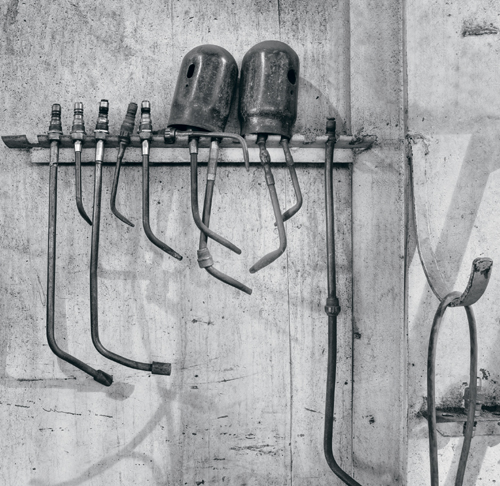
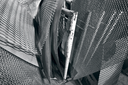
Welding Equipment
The subject matter isn’t exactly exciting, but I like the shadows and the shapes.
Initial Disappointment
It is not uncommon to come home from a shoot, download your images (or hit the darkroom), and then find yourself very disappointed with your results. If this happens often enough, you may start to question your skills and whether it is even worth persisting. This can lead to periods of weeks, months, or even years without photographing.
Disappointment can come from a number of sources, some of which are listed below:
- You may have missed that one great image you had hoped for.
- The image may require a lot of editing for the good qualities to even be apparent. Thus, unless you particularly remember the image (and in a big shoot you very well may not), you may have to make some preliminary adjustments before you appreciate its worth. This is very apparent when you “expose to the right” with digital cameras (as you should), and thus, in using the maximum exposure that won’t clip highlights while supplying good shadow detail with low noise, you end up with an image that is very light and washed out–enough so for you to not recognize the image’s strengths.
- After the shoot, your memory of certain images might overestimate their value, while discounting others. The truth is that you often can’t tell during a shoot which shot will end up being excellent.
- Images of simple design may look OK in thumbnail size, but many images do not, and all your images deserve to be seen at full size on your monitor before you consider ignoring them.
- Perhaps the images would be better in black and white.
- Cropping may be necessary (at least in one dimension) for an image to show its potential.
- Some images take time to grow on you. Therefore, following are some suggestions for reviewing images after a shoot.
- Create a slideshow that allows you to view the images in full screen and uncluttered. Use a rating scale (available in many cataloging programs) to eliminate technically unsalvageable images, and do not discard any other images. Review the remaining images very carefully and assign a rating to images with potential. Consider the possibilities for monochrome conversion, cropping, and other editing adjustments and how they might impact each image.
- Do not discard any aesthetic duds for the first year, though you might feel brave enough to discard duplicates (ensuring that you keep the best one). Frankly, with the cost of storage coming down, you may feel it is never wise to throw out an image, because it may prove useful later on.
In the fall of 2006, I was on holiday on Vancouver Island and returned home with hundreds of images. My initial review of my images left me very disappointed with the results. However, over several months time, I found some nice, if not exactly earth-shattering images, and my opinion of the trip changed significantly. Since that time, I have refined a few of the images and they are now among my best. Had I not rechecked those files again and again, I would be missing some portfolio-quality images. This experience represents a very important lesson.
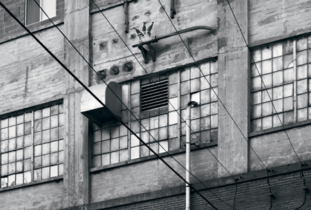
Flour Mill Wall
Overlooked until the editor asked me for more images, and I thought, maybe if I correct perspective, and it was one of those published.
I realize, though, that I have to be careful. Sometimes, in an attempt to find something new, I will scan old files and try to convince myself that an image, which I previously rejected, is worth printing. There is nothing wrong with that, providing that at some point in the process I recognize when it isn’t working and know when to abandon the image. I find I can usually tell part of the way through the editing process when I am simply trying too hard to save a mediocre image. In the case of finding “late bloomers” the feeling was quite different—each just got better and better as I worked on the image, until I recognized it as a major find.
At the time of capturing the images, I had no awareness that any of them would turn out to be one of the best images of the trip. My feeling about these was the same as it was for hundreds of other images, which was, “Has potential—hope for the best.”
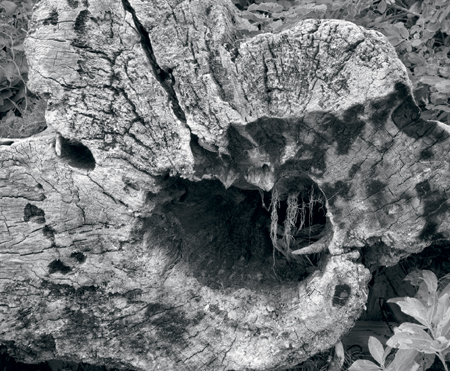
Hollow Stump
Both driftwood and burned stump in one. The massiveness of the stump compared to the delicacy of those roots hanging down, and the age of the wood compared to the freshness of the leaves is what the image is about.
Selecting Images for Presentation
When selecting images for your own entertainment, a “greatest hits” theme works just fine. If, on the other hand, you want to impress someone who knows art, then this strategy is less likely to impress. This holds true whether you are seeking the approval of a magazine editor, a gallery owner, or a museum curator. It is also true of many photo contests.
From the point of view of the keeper of the gates (e.g., the editor or gallery owner), their reputation hangs (sometimes literally) on the work you give them. A gallery owner hopes for a good review in the local newspaper, an editor wants more advertisers and readers, and a book publisher’s living depends on the success of the book. They have the right, the need, and even the responsibility to choose very carefully.
A cohesive collection says a number of things about a photographer, some of which are described below:
- It implies a certain degree of commitment to the work—usually involving multiple shoots, sometimes spanning a period of years.
- Being able to come up with different images on the same topic says a lot about the skill of the photographer.
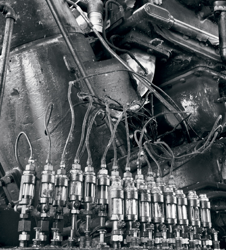
Lubricators
Glass and polished metal reflect light wonderfully—here we have both. - A unified theme to the work implies some emotional involvement, as well as determination, which suggests there is more to the images than just being technically great and well-composed.
- A consistent body of work means that luck is unlikely to have anything to do with the images. A photographer who is out there a lot might get lucky in the mountains, at the seashore, in the derelict building, and with a picture of the girlfriend, yet they are very unlikely to get lucky ten times in a row with a single theme.
- A single subject implies at least the possibility that the photographer has something to say.
Sometimes magazines hosting a contest will specifically state that the work should be of a single theme, or that preference is given to such. Sometimes they don’t tell you that until after the contest, or until the deadline for submissions has passed. You should assume this is implied unless specifically mentioned otherwise, and even then, you should still wonder, knowing judges are only human and perhaps not even aware of their biases.
In the case of B&W Magazine, every other year they publish the top portfolios received (on alternate years they publish best single images). This is the only way to get one’s images in the magazine, other than by specific invitation. No other submissions are allowed. They clearly specify that they prefer a unified theme. They look for 8-12 images, and random, top-ten type collections are not typically selected for publication.
Some editors, owners, and publishers are specifically looking for something new and different to present; the more “artsy” it looks the better, but it damn well better be different. For example, Camera Arts Magazine goes out of its way to push the boundaries and feature the new, different, or some might say, just plain odd. Sending this magazine a portfolio of classic landscape images is unlikely to get very far.
On the other hand, while Lenswork Magazine does like to show things not seen before, the classic and traditional values of quality still hold forth here, and a traditional portfolio is more likely to be welcomed. Do keep in mind though that magazines of this ilk receive hundreds, if not thousands, of such portfolios, so your work does need a certain something to make it stand out.
Following is a list of questions you might be asking at this point:
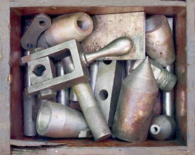
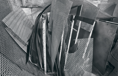
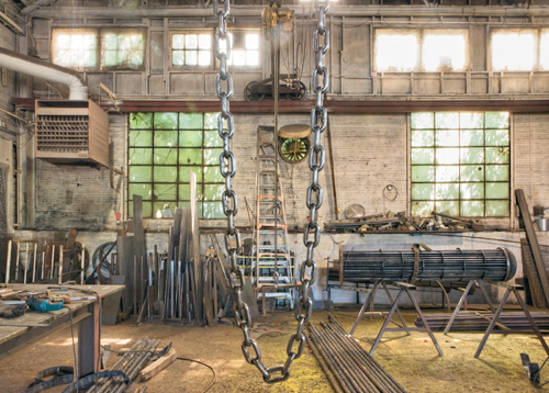
Machine Shop Odds and Ends
Sometimes you know right from the beginning that this will make a good image. I did have the added challenge though of moving the objects in the box to the best position.
- So, how DO you select images to present?
- Is it true that you are defined by your weakest image?
- Can you submit two images of the same subject from different viewpoints and compositions—perhaps one near, one far? How similar can they be while still being acceptable?
- How tough do you have to be in selecting images?
- Should you even be doing your own selecting, because we often hear that we are not the best judges of our own work?
- What if you have barely enough images that you think are good enough to meet the minimum requirement?
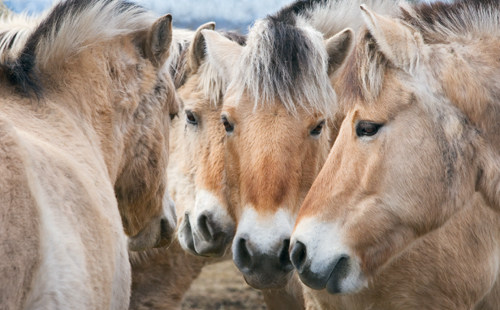
Fjord Horse Conversation
The alignment of the heads and the question of just how many horses are there makes for an interesting image.
Remember that it is human nature to want to control one’s work. That applies to us photographers, but keep in mind that it also applies to the editor, and after all, it’s their magazine you are hoping to get your work into. This means that giving the editor who plans to publish six images, several more than they asked for so they can choose what they think is best, is only common sense.
I will walk you through the method I use when I am selecting images for submission to a contest or magazine.
I start by selecting every image that could reasonably fit the theme I am presenting. I collect them together, and because mine are digital, I run a slideshow on the computer and rank the images as I go.
The first time through, I eliminate any images with technical flaws. Keep in mind that even if you sneak a digital copy past the selectors, sooner or later you are going to be asked to make a print of the image. Therefore, all the images must hold up in print. If you haven’t printed every image by the time your collection has been determined, then print those you haven’t to confirm quality and check for any printing difficulties.
Look for flaws such as:
- Over-sharpening
- Lack of resolution
- Less than subtle image manipulation
- Bleached-out highlights and blocked shadows
- Focus that is spot on
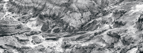
Mudwall
I have been returning to the badlands to photograph for 22 years and it’s still exciting for me.
If I feel any hesitation about the quality of an image, I eliminate it from the collection.
Next, I run through the slideshow again and pick the obvious winners–the images by which I define my photography. They don’t have to be crowd pleasers; I may only be trying to impress a single person whose taste I am not privileged to know beforehand. I then place the definite “keepers” into a separate pile or folder so I don’t have to repeatedly go through all of them.
At this point, it’s not necessary to have a detailed ranking system–we don’t care if an image is a 3, 4, or 5. All we need at this point is a good, bad, maybe system. Fine-tuning may be helpful near the end of this process when trying to separate the good from the great, and making final choices for the portfolio or submission.
By now, I am probably down to 50% of the original group of images, having passed through the top 25% and rejected the bottom 25%. My selection process now becomes more difficult.
The middle-of-the-pack images that are remaining are there for several possible reasons:
- An idea that almost came off and I hate to give up
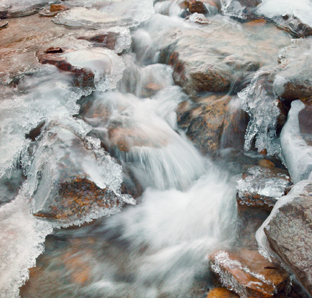
Ice and Stream
Transclucent ice is always worth exploring and flowing water doesn’t hurt either. - A sort of nice image, an image that others like but I don’t
- An image that is terrific in every way except that one little flaw that keeps bugging me
- And certainly there are many other types
Hopefully, none of the images fit into every one of these categories! Many images may be flawless, yet not so obviously exciting. That’s OK. Not every image has to be a barnburner. Because they will be presented together, some images may be needed to fill gaps, provide explanations, or expand the story.
The images that I like except for that “one flaw” are probably best bounced off of someone else. I had an image I showed my wife (who is a non-photographer) and she said she liked it. I then asked her about the out-of-focus areas (which, if truth be known, weren’t out-of-focus enough), and she said that they were distracting—so, out with that image! Other times, though, the one thing that bothers me in an otherwise wonderful image may not be distracting to others.
If you look through the published images of the greats, there are lots of minor imperfections, which, had the photographer obsessed about it, we would not have had the opportunity to view the work. We expect perfection from ourselves, but are more forgiving of someone with a proven reputation. The subtle imperfections we notice this year may turn out, with a couple more years experience behind us, to be glaring errors. I have found myself in this very situation, looking at prints I made a few years ago and thinking, “My God, I’ve come a long way!” At least that’s what I think on a good day. On a bad day I think, “God, I was awful. How did I ever have the nerve to show that in public?”
Regarding images that are good but not great, when I submitted my work to Lenswork for issue 57, I sent them about 25 images. After accepting me, they then asked for everything I could send to them that was along the same theme (black and white industrial). I sent them everything I had that I thought was reasonable, and I even processed a few more images that hadn’t excited me enough previously to even work on. To my surprise they didn’t consistently publish the images I would have selected as my strongest, and they published several images from the extra images I sent. This was interesting, because they printed 17 images, and I originally sent them 25. They chose not to publish about 11 from the first batch of images I sent, and used four of the extras. Of course, I’d already been accepted, there was nothing to lose in sending the extra images. We should all consider the possibility that we are not necessarily the best judges of our own work. Some of our “goods” are “greats” to other people.
At this point, I usually want to show my entire selection to someone else to get his or her feedback. This is especially helpful if the person is pretty honest about their reactions. I am blessed with a wife who, while not making derogatory comments about a picture, will let me know how interested she is in it, and if it doesn’t work she is not afraid to say so. This is a great asset, and though my wife doesn’t have a visual arts background, I find that if she isn’t excited by an image, I’d better have a pretty darn good reason to overrule her. You too might want to find someone who could play a similar role. I believe it might be better if it isn’t a photographer. Usually, people who aren’t photographers themselves, but are skilled lookers, will judge our work.
And so, back to my selection process:
Well, I needed 8-12 images and am now down to 15. I now do a double check for consistency of theme. I realize that although all the images are from the Badlands, 11 are close and middle ground images with no skies, one has a dramatic thunderstorm over the Badlands, and the last is an old truck dumped into a gully in the Badlands. It would make sense to eliminate the last two images no matter how strong they are because they are jarringly different from all the other images (or, alternatively, add more images in that style so the two don’t look like they are crashers at the party).
Here’s another check I do. I ask myself if any of the images are too much like each other—enough so that it is repetitive. I do think you can submit more than one image of the same object, person, or whatever—provided there are enough differences to justify both being included. Simply including a second image that is, for all intents and purposes, a crop of the first image is a definite no. You would have to use your feet to explore the subject from a different point of view, and then can include another image that shows a different aspect of the same subject.
Sheet Steel in Rack
I like that there is a bit more in this image, particularly the top corner of the middle sheet.
More of Steel Rack
Here the composition is simpler, cleaner, but is it better?
Even if the subject matter is different, if it is similar in shape and tonality, and especially if it doesn’t really add anything further to the portfolio, this is grounds to exclude it from a portfolio. Though this is not necessarily the case when publishing, because the editor will decide which of the two he prefers and if he happens to use both, well, obviously he felt there was enough difference.
Now for the last check. Let’s say I am down to 13 images of the 8-12 I need. It’s time to stop thinking about the images and to just react to them. Although by now I have looked at them dozens of times, I flip through them again and rank them according to my emotional response. If I haven’t had a chance to sleep on my selections, I need to come back the next day and see if I still feel the same way.
I have to ask myself whether it is better to provide eight really strong images, or to show my depth by providing the full 12. The answer to this depends a bit on the situation. In the case of B&W Magazine, we are told they will only print four images, therefore having eight to select from is pretty good, and if they are strong images, there is nothing to apologize for if you don’t submit 12.
This would be a much bigger issue if you had simply included your all time greatest hits, in which case, running out at eight has some pretty significant implications, but you can tell a lot about a single subject in eight photographs, so my inclination would be to see if I can determine where the breakpoint is in quality (the point at which there is a noticeable falloff in quality) and if it falls between the 8th and 12th image, that would become my cutoff, no matter what.
Of course, after doing all these steps, you may come to the point where you decide your work is not good enough for publication, and you lose your nerve and never submit it. Because it is very unlikely that you will magically, within a few months time, produce dramatically better work, why not go ahead and stand behind your work and say, “This is the best I can do.” The worst that could happen is that you may receive some derogatory comments from a gallery owner referring to bird-cage liners, but even here there may be something in the feedback that you can take and work with. The only time you can guarantee no rejections is to never submit. And, what a pity that would be!
I think there is some truth to the saying, “You are defined by your weakest image.” If you include images that are glaringly weaker, they may tend to drag down the better images. I would never submit an image of lesser technical quality. Aesthetically though, who’s to say? The image you worried over may be their choice for a cover.
Good luck in selecting a portfolio of your own work. Show the world the best you can do, and then move on.
More on Picking Our Best Work
Someone mentioned that we are not the best judges of our own work. This raises a number of questions.
- Is this true?
- If it is true, then what does this imply?
- And, what do we do about it?
I have heard this expressed before, though of course, something being stated multiple times does not necessarily make it so.
Let’s assume you and I are reasonably talented photographers with something to offer the world. Some of our images have been admired. We normally present only our best work to the public, burying our mistakes.
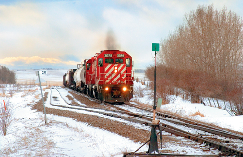
CP Train at Olds
It can be tempting to always aim for the dramatic, the most exciting. But images which evoke typical local scenery or events may well have more power than photographing the Grand Canyon or Mont Blanc.
First, allow me to make some bold statements.
A dog is a dog is a dog. If we think an image is bad, chances are pretty good that every-body else in the know will agree. That is not to say that these images might not get positive feedback; regardless of how bad they are, they may be liked for any number of reasons, not related to their strength as images. Perhaps the person looking at them doesn’t have an educated eye and simply doesn’t notice the compositional or technical flaws, which are so glaring to us. Still, a skilled viewer is likely to see the same fatal flaws we do. Flaws don’t fade with time, but instead become amplified.
Secondly, when it comes to sorting our good from our best work, we are not necessarily good judges. There is a reason that in the movies there are directors and there are editors, and for the most part they are not the same person.
Here’s another story. For a recent show, I sent a number of images, some strong enough I would stake my reputation on them; others good enough to sell, but definitely not amongst my best. Of course, it is one of those weaker images they chose for the catalogue, website, and advertising. My first reaction was to be upset that my “name” was going to be made (or not) on the basis of this image. I thought of asking them to change it, but I’m not the one to tell a curator they are wrong when they have offered me a show, so I kept quiet.
It is now six months later, and looking at the advertising material from the show (even with my name spelled wrong!) I now see this image in a different light. I see it more as an abstract in forms rather than a picture of a frozen waterfall. Maybe I had undervalued the image, and had either accidentally or intentionally put more into the image than I recognized. In hindsight, I can see why they picked the image. I still wouldn’t choose it to represent my work, but I can now see why someone else might. And, I find this a bit disturbing. It clearly means I can be wrong about image choices, so yes, I would have to say that it’s true: We aren’t always the best judges of our own work, and yes, we do need help from editors and curators, even ignoring the fact that these shows and publications represent their best efforts and their reputations stand on what they show.
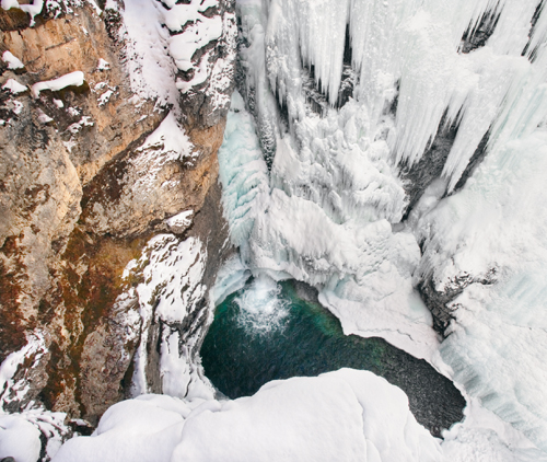
Frozen Waterfall
The gallery picked this image to use in brochures, yet it’s not an image I especially like.
I have read several times of photographers needing and seeking outside help to select and sequence images for a book.
Here’s a fictional story. A photographer strongly dislikes an image. He junks it as a failure, but a friend notices it in the garbage and rescues it, exclaiming over it’s worth. Our photographer is persuaded by said friend to include it in his catalog. This image turns out to be tremendously popular, our photographer is asked to reprint it many times, and it becomes the image by which he is known. Yet, he still hates the image and cringes every time he’s forced to print it.
I think it means that we need to divide our images into the following categories:
- Bad – I don’t want anyone to see this.
- OK – I would be willing to include it in my sales catalogue and actually sell it, but I would not want it in any shows or publications.
- Good – I think it is a decent image. I would prefer it wasn’t the image by which I am known, but I’m OK with showing it to the powers that be and I’ll take my chances.
- Great – These are the images by which I stake my reputation and by which I want to be known.
So, when picking our best work, it’s fair game to pick from the great and the good, but not to use any of the others, no matter how enthusiastically someone else might recommend an image.
We run the risk of missing an image that others will get excited over, but we can always change our minds. There are a number of images which I have much later decided are good after all, or more commonly, I can now make good prints of these when I couldn’t before (I now see how to work them).
In the end, I think it’s better to hold back an image that you are less than happy with.
In terms of sorting out the good from the great, it looks like we may need some help here. Two problems immediately arise.
- We may love an image for reasons that are not apparent to others, and so they never pick our favorites.
- We may dislike an image to some degree (i.e., we like an image less than other images), but we like it enough that we are willing to share it. Perhaps it’s an image that we will appreciate in full later on. There may be something about the image that prevents us from seeing it to its full advantage. We might be obsessed with a minor flaw in the image and can’t get past it, while others pay no attention to the flaw at all, and even when the flaw is pointed out, they can’t understand why we fuss so much.
Just as we can ascribe wonders to an image, which aren’t actually there (they are remembered), we can also remember things, which spoil the image, and yet which don’t actually exist in the image. Rather, they can come from other memories and associations.
Here is the bottom line: If you hate an image, don’t show it to anyone. Maybe, in time, you’ll change your mind, but ultimately they are our images and they make a statement about us. If one or two images don’t get shown which could have been, well that’s just too bad.
If your reputation hangs on a couple of images, then you have more work to do.
Image Deficiencies
I look at a lot of photographs. Some are by near-beginners, others by people who have been practicing the hobby for 30 years. Quality ranges widely and some are fantastic, yet a fair number of the images are quite weak (even some by the same photographer as the great images), more often they are lacking aesthetically rather than technically. The weak images have no message and are often just a hodgepodge of pretty things thrown together. I’ve written about the finer points of creating images, but these shots are failing at a fairly fundamental level, and at the risk of offending, I think it is important to deal with this issue.
Horseshoe Canyonin Sun
Shooting into the sun is usually problematic, but if there is a little haze, you can control the contrast...
These images fail, not because someone did or did not use the rule of thirds for composing. Rather, they fail because the photograph is a disorganized jumble; such as a bright sky here, a deep shade there, and branches sticking out everywhere. I somehow have the impression that what the photographer saw is not what ended up in the print. Giving advice on improving the image is difficult. Telling someone I wouldn’t have taken the picture at all isn’t terribly helpful, yet it can be true—the image doesn’t need improving, it needs replacing. Unfortunately, some photographers are often unaware of their faults, or even if they see something lacking, they are convinced that it could be fixed by a better camera, more pixels, or some technical fix the experts have and aren’t willing to share.
The following are a list of the more common reasons for images to fail. Because many of my old images, and not a few of my current ones fail for exactly the same reasons, I hope you will forgive me for raising the subject and for suggesting some image faults to avoid.
Top Ten Reasons Why Images Fail
- The image is confused because when you saw the scene you did so in three dimensions with two eyes, the viewfinder not withstanding. There are various ways to fix this, but oddly, looking through an SLR viewfinder is not one of them. Better options are to use a viewing rectangle (a simple hole in cardboard or plastic), or possibly the large LCD (liquid crystal display) screen of a pocket sized, digital camera. For all the hassles of using a view camera—a large ground glass is an excellent tool for composing. Even your fingers can make a crude rectangle for composition purposes.
The SLR viewfinder with its dark surround and optics that make the image appear distant, and the relatively small size of the image all contribute to making the image appear better than it really is. It can actually be worth recording the image with your digital SLR, use the LCD screen to evaluate the worth of the image, erasing it if necessary, and then reframe and reposition as needed to improve the image.
Machine Shop
Framing is a matter of including enough to give a sense of the place, without including much of the surrounding clutter. - You are photographing less than what you experienced. An image can’t give us the sound of flowing water or the sigh of wind in the trees, the smell of new buds or the warmth of the sun on our skin. Nor can it record the emotions the photographer experienced in a particular location. You are going to have to work to include any of these sensual elements into the image, and the image has to be strong enough to survive the removal of all those things Given that you can’t, in general, represent these other senses in your images, your images must be that much stronger visually to compensate for the loss of the other senses. This means an image that is cleaner, with fewer distractions, a really strong design, and captured at the ideal moment. Your goal is to find the parts of the scene that can be arranged to represent the whole. You may find a very photogenic person sitting across from you on a subway. They may appear so photogenic that you get up the nerve to ask if you can take their picture. A snapshot of them sitting on the bench surrounded by ads and garbage and people standing, holding shopping bags and looking tired and grumpy will not show any of what you felt when viewing the entire scene. You may feel that it’s the whole human being that is what you are reacting to, but that is unlikely. Far more often there are, at best, just a few things that attract you to a subject, such as their eyes, their smile, or their hair. After all, you haven’t seen their backside (they’re sitting on it, remember. And, they may have huge, ugly, bunioned feet). Your assignment is to take a photograph that will capture what you saw and what it was that attracted you: You need to THINK! Perhaps it was that faraway look, the smile as the person turned towards you, the curve of the neck, sweep of hair, or glint in the eyes. What was it and how do you go about emphasizing that part of the subject so that others get at least a hint of what you saw? You need to eliminate what distracts and emphasize that which “makes” the image.
- Something may capture your interest, but you can’t find (or don’t look for) a way to isolate it, and a cluttered foreground or background completely spoils the image. It can be hard work to find a simple background, and you frequently have to walk away without your shot. Yes, perhaps the rock was interesting, but in its current location it just doesn’t make a pleasing picture.
- Cramming in as many possible shapes, textures, and other things into an image does NOT create a good photograph. Even if adding a particular element could potentially add to an image, if it comes with excess baggage, it can do more harm than good. For example, adding that sand dune to the left is good, but taking the bush that comes with it is bad: Short of removing things in Photoshop, adding the sand dune may hurt more than it helps. Even if a “goody” comes without excess baggage, you should ask yourself whether it really adds value to the image. The rock on the left may have a lovely hue, but unless it somehow ties in with the other rocks (by pattern, texture, or shape), simply adding it because it’s pretty may actually weaken the image.
- Not enough effort has been expended to remove extraneous elements. Simplify, simplify, simplify. Clean up the image by moving to the absolutely best vantage point, and remember that knees bend—get low, wet, and dirty if need be to get a good shot. You can remove extraneous elements by framing your shot so they are excluded, they are hidden behind something, or your position minimizes their prominence. You can reduce their effect by placing them in shadow, or by making them significantly out-of-focus. Objects that intrude because of their color can be toned down. Keep in mind that some “stuff” acts as a frame of reference for your subject, either by literally framing or by simply providing information about the subject, such as its location, or circumstances.
Cave and Basin Hot Pool
The reeds are reflections—it doesn’t hurt to make your viewer think. - People often include skies even when the sky doesn’t add to the image. With skies being bright and horizons often horizontal (who’d have thought?), they really are a strong part of the image, for better or worse. I think you need to ask yourself permission to include the sky rather than the reverse. A travel brochure needs the horizon in the image; fine art photography does not. If you feel the sky is important and must be included, you should do just about anything to break up the line of the horizon. When photographed, lakes have far shores, and unless they are perpendicular to the direction the camera aims, the shoreline will not appear to be horizontal. This can often be very disturbing in an image, even though it is literally correct. The same phenomenon occasionally occurs with a horizon that isn’t, in fact, a true projection of the 15 miles away real edge of the sky. Thus, an object that is relatively near can give the impression of being the horizon, but at the same time may not be horizontal. Quite disturbing!
- Novice photographers often take pictures in which several objects have equal importance; there are no predominant objects, no links between the objects, and no overall pattern to the objects. Such images are often doomed to failure. Firstly, these objects have to have a connection—not necessarily a physical connection, but one created through similar characteristics. For example, an image in which a log, a rock, a tree, and a stream have equal importance (whether through positioning, size, brightness, etc.) is very unlikely to result in a successful image. But, you might be able to link them through positioning. Your perspective and framing can show the water in front of the rock, the log on the left, and the tree on the right. You have now created a logical connection amongst them, and you have arranged them in a way that changes the relative importance: The water and rock being centered in the image take precedence. To achieve this would require a relatively low viewpoint. Standing tall or even looking down at the scene in a valley would equalize the elements and spoil the image.
- More images are spoiled by failing to fill the frame than just about any other error. “Move closer,” should be your mantra. Occasionally we’ll regret cropping just a bit too tight, but often the adjustment needed is only six inches, what I’m talking about here is moving twice as close to your subject (half the distance away). Sometimes this can be best handled by using a longer lens, but more often it is simply a matter of shoe leather.
- Sometimes it’s clear that a particular part of an image is most important, but the photographer may not have given it much real estate. Emphasize the most important part of the image! This can be done by moving in as I mentioned, but another way is to use a wide-angle lens so that you can get really close to the object while giving the appearance that everything else is much further away, and therefore, a whole lot smaller. It may also be emphasized through being much darker or lighter than what surrounds it or through having lines in the print point to it or through other parts of the image framing it.
- Color must be there for a reason. There must be a theme to the color scheme. Unless photographing rainbows, there is usually not much reason to include a wide variety of colors. If you study great art, you will note that many works of art have a limited array of predominant colors in any single painting. You should strive for a similar, reduced palette.
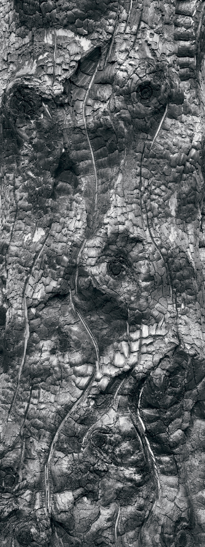
Burned Stump
I was on my way home from my intended photographic destination when I caught, out of the corner of my eye, a meadow in which stood a single dead tree, clearly burned and black. I could see that the surface was uneven, and previous experience with burned stumps meant I knew this was likely to have some great tonalities in black and white. After a quick and relatively safe (but probably illegal) U turn and carefully pulling off the side of the road, I ran across the field with anticipation and wasn’t in any way disappointed. It wasn’t a particularly large tree—perhaps ten inches across. The roundness of the tree meant that depth of field would be an issue at the edges of the trunk. It was pretty clear it was going to be a vertical image.
There were patterns in the burned bark where branches came off, and some great light areas as well as some deep cracks which exposed the unburned wood underneath. Although it would result in a very tall narrow image (an unusual and unconventional and therefore, probably unpopular shape), I felt this would work best for this image. It took some considerable time to find the best position and focal length to record the image.
Burned wood tends to form small rounded squares of charcoal and some areas, perhaps more dense, actually become quite reflective and work very well in both black and white and color. In this image the only color in the entire image was in the deep cracks exposing the beige wood underneath; not enough to keep it in color and I’m very happy with the black and white result.
In selling photographs, it’s not uncommon for people to buy for specific locations, and so it is not unreasonable that they have very specific shape and size requirements. Therefore, even an image of this shape may be perfect for a wall somewhere.
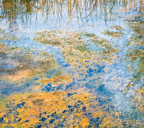
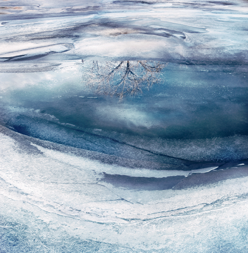
Tree Reflection
This was photographed only a few blocks from downtown Calgary, population one million. The bus barns were behind me and a railway bridge just to the left of the image.
I’d been out photographing on a warm February afternoon. The river was starting to thaw (in fact I went through the ice thigh high at one point trying for an image). I’d hoped to find interesting swirls in the ice, but had in fact been quite disappointed with the patterns. I found nothing that would make a strong composition. Then I came across this scene. With the intensely blue sky, except for a few clouds, two of which are reflected in the pool in the center of the river on top of the ice, and another hiding the sun, there was a little bit of a bay at river’s edge giving the lovely sweep of the bottom of the image. A large tree on the opposite bank is reflected in the pool, while the ice at the edges has melted and refrozen so many times it has formed large crystals that are fairly easily photographed.
The blue comes from the skylight, its intensity increased, because of increasing the contrast in the image quite dramatically—so much so that I had to desaturate the image a couple of times to get a reasonable balance. Of course, I know the color isn’t real, but remember that I’m a photographer with more concern for creating an image than recording one. Not everyone agrees. My wife still prefers the muted tones of the original image.
This raises the whole issue of fidelity to the original scene. Just how far from “natural” is it fair to go? Some would argue that no deviation is reasonable, though these are often the people who happily darken skies with a polarizer or choose Velvia slide film for it’s propensity to saturated colors. Others simply want the image to look natural, whether it’s real or not. For myself, I have no qualms about deviating significantly from the original, feeling that I am creating art (with a lowercase “A”). Perhaps this is a left over of my purely black and white days in which manipulating an image was the norm and fidelity to the original was hardly an issue since the color was gone anyway.
Get Take Your Best Shot now with the O’Reilly learning platform.
O’Reilly members experience books, live events, courses curated by job role, and more from O’Reilly and nearly 200 top publishers.

