1 Seeing
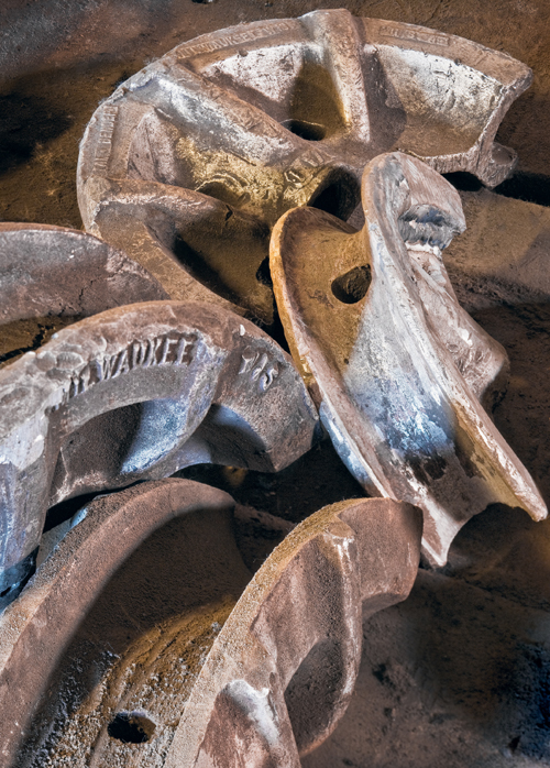
Pipe Benders
In this image, I had the task of arranging the objects on the workbench pretty much as I chose, which was a lot more challenging than simply finding a good composition.
On Reading Photographs
I believe the single most important exercise for any photographer is to study the work of the masters, whether of your own particular interest—say landscapes—or of other kinds of photography. I’ll go further and say it is just as important to study paintings and even sculpture. There is much to be learned by a close study of great artistic works. It could be argued that a cold and clinical analysis of these works takes some of the enjoyment out of them; but this isn’t about enjoyment, it’s about becoming a better photographer. We’re talking sweat equity here—putting some effort into improving.
Before you can creatively and intelligently compose an image, you can either learn a number of rules by rote—you know, divide the image into thirds, and so on—or you can study enough great images that you develop both a strong sense of what works and an eye for finding such compositions in your own photography. Rules are for beginners. Real photographers simply put the image together in a way that works, learned through experience and instinct developed from all those images they have studied and made.
Most of us read text left to right, then top to bottom, but there are no hard and fast rules in photography: Each viewer will read an image in their own fashion. That being the case, the questions are as follows: What did the photographer do to make you first notice the image, then to stay with it and really study and absorb it, and finally to leave it feeling just a little bit different? If we can unlock the secrets of the great images, perhaps we can apply the same “tricks” in our own images.
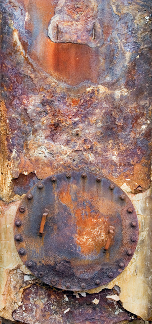
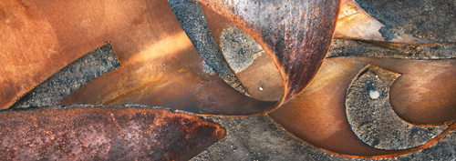
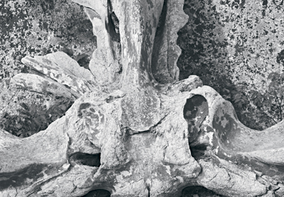
Circular Door
In a very tall image like this, I find it works best to center the main object horizontally, rather than vertically, as was done here.
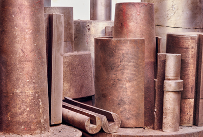
Steel Columns
This is from my “Independent Machinery” series, which has encompassed a total of six trips thus far, and I still get excited with the new images I find.
Following is a list of image attributes with questions for your further study. By asking yourself these questions as you study great photographs, as well as all great art, you will begin to learn the answers.
1. Center of Interest
It would be an exceptional viewer who systematically looks at an image, always starting at the edges then working their way into the center of the image. I would hazard a guess that 99% of us zoom in on the main subject of the photograph; we then zoom out to its surroundings, and then perhaps back to the center. Or maybe our eyes simply wander around the image as we are lead by the lines within the image.
Most images do have a center of interest; but if one doesn’t, how does the photographer manage to capture your attention and keep you looking at the image? Does he leave markers for the path your eye should follow, or does he build barriers so your eye won’t leave the image?
2. What is the Image About?
How do you know what the image is telling you—is it obvious? Did the photographer leave clues? Is its uncertain substance part of what catches your interest, making you look further to identify what it’s a picture of? Too many hobbyists’ pictures don’t make it clear what the image is about: When it comes to adding bits and pieces to the image, “If it’s nice, add it to the image” seems to be their motto.
3. What is the Photograph About at a Deeper Level?
The subject of an image may be easily identified as a pond, but perhaps there is more to it. Is it a beautiful, pristine pond with great reflections? Or perhaps it is a pond with pollution or junk, dead trees, or uncharted depths. The image could make you feel excited or calm, scared or disgusted, sad or discouraged.
4. What are the Parts of the Image and How do they Relate?
Identify the main parts of the image, including such parts as significant, deep shadows. Do these main parts create interesting shapes? Do the spaces between the parts make interesting shapes themselves? Are there parts that relate to each other in some way, i.e., through proximity, tonality, shape, or substance? Are there interesting lines in the image? Are the lines parallel, radiating, or converging to the horizon?
Consider the overall balance of the image. Does it have a sense of rightness that is pleasing? Are there parts that appear to be in opposition, adding to a feeling of tension in the photograph? Are left and right in balance; top and bottom? Perhaps a very heavy-appearing part to the left is balanced by a small part off to the right. A heavy part above a light part (either in tonality or size) adds tension, making the viewer feel as if the heavy part could fall at any moment.
Is there repetition in the photograph? This can be a powerful tool. This repetition can be the shapes, the angle at which lines are set, or even the tones of certain parts. Is there a progression, such as a part that gets smaller and smaller in one direction; or perhaps a balance of sizes with a large object flanked by smaller ones? A single large part of the image with two smaller parts on either side is very static, but what about two small parts on one side of the large object and only one on the other?
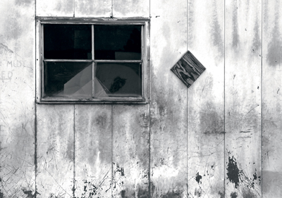
Tin Shed
Note the repetitive diamond shapes both on the wall and through the window.
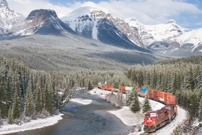
CP Freight
Had my viewpoint been a bit higher, more of the S-bend in the train would have been visible in the distance. Position is everything (as well as being there in time).
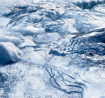
Bow Falls Ice
Color saturation is frequently overdone, but in this case I feel it adds to the sense of an abstract image, creating an image that is more like a painting than a photograph. This is not meant to be “real”.
Don’t forget that the edges of the image are lines in themselves, and anything next to the edge becomes a shape. We talk about negative space as the “empty” parts of the image that surround important parts, (often the center of interest). Are those surrounding parts interesting shapes in themselves?
How has the photographer handled the center of interest, if any? Is it located in the center of the image, which again implies quiet and stability, or is the center of interest well off to one side to add drama?
Are there lines that direct your eye throughout the image while keeping it from leaving the image? A line leading to and suddenly disappearing off an edge invites the viewer’s eye to just keep going right off the page. Conversely, a line that curves back into the image keeps your attention. That being said, radiating lines around a center of interest are essentially a series of arrows pointing toward the center of interest, in which case they draw the viewer’s eye inwards.
5. Tonalities
What has the photographer done with the various tones of the image to capture and keep your attention? A pure black shadow is bold, a thin shadow may be ugly, and a deep shadow with lots of detail seems good enough to dive into. Are the highlights handled nicely, maybe progressing ever so close toward (but not quite) pure white? Then, perhaps there are some small areas of pure white, which then look blazing by comparison.
Are the tonalities attractive? Original prints by master photographers have the most amazing tonalities, and I would encourage you to do whatever it takes to get your hands on some really good prints. If humanly possible, look at them in their “bare” state, without glass or plastic hiding the surface. If you’ve never had this opportunity, you are in for a treat. This is particularly applicable to large and medium format prints from film days, but a wonderful job of tonality can also be achieved in prints of a reasonable size from digital single lens reflex (SLR) images.
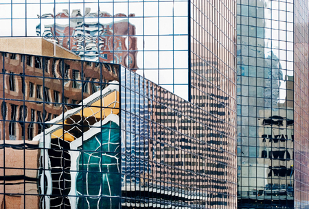
Building Reflection
Shot from a parking garage roof (hardly a glamorous location), I got three good images, each about 120 degrees apart, and each completely different in character.
6. Emotional Impact
When you look at a great photograph, do you get a visceral reaction? Great photographs can grab you deep inside and not let go. You want to cry with the exquisiteness of some images, gasp with the beauty of others, or shed a tear at the pain in another.
What has the photographer done to produce that reaction in you? Could you possibly do something similar in your images? Look hard at these wonderful gifts. Is it the lighting or the subject, the viewpoint or the arrangement, the framing or the tonalities that make it a masterwork? Understanding what made this image powerful will surely help you with your own images, regardless of the subject matter. You might be doing a series on barbers, and the image you have just been studying is Weston’s Pepper #30. You might think there is little to compare, yet perhaps there are comparisons to be made. What about the chrome of the chairs, the globe lights hanging from the ceiling, the sunbeam coming in the window? Are there textures in the old hair cream ads stuck to the wall? The tones in the black drapes, which the barber placed over his customers, might be where you want those deep but detailed shadows. Do the elevated arms of the barber create interesting shapes in the negative space between arm and body?
7. Flaws
This exercise is about image analysis, not admiration, so you should identify anything in the image that you don’t like, or you feel is out of place, unbalanced, disturbing, or awkward. Noticing that an object actually touches the edge of the image, when perhaps it would have been better with a bit of breathing space, will alert you to set things up in your own images in ways you like. When looking at works of uncertain provenance, and you don’t know whether you’re supposed to admire them or not, this sort of analysis really comes into its own. With that said, I know that I don’t like every so-called “great” photograph. Some simply don’t work for me even though experts may rave about them. This same concept holds true in music. You are not expected to equally like every genre of music, and it’s perfectly OK to hate some kinds. The same philosophy holds true with photographs.
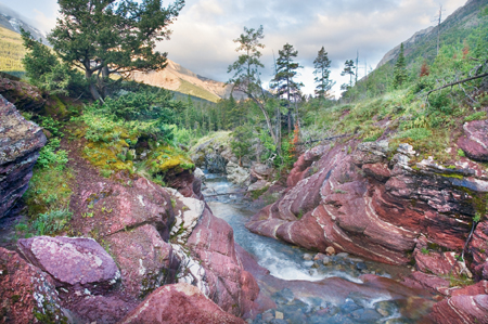
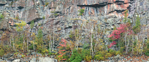
Red Rock Canyon
Good landscape photographs require effort, timing, positioning, and more than a little luck. Usually, you make your own luck with repeated visits until everything falls into place.
Reading My Photographs
Below, I will share with you my own analysis of four of my images. It is entirely possible that you think I’m completely off base in my comments, or that you may not even notice the features I point out. However, comparing your analysis of my images to my analysis is a useful exercise, as you discover that what I think works may be different from your ideas: The lines and shapes I see may not be perceived by you in the same way, and the message I think I am sending with the image may differ dramatically from your interpretation.
If two people interpret a painting in different ways, one is not automatically right while the other is wrong. Paintings and photographs do not come with artist-generated explanations against which you can check your interpretation. Often, art critics will tell you what it’s all about, but keep in mind that this is strictly their opinion, and their’s is no more valid than your own. In this case, though, I’m going to point out what I believe to be the strengths and weakness of my images, and you can see if you agree.
What is the Photograph About?
Well, in this case, it’s a picture of a presumably old, broken headlight (it’s perfectly round and the body of the vehicle is very rusted, making it appear fairly old). The subject matter might or might not interest you. If you were into old vehicles, you might wonder what the year, make, model, or even what kind of vehicle this is. Perhaps you’d ask yourself where such a vehicle was found; on the street, in a junk yard, or wherever? Curiosity about the subject is an important component of an image. If it doesn’t generate curiosity in anyone, then it has failed at a fundamental level. Another way to look at this image is as a semi-abstract. Sure, it’s of a real object, but it is largely about shapes, tones, and lines. That it happens to be a headlight is, to a large degree, irrelevant to the image.
What is the Photograph About at a Deeper Level?
For those of you who are of a philosophical or analytical bent, you might wonder what the photograph says about aging, permanence, design, functionality, or any number of other aspects of the image. It isn’t even necessary for the photographer to have been aware of those aspects of the image, and certainly not to have deliberately inserted them into it. Whether or not the photographer was aware of it at a subconscious level really doesn’t matter. If the photograph makes you think, does it matter if the photographer didn’t? Can a blind person bake a cake that looks nice? Why not?
What are the Parts of the Image and How Do They Relate?
Well, the hanging, broken headlight is obviously a major part of the image, but so is that dark, interestingly shaped shadow of the bulb sitting below it. Note the filament nicely located over a highlight, which stands out a bit even though it is quite small. The body of the vehicle has several textures and colors from fairly rusty to quite smooth. Note the color tie-in from almost purple in the rust on the left, to the bluish-gray on the right; and the bluish tinge in the glass of the bulb, contrasting with the orangey-rust of the headlight socket.
Also of note are the repeated semi-circular shapes seen on the inner part of the bulb base, the outer part, and the bright white rim around the headlight (part of which can be seen through the glass of the bulb), as well as the curve at the bottom edge of the bulb; that’s four matching curves—always a strong design element.
Broken Headlight
An image being popular is not the same as being good. Do you know which is more important to you? The answer to this question significantly affects the kind of photographs you take.
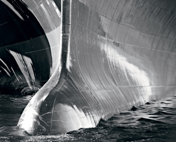
Ship’s Bow (black and white)
Many of the images I take are so tightly framed that edges, horizons, and skies; as well as clues to size, location, and even subject matter are missing. All this is deliberate.
The wires curving downward are important, particularly for their bright white shade.
Tonalities
There are some subtle tonal gradations in the body of the vehicle and in the way the light plays off the old metal. There’s just enough variation in tonality in the body of the vehicle to provide interest without adding distraction. The dent in the body even provides a bit of a specular highlight in the upper left where we notice a bit of shine on the rusted metal. The texture of the rust varies from almost smooth to quite rough; perhaps you think you can feel it.
Negative Space
If you look at the shapes surrounding the headlight and its base, they are quite interesting in and of themselves. If you cover the base and headlight, leaving only the shadow and body of the vehicle, you still have some interesting shapes and textures, colors and tones.
Balance
The image appears to be well-balanced, with the base in the upper right, the bulb in the middle, and its shadow reaching to the lower left. Note the darker edges in the upper-left and lower-right, which tend to direct one’s eye to keep looking towards the center of the image, almost acting as a frame to the parts of the image that are arranged in a bottom-left to upper-right sequence.
Framing
There isn’t much to complain about regarding the framing of the image. The bulb has breathing room: Sure, I could have cropped to the edges of the bulb, but the background works nicely and gives a hint of the old vehicle, so it is justified. Would the image have been better had the entire circle of the headlight base been included, or possibly more of the body (fender?) of the vehicle, perhaps to help identify the vehicle? Well, as it stands, it has more of an abstract feeling to it. A wider shot, even if it were well composed, would be more illustrative, but is certainly not the effect I wanted to portray. I don’t care at all what vehicle it was from, even though the viewer might.
Emotional Impact
Come on guys, it’s a picture of a broken headlight, not a grieving widow after a massacre. Still, to me it has a sense of rightness, and I believe the elements in the image work together. I would like to think that someone might react with surprise that such an ordinary subject could make an interesting photograph. If the emotional impact is nothing more than, “Well, isn’t that neat,” that’s quite sufficient. I don’t suppose anyone is going to say that this image altered their lives, but perhaps it will spur someone to remember their dad tinkering with rusted old vehicles, or that beat up old truck on Grandpa’s farm they played in as a kid. Did I think of this as I took the picture? No, of course not! We don’t even know what Da Vinci was thinking when he painted the smile on Mona Lisa; he may have reacted to it at a gut level rather than an intellectual one. Perhaps he had no idea of all the guesswork he would engender as people over the ages try to figure out what it’s about—perhaps she had gas after the spicy sausage at lunch. It doesn’t really matter. Da Vinci saw it (or created it from memory), thought it was interesting, and painted it in.
Flaws
There isn’t a lot in this image that I am unhappy with. The white of the wiring and of the surround for the headlight base is glaring white—overexposed—no detail recoverable. Does it matter? It bothers me, but I don’t know if it bothers anyone else. I did use highlight recovery in an early version of Camera Raw, but with minimal results. It’s possible that the latest version might work better, but probably, over the top is still over the top. I can live with it. None of my images is perfect in every way. If we only read perfect novels, watched perfect films, or listened to perfect music we wouldn’t have much to enjoy. After reading, viewing, and listening to the few true masterpieces we would quickly run out of material. “Two thumbs up” means a movie is worth watching, not that it’s perfect in every aspect. It’s too bad the filament isn’t 10 times bigger and shown against a white background so it would really stand out. Yet, there is something to be said for offering persistent viewers more to see after their first cursory look. In fact, I would say it’s essential to give them more. It would be a very shallow picture that could be consumed in a glance.
With this second example, I’m not going to systematically go through the same criteria as in the previous image. Rather, I’m simply going to point out the parts that I believe work, as I think of them. First off, it’s a rather striking image, which displays strong contrast while also having subtle gradations of tone. The subject matter is probably interesting simply because it’s unusual: The bow of a container ship, with that bulbous projection used in modern ships to lengthen waterline and alter the bow wave to reduce resistance. Since we usually see ships from a long way off, this closeup viewpoint is rather unusual. The lighting on the two sides of the hull is catching. On the left side (of the print), the hull is a detailed dark tone, with angular shapes leading away from that bulbous bow. On the right side, there is that luminous, silvery, curved reflection which seems to frame the bulb from the other side.
Rockwall
Light and shadow were created later in image editing, lending a relatively random pattern, as well as strengthening the flow and organization of the composition.
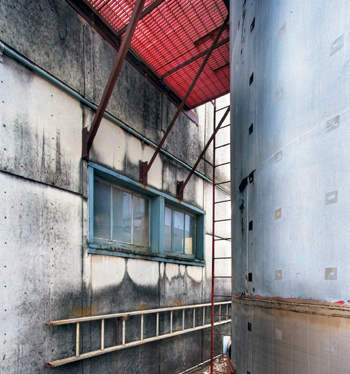
Ladders and Tank (color)
In the color image, the right side of the tank appears weak despite the increase in contrast and “burning”, yet the red platform works well against the blue in the shadows.
Note too that the line of that reflection matches the more angular shape on the left side of the print. There are matching highlights on the bulb itself. Can you imagine if it were entirely dark? Notice the arched lines of the steel sheets on the hull as they curve away from the bow, both left and right.
One could argue that the main feature is the bow and the bulb, which is located off center and balanced by the smaller, dark part of the hull on the left and the larger, light side on the right.
There are great “textures” in the sheet steel itself, which copy the curve of the bow and are perpendicular to the horizontal seams. The lightning bolt-shaped scrapes on the bulb are both visually appealing and tell a story of past encounters. The tones in the water on the right side of the image are lovely—strong, but neither pure white nor pure black. Note the radiating reflections on the dark hull on the left side of the print and at the base of that triangular bright area; these, too, complement the curves in the bulb. The numbers up the side of the bow add interest. The complex pattern of light and dark on the left side of the print makes you wonder what might have caused such complex shadows.
There is a lovely gradation of gray tones from the highlight on the hull on the right side, as it transitions from almost pure white to quite dark in the upper-right corner.
I do see flaws in the image. The specular highlight on the left part of the bulb is, perhaps, a bit much (though it obviously hasn’t stopped me from showing you the image). The water around the bulb and toward the bottom-right is a lighter gray and somehow seems a bit weak, though obviously that is something I could easily correct next time I make a print. For that matter, it would be fairly easy to take the highlights on the right (your right) side of the bulb, copy them to a blank image, flip them, lighten them substantially, and use that to paint into that white highlight on your left of the bulb. I’m not sure if it’s needed, but I don’t have any compunction against doing it. We shall see.
Well, that is my interpretation. How does it vary from your’s and how could you use that information in making your own images?
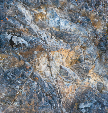
This image is a bit more difficult to analyze, for me and probably for you too. For a start, there isn’t an object that is the center of interest, since the whole thing is a relatively flat rock face. There are certainly separate shapes—the light colored vein of rock near the top and sloping down to the right, the orange rock, and the radiating streaks in the darker rock around the edges. To me it appears to have balance, but I might well be reading too much into it. I have variously thought of this image as showing an exploding star, a galaxy, or a nebula. I’ve just had a look at the image without my glasses. My left eye sees it as very blurred and can’t make out any interesting patterns at all, so maybe I am deluding myself. My right eye, which is only moderately compromised, sees a gentle blur, and definite, interesting patterns. Sometimes having poor vision can be an advantage. If you have perfect vision, you can at least squint at a scene or an image, which will allow you to see only the major shapes.
This image risks being so complicated that it looks like a jumble to viewers, though some have liked it, and they apparently see something of the patterns and shapes and lines I see in it.
This image has a lot going for it; the radiating diagonal lines, the window and its reflections, the weathering on the wall, the roundness of the tank on the right, the triangles made by the walkway above with its red against the blue of the tank and above the blue of the window. Note the wall-mounted ladder is white and is nicely set against the dark part of the wall. Were this part of the wall pristine, the ladder wouldn’t have nearly the impact. In the end though, my own feeling is, “Clever composition, but so what?” It leaves me completely cold. This points out that it’s not enough to be clever, you have to be inspired, excited, motivated, and interested. I made the best of an iffy subject, but frankly, it wasn’t enough. Others appear to agree with me as no one has ever purchased this image, where they have purchased many of my other industrial shots. I can’t see a message in this image.
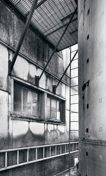
Ladders and Tank (black and white)
Cropping tightly and eliminating the distraction of color strongly emphasizes form.
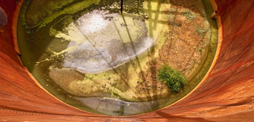
Tank Bottom
Beauty may be found in the oddest places. After climbing a rickety ladder and then peering over the top of this 20-foot high tank, I discovered sheer magic. Totally unexpected!
OK. Having written the above, I wondered, “Would it be better to eliminate the colors? And, what would happen if I cropped out the large white areas on both the right and left edges? I’d lose the end of the ladder, but would that matter?” I definitely think these changes make it a better image. The window is much more emphasized with its reflections. There is a sense of wondering what’s around that corner, past the vertical ladder. Inspiring the viewer to ask questions about something in a photograph is usually positive. It’s good to stimulate their curiosity. Of course, there is no way for the viewer to answer what is around the corner, so they have to use their imagination: What could be there? By cropping more tightly, it’s less obvious what the objects are, creating more mystery. Note that I chose to crop the left edge so the bottom of the walk-way meets the upper-left corner. Good idea? Perhaps I should have cropped the bottom so the ladder comes to the bottom-left corner. Is it too cute now? Hmmm... Some have suggested that getting rid of the color was a mistake, but what do you think?
Well, you have now discovered what my thoughts are about four and a half of my images. You have experienced me radically altering an image simply because I was trying to describe it to you, which made me think about other possibilities. None of these images is amongst the dozen I would stake my reputation on or wish to be remembered for, but I did put effort into finding, composing, framing, and then editing them. Do you have similar thoughts about any of your images? If the best you can say of your own image is, “It’s pretty”, then you have work to do, and hopefully this will give you a start, because the flip side of reading images is writing or creating them. To work with you!
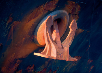
Anchor
The low angle of the sun, the orange rust, and the dark blue shadowed background come together here for a simple design. Sometimes simple is best.
Is Beauty Essential to Great Photographs?
The question of whether beauty is essential to great photographs is more than simply a philosophical debate. If it’s true that the best photographs come from photographing beautiful things, then it has serious implications as to where we look for things to photograph.
To begin, let’s think about some classic images. Who hasn’t had an Ansel Adams calendar, at some point or other, filled with beautiful scenes, many shot in national parks? That works. What about Weston’s nudes? No argument there, though perhaps the ideals of beauty have changed since he created those works. Certainly, the modern works by Barnbaum, Sexton, et al., are generally from beautiful things, therefore we would be forgiven for thinking that beauty may not be essential, but looking at their work may convince us that it surely must help.
It starts to fall apart though when we look at the work of others. David Plowden’s small town and industrial images weren’t beautiful to start with, though one could certainly argue that they appear so in the photographs.
How about Brett Weston’s patches of rust, or the work of Paul Strand? There is a Paul Strand picture of a mudguard and spokes of a motorcycle wheel, which has beautiful curves and shadows and is a very nice photograph. The motorcycle might have been beautiful to some people, but I doubt anyone would have thought the wheel itself was all that exciting. Rather, it is only in the way that the spokes, shadows, and mud flap come together that make it an interesting photograph.
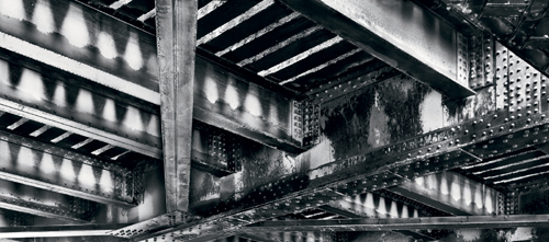
Horizontal Railway Bridge
Who looks up at the dark, dirty, underside of a bridge? With a proper exposure and an ability to look for the unusual view, a reward may await.
My picture of the underside of a railway bridge is beautiful, in my opinion. There was a bicycle path running under the bridge, and I’m sure thousands have passed under it, and perhaps many have even looked up briefly. I doubt any of them saw anything beautiful there. In reality, it is dark, dirty, and ordinary. With the correct exposure and composition (emphasizing the wear patterns and light coming through the railway ties), it makes an interesting picture.
Many of Michael Kenna’s images have a simplicity that makes them beautiful, but were you to look at the scene as a whole I suspect most often you would not see beauty.
The late, great photographer, Carlos Clark, known for his fetishist and outlandish fashion images, none the less, made a project of rescuing objects from the mud of the Thames river in London. He photographed old cutlery, complete with a patina from years of submersion. His image of two forks facing and touching each other is absolutely wonderful on several levels. They were just forks, not even clean or new ones at that. There was nothing to lead you to think it would be a magical image, yet the photographer was creative enough to collect them in the first place, then pose them together, light them, select a background, and print them in a way that was unquestionably beautiful.
It’s a little harder to pick examples of not needing beauty when we talk about the grand landscape, but think of your drive through the mountains on holiday. Sure they were pretty enough, but hardly the stuff of famous photographs. What make the mountain pictures exceptional are the photographers’ selection of wonderful light or unusual weather conditions, and perhaps shooting during a different season. Though even here, it is often the way in which all the elements are put together that “makes” the image. Any other viewpoint may have been pretty, but nothing more.
Cut Pipe
Without a clean background in any direction, I set the camera up on a tall tripod, aimed it downward, and then raised the center column. Aiming was by guess and by checking the LCD, because, at eight feet above ground the viewfinder was out of reach.

Columbia Ice Field
Very wide panoramas often fail, but this seems to work for a lot of people. This was stitched, of course.
Pools
With this image I asked myself, “If I can’t do anything with the whole thing, what can I do with the parts?”
Over the years, some rather ugly buildings have made for some very nice images; as seen in the images from Atget to Walker-Evans to Joel Meyerowitz. I own a wonderful photograph of the doorways in an insane asylum by Shaun O’Boyle. This image is unquestionably beautiful, yet the subject matter is inherently not.
OK—so beauty isn’t essential to photographs, even landscape photographs. It’s probably true though that if you want to photograph the grand landscape, you are going to have to go somewhere pretty and interesting, then find the beauty in it. If you can move in a bit, then you might not need inherently pretty scenery, but you will probably need persistence or luck. If photographing a portrait, you would at least want an interesting face, if not a beautiful one. When doing figure studies, beauty helps if shooting the whole body, but when concentrating on parts, you might well be able to work with all sorts and sizes of people.
When shooting industrial subjects and still lifes, it is a matter of finding the beauty in ordinary things, or outright creating beauty through careful juxtaposition, use of shadows, and finding interesting shapes and lines within something very ordinary.
Does it actually hurt to have something beautiful to photograph? Perhaps, in one way it does. The more beautiful and dramatic the subject, the harder it is to create something that is better than actually being there. You risk the postcard look which says, “Wish you were here”, on the back.
A scene can be so darn pretty that it’s difficult to isolate something that will make an interesting composition. On our trip to Vancouver Island, we stopped at a waterfall/boulder complex that was absolutely beautiful, but it was the whole experience that was beautiful, and the whole couldn’t be shown in a photograph. I really struggled to find something I thought worthy to capture; yet no matter how interesting the parts were they never did equal the whole experience.
In other types of photography, beauty may seriously get in the way of a good image. In trying to portray facial expressions, would it be better to photograph a top model, or someone who’s face shows some character, weathering, a bit of age, and lots of expression? Given the choice of shooting a modern chrome and glass skyscraper vs. an old tenement with graffiti, rust, stains, and streaks, you may prefer the latter building for creative images. Yet, I have seen some wonderful images from modern shopping malls, where lighting, shadows, concrete texture, line, and form are placed perfectly together to make very strong images, possibly even beautiful images.
Conclusion: Beauty may help in a subject, but it can be distracting and it doesn’t come close to guaranteeing a meaningful or beautiful photograph. Beauty can exist in the small details that others overlook, and it may hold true that ugliness itself can result in a beautiful photograph.
If you’re cruisin’ for snaps, it pays to head to interesting subject matter, but the definition of “interesting” can be very wide, and your definition is almost certain to be different from mine. Whether or not you seek beauty will depend on your goals, but remember that it may not, in fact, be in your best interest as a creative photographer.
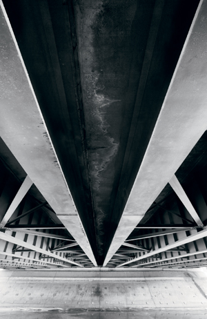
Bridge Foundation
This is an example of an image in which the edges are probably more important than the center.
Elements of a Great Photograph
If I could compile a list of the essential ingredients of a great photograph, you could simply assemble one, as from a kit. If there were a formula for attaining great photographs, you’d think that those who are clever enough to sometimes make them should be able to make all their photographs great. However, the truth is that even of the images they show us, some are good, some even admirable, but only a handful are wonderful.
With this limitation in mind, perhaps we can consider those elements that many great photographs do have in common.
Almost without exception, great images are strongly composed. The elements fall into patterns, which work to reinforce the message. Even great news photographs tend to be well composed, because in doing so, the images have a lot more impact, drawing your eyes to the important elements of the image, with the main subject often isolated from surrounding details to make it more powerful. Edward Weston said that, “Composition is the strongest way of seeing.” When you think about it, why would you ever not want that to be true?
Great photographs almost universally surprise us. It might be showing us beauty in something we would normally consider ugly. It could be revealing something about a person that we didn’t expect, such as the dignity of a beggar or the beauty of someone we would normally think old. A great sports picture shows us details of the game we would miss if we were simply viewing from the stands.
Almost without exception, great photographs are quite simple. By and large, complicated and complex compositions tend to be admired only by the photographer and seldom by others, as only the photographer holds the “key” to making sense of such apparently muddled, cluttered, and disorganized images.
Great images often trigger reactions in viewers. It might be nostalgia for small towns of the 1950’s, as in David Plowden’s images; wonder at the power created by dams; fear of dark streets and menacing, disenfranchised youth; or amazement at the incredible English cathedrals photographed by Bruce Barnbaum.
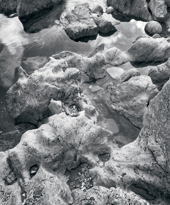
Many great images tell a story, even if it’s nothing more than showing you the effects of millennia on a rocky foreshore.
Great images are often of subjects that happen to photograph well. I don’t mean that they are simply pretty, but rather that the objects in the image give off wonderful tones, whether it’s the subtle glow of the skin on a beautiful body, or the texture of rust in an old machine.
Great images often show objects or even people in relationships with the scene, which creates interest. Think of the ability of Cartier Bresson to place the people in the scene to absolute perfection through careful watching and perfect timing. Interesting relationships might be the way a log extends into water, the position of a shadow next to an object, or two objects that would not normally be expected to “go together.”
Bare Tree on Golf Course
While ballooning, most people look horizontally, but the most interesting material was to be found looking down.
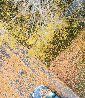
Fallen Leaves and Car
Initially, I cropped out the car, but later decided that the vehicle provided a counterpoint to the rest of the image.
A great photograph stands on its own. That is, it isn’t simply a memory marker for a special event, occasion, or location. Good images go beyond simple recording, and give viewers an experience they likely would not have had even if they were in the area at the time.
A good photograph is interesting. That may seem self evident, but I think there is something to be learned here. Can we agree that there are great photographs of mundane (dare I say uninteresting) subjects? Is it possible that the dirty underside of a railway bridge, something you might cycle past daily and not pay attention to, could actually be interesting? What about peppers, dead birds, rocks, weeds, grass, cracked roads, etc.? So somehow it would seem possible to make an interesting picture of an uninteresting subject. How is that done?
Think of portraits. A picture of a beautiful woman or drop-dead gorgeous man merits a quick look, but usually most adults don’t give it much time, don’t tear it out of a magazine, and don’t frame it. Yet, there are portraits that cause us to do all of those things. Migrant Mother by Dorothea Lange is a beautiful portrait and one could say that the woman shows a special kind of beauty; but really it is a picture of a tired, worn out woman who’s given up hope, yet has the strength to struggle on. It is such a striking image that the photograph is beautiful even if the person photographed may not be. Karsh’s image of Winston Churchill is hardly beautiful, but Karsh captured such a sense of power and determination in the man that you can see how he pulled a nation through a war.
A news photograph might not be considered beautiful at all, but a good one is certainly interesting—interesting because it has a message or is so representative of the issue at hand that it serves as an icon for our feelings about a situation say war, a natural disaster, politics, or whatever.
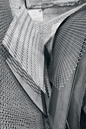
Perforated Steel Sheets (Abstract)
On my first visit to this location I hadn’t even noticed this wonderful composition. On my second visit, I shot from the side. But, on my third visit, ah...
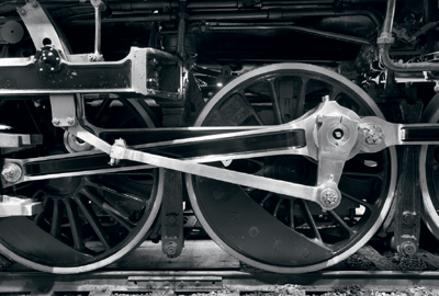
Drivers
This subject is hardly original, yet was rewarding to photograph nevertheless. Old steam locomotives offer many possible compositions, and those polished rods photograph so well!
In the end though, the magic of a great photograph, which probably can’t be explained, comes from the genius of the photographer. This may not even be understood by him, and can’t be called forth on demand, but rather crops up now and again because the photographer was ready. He was ready due to years spent practicing, looking at images, being alert to the possibilities, and being organized to catch the image the moment it presented itself.
What Photographs Well?
Some objects, materials, and surfaces photograph particularly well. They do so because of their textures and the way they reflect light. You might as well take advantage of this knowledge.
Have you ever thought about whether dark subjects photograph better than light ones, or the other way round? Do gradations have to be smooth or can they be harsh? Do patterned objects photograph OK? How shiny must a surface be to have interesting tonalities; can it be too shiny?
I can spout off about my own theories, but it would be more instructive to analyze the great photographs and see if there are any patterns. I’m going to make some observations from my own experience of looking at good photography.
Below is a list of what photographs well based on my own observations. I strongly encourage you to compose your own list.
- Light objects are much more important than dark ones. Think of Moonrise over Hernandez: It is the light buildings, the gravestones, and the clouds that make the image. In Pepper #30, the silvery highlights are what make the image, not the dark tones. Far more good images have the light tone as the focus of the image. There are exceptions, but if you were a betting man... Remember that the actual brightness of white photographic paper compared to black is not much different as measured with a light meter. If you want light areas to glow, they need to be surrounded by dark tones, in which case they will appear brighter than plain white paper because of the contrast.
- Gradual changes in tone photograph better than sudden changes, other than to define a pattern. Think of the way in which water photographs, or driftwood, peppers, skin, or round objects... Of course, this also means photographing rounded objects in soft light to maintain the appearance of roundness.
- Triangles photograph better than squares, though keep in mind that a square viewed from an angle tapers into the distance and therefore may appear as a triangle. What counts is the apparent shape on the print.
- Skin is wonderful in photographs—whether it’s the special glow in a Weston nude or the lined face of a Chinese octogenarian, it works wonderfully well. One wonders if we would think so if we were feathered birds; would we still shoot human nudes? Regardless of our affinity to human skin (including our own), it does photograph well. Like other wet surfaces, oiled skin takes on particularly powerful tones. It doesn’t seem to matter whether it’s the pale skin of someone who sees little sun, the freckles of a true redhead, or the various shades of “black” skin, which has great contrasting highlights: They all seem to photograph well.
- Diagonal lines generally look better than horizontal lines, and they do a better job keeping your eye in the picture. They add energy to an image. Diagonal lines can be parallel, they can radiate out from a single point, or they can be perpendicular to each other. Randomly angled diagonal lines often don’t work well. Repetitive diagonal lines of the same angle to the edge of the image can really strengthen an image, pulling it together because of their consistency.
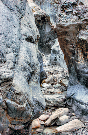
Canyon 1
Soft light allows you to increase contrast and bring out detail. Depth of field was obtained here with multiple images blended in Helicon Focus.Driftwood Arrow
I intended to photograph rocky shores and crashing waves, but made do with what was found... and started a new portfolio.
My Feet
Even in the bath I am aware of light and shadow, form and composition; so off I went, dripping, to find my camera. Seeing begins with looking. - Wet objects photograph better than dry ones. It makes you wonder why we all scurry indoors when it starts to rain. Surfaces such as slate and other dark rocks and roads come alive when wet.
- Long, soft shadows are generally better than short, sharp, deep ones. The low setting or just rising sun creates both long and luminous shadows. Remember though that you can have long shadows at noon if you are photographing a vertical surface.
- Partial sun is better than full sun. Those who take snapshots head out in good weather, but the real photographers head out in bad weather.
- Uneven cloud coverage is better than completely even cloud coverage. A completely overcast sky creates flat lighting, which makes it difficult to achieve much tonal variety unless there are objects that overhang, and thus shadow others.
- Patchy sunlight (as in a forest at noon) is very hard to photograph.
Algonquin Cliffs
In the pouring rain, no one else bothered to get out of the car. Their loss! - Light colored rocks photograph better than dark ones. On the east coast we had lovely, slick granite; on the west coast we had dull, almost black rock covered in white bits (not all of which was bird poop). Guess which rocks photographed better. The west coast rock simply got darker when wet, but they didn’t reflect more light because of their rough surface. The east coast granite was the winner!
- Age photographs better than new (except in people, and sometimes then too if you aren’t trying to please the subject). The patina of old surfaces tends to photograph well, though some new surfaces can also photograph well. I’m thinking of some of John Sexton’s power plant images in which brushed aluminum appears to glow in the prints. The shiny, new Guggenheim Bilbao Museum and the Walt Disney Concert Hall photograph wonderfully.
- Tidy scenes photograph better than clutter, unless there is a pattern to the clutter.
Wire Forms
I took advantage of a rise from which I was able to look down into this concrete plant and capture the reinforcing wire. While circular in themselves, the overlapping shapes combine to create an S-bend.Under Glenmore Trail
A very wide lens and parallel lines result in bold triangles. - Circles photograph well. When viewed off to one side the same circular shapes appear as ovals, which are even better.
- S-bends are solid gold! Whether this is opposite curves in a road, the patterns in a grain field or the sweep of a stream, it photographs well.
- Receding parallel lines take on a triangular shape, which looks good. Think of roads, railways, bridge beams, etc.
- Leaves look better in the spring than the summer, by which time they have a sameness in overall color and brightness which is not as appealing. Wind turns leaves inside out, supplying some variety in tonality.
- Objects blurred by movement often look good in a photograph, which kind of makes you wonder why we all stand waiting, sometimes for hours, for the wind to die down to capture our images. Though to be fair, slight movement is not as good as a lot of movement, and movement in only a small part of an image doesn’t look right when the rest is still.
- Most objects look better with a plain back-ground. The world’s worst background is a forest with patches of bright sky showing through.
- An image that is just a little out of focus isn’t attractive, but very out of focus can be lovely.
This list is at best only a start to describing the surfaces that photograph well. Rather than carrying such a list into the field, you’d benefit more after reading it to simply pay attention to surfaces and how they deal with light so that you can apply this knowledge whether photographing food, sports equipment, machinery, or landscape.
Driftwood Reaching (before blurring)
I forgot to take into consideration the effect of stopping down while trying keep all the wood in focus, which resulted in a very distracting background.
Driftwood Reaching (after blurring)
It would have been best had I shot this correctly at the scene, but considerable work in Photoshop rescued the image. Think ahead!
Photographing Clichés
Some locations are so famous, so attractive, and so accessible that literally thousands of photographers have attempted to create meaningful images of these locations; so much so that one can’t help thinking, “Oh no, not another one.”
The same applies to certain clichéd ideas from cute babies to street people.
This then raises the question of whether one should even attempt to photograph these situations any more. Surely, the odds of anyone adding something meaningful to the genre is poor at best.
Well, perhaps YOU don’t have a good photograph from one of these places and no one else has one done in YOUR style and through YOUR eyes. Just maybe you can create an image that others will like; but, if you don’t create something all that different, does it really matter? Who’s to say you can’t simply enjoy your image for your own sake? You can even mount it, frame it, and hang it in your office.
The image opposite of Peggy’s Cove, Nova Scotia is one such clichéd spot. Everyone who visits Nova Scotia travels to Peggy’s Cove. There is a steady stream of tourist-laden busses arriving one-after-another filled with tourists carrying cameras with which to record their own version.
Actually, Peggy’s Cove is a wonderful spot to photograph, and I had a lot of fun there. We arrived before dawn and started photographing in the dark, continuing until midday by which time finding a spot without a tourist was the real challenge. I took a number of pictures of the lighthouse, gradually getting more creative. I wouldn’t be at all surprised to hear that someone used exactly the same position as me, but you know what? I don’t really care. I found the search for new perspectives to be challenging and am quite pleased with the resulting image. Sure, it’s a lighthouse picture, but it’s MY lighthouse picture, and I see no reason for you not to go out and get your own.
People have been trying to reproduce Ansel Adams’ Winter Storm Clearing for over 50 years from the same viewpoint in Yosemite. Despite the thousands who have tried, I’m not aware of anyone who has succeeded. Somewhere I saw a “straight” print from that negative and you’d never know it was the same image—flat, boring, ordinary—you’d never guess that such a great image could result from this very ordinary negative. Even if you find the tripod holes of those who have gone before you, the image you make is likely to be very different.
Following are several reasons why I think you might want to give photographing a cliché a try:
- You can challenge yourself to produce a good image, regardless of whether it’s been done before. It hasn’t been done by you yet!
- You can challenge yourself to see it in a new way. You could get lucky, and the mental exercise will certainly stimulate you.
- Working with photogenic material can be a good exercise. You know you should be able to get a good picture rather than doubting that the scene is worth it. Now all you have to do is figure out how. For many of our images we can’t tell if we shouldn’t have taken out our camera in the first place, or if we just didn’t know how to work the scene. That won’t be the case here.
- Cliché scenes tend to be popular with viewers and, frankly, it doesn’t do any harm to make some money off people who prefer easily understood images of classic scenes. My Peggy’s Cove image is my all time moneymaker, and while I may be a bit embarrassed by that, I’m still pleased with how I portrayed the famous scene. So there!
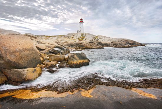
Peggy’s Cove
When at a classic location, the most you can do is make the strongest image you know how.
The image was, in fact, challenging to obtain. The lighting varied as clouds came and went, and the waves had to be factored in, but most of all I didn’t come across this particular viewpoint until mid-morning, by which time busses were arriving every few minutes. There was an almost steady line of tourists walking to and from the lighthouse, or they were simply standing by the lighthouse staring out to sea, (or trying to figure out what the hell I was waiting for, more likely). Anyway, it took over an hour to finally get enough of a gap in traffic that there were only one or two heads showing behind a rock and none at the lighthouse or on the rocks around it.
Whale
There is nothing wrong with taking advantage of what is offered, in this case in front of a gift shop.
It’s Been Done Before
You take your photography seriously and you like to think you’re creative. But, every time you come up with an idea you find that someone has already beat you to it: Either you realize you have seen the same subject shot before, or after a great deal of work on your part some well meaning “friend” tells you where he’s seen similar work. Just how “bent out of shape” should you be over this revelation? Is it even possible to find a subject that hasn’t been done before? Is it just too bad if you find out after the fact that others have been there before you? Do you now hide your images of the same subject, sneaking them out when everyone has gone home?
An important issue in serious photography is whether it is valid to try something that has been done before, or possibly has even been “done to death”. It’s obvious that it is impractical to eliminate entire categories of photography on the grounds that “it’s been seen before”. By this logic, we would eliminate all nudes, landscapes, portraits, architectural shots, flowers, and virtually every other topic, leaving us to photograph extraterrestrials (assuming they visit), and not a hell of a lot else.
OK, what if we were a bit more specific? What if we were to photograph nudes with high key lighting? Sorry, already been done. Does this mean we can never again shoot a nude with high key lighting? Harry Callahan did this 50 years ago. Should we then criticize every photographer since who has used this type of lighting to photograph nudes?
I believe that categorizing images is the problem here. We need to evaluate images based on whether they add something to our understanding of the world or they create a reaction in us, even if we are fairly educated about the history of photography. Should they do so, finding another image by a different photographer with similarities really doesn’t matter.
Think of writing instead of photography. Shakespeare used standard plots, situations, and conflicts in writing his plays. He’s famous not for his original plots, but rather for his fleshing out characters and his use of language.
Frankly, if the only thing to recommend one’s images is that they are new, then I for one don’t think that’s good enough. In fact, I will predict that they won’t last or be remembered, except possibly in a history of photography.
I would rather be known for taking a great photograph of Yosemite, rather than for taking the first photograph.
Rather than spending your time pigeonholing an image, stop, look, and enjoy it. If it happens to be very similar to another image you have previously seen, and is even better, well isn’t that wonderful? If it adds nothing to your experience, then don’t bother looking at it again. The odds of your images being identical to someone else’s are slim at best. Even two photographers with an identical negative make radically different prints (as shown in a monthly series in Black and White Photography magazine).
If a photographer studies only a few of the masters, then it can be challenging to be original. But, if the photographer becomes familiar with the work of many photographers from a variety of styles and schools, then he has so many examples that copying one without being influenced by all the others is nigh impossible. Add to that the photographer’s own personality, likes and dislikes, mood and skills, and a different photograph is almost assured.
However, what if you inadvertently do create an image that ends up very similar to one created by someone who is more famous than you, and who did it before you?
Recently, I took some photographs to a museum gift shop to add to the images they sell for me, and there in the collection of another photographer was a very similar shot of one church photographed through the side window of another church. I knew when I set up the image that it was obviously such a good idea that someone else was bound to have done it sometime before. Yet, I liked the idea and the image pleased me considerably once executed. I don’t think the gift shop needs two similar images, but I have absolutely no intention of hiding my version even though mine was almost certainly photographed after the other.
Remember that if two scientists come up with the same idea independently and without copying the other, they share in the Nobel Prize. Think of music and how the later composers build on the works of those who have gone before them, such as Rachmaninoff’s Rhapsody on a Theme by Paganini.
Consider the case of a painter who creates a magnificent work on commission, but who subsequently creates another painting for someone else that has many similarities to the first. Do we discount the second image as being derivative of self? I don’t think so. Both paintings may sell for millions. Monet did many fairly similar paintings of water lilies, and Rembrandt painted many rich burghers’ wives in a similar style and pose.
No; you should feel free to “stand on the shoulders of giants” and see further than they ever did.
Dorothy Church
Not every image is going to be startlingly original—not mine, not yours—but we can do it well and share our best efforts.
Noticing Subject Matter
Much of photography is about noticing; about paying attention to what is around you. It helps to be right-brained (creative and nonlinear), but just like Sherlock Holmes you can learn to observe, and to enjoy the journey more than the destination, the whole more than the important parts.
You don’t even need a camera. In fact, it might be better to put your camera aside. Go for a walk in your own familiar neighborhood and have a good look around. Check it all out, from cracks in the sidewalk to the shapes of shadows, from the manhole to the chimneys. See how many different things you can discover within one block that you never noticed before. Did you notice what kinds of doors people have? Curtains in windows? Any pets peering out? This isn’t a test. There is no deadline, no prize for the most objects noticed, and no wrong answers. Look in a leisurely fashion, enjoying the little details.
When you meet people, without staring too much, notice the features of their faces, the type of chin they have, the shape of their eyebrows. What kind of mouth do they have? Imagine you had drawing skill and had to make a caricature of them: What features would you emphasize?
Walk down a back alley and check out the interesting objects people store behind their nice, tidy houses. You may discover old cars, RV’s, garbage cans in varying condition, weeds, and decaying fences. See if you can see something unique about each house you pass.
Do you have an odds-and-ends drawer in the kitchen? Have a good look at the contents and instead of simply naming each object, look only at its shape. Look at it from a variety of angles, and note signs of use. Look in the drawer for objects that might photograph well due to their shape, texture, reflective properties, or even their shadows. Look for pairs of objects that might look good together: Not just the obvious functional pair of hammer and nail, but look for other features in common.
Go to your workshop and select some sort of old metal tool and really study it: Take a good 15 minutes to study the one tool. It doesn’t matter whether it’s a drill, chisel, screwdriver, or hammer. Imagine how you might photograph it. How many different ways can you imagine photographing it? How could you show in a photograph the properties it has when you hold it in your hand? Can your image communicate its weight, sharpness, age, coldness, etc.?
Learn to enjoy the process of looking. Get so that when you see a lovely S-curve, you can enjoy it for itself, without feeling the need to rush home for your camera. At the bus stop note things such as the shape of the collar on the fellow standing in front of you, the people’s shoes, and the bags they carry with them. Look around the bus for interesting shapes, tones, lines, and shadows. Pretend you are photographing. How would you frame that fellow across the aisle from you for a half-decent portrait? Instead of seeing a coat, look at the folds in the coat and see how they interact with light.
Come up with your own visual exercises. Read about left-brain/right-brain differences in books or on the Internet. Check out a book on developing your right brain. Become an observer throughout the day, when working or having coffee, when driving to work or taking the bus home.
Become an observer par excellence!
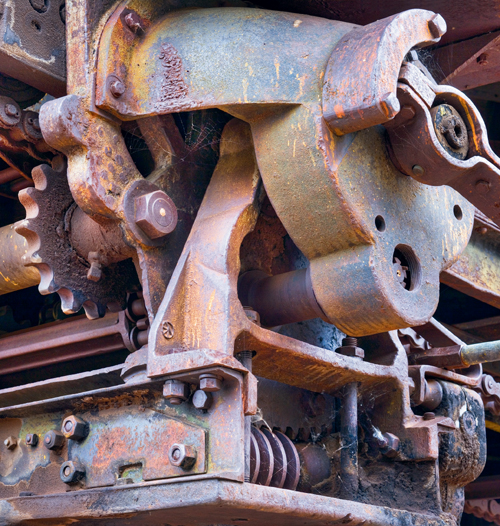
Machinery
It’s not necessary to illegally enter abandoned, fenced off, private, and dangerous industrial sites to get good photographs. I shot this image at Atlas Coal Tipple—the last standing wooden coal tipple in Canada, and now a historic site with signs and guides. Most of the guides have been remarkably understanding, even making suggestions on interesting areas to photograph. Mind you, I’m polite, unaggressive, and very grateful for any help they give. It’s important when doing industrial work that you make it clear you don’t have a political agenda (unless of course you do). Private sites often fear government environmental or safety inspectors, and it’s their natural inclination to say no. You need to make it clear where you stand before they get a chance to say no.
I photographed this part of a conveyer belt mechanism previously, but with better equipment and wanting a wider image I was ready this time to do a stitch of three vertical images. You are looking at the device which can swing horizontally as well as raise and lower the conveyer so it can spread the load of coal in the cars. A hut has been built over the equipment, but it is exposed to the elements from the front, and not surprisingly, has developed a lovely patina over the years.
Camera position was pretty limited, as there was really only one position from which the gears and shell and base all worked together. Mind you, finding that position quickly comes from practice and awareness of the relationship of all the parts.
There was nothing particularly tricky in making the image—some perspective correction since I’d been aiming upwards to start. The cobweb has had considerable work in Photoshop to make it brighter without disturbing the background. There were probably 40 other minor adjustments made to produce this image, all designed to lighten or darken areas or adjust contrast up or down in an effort to reinforce important lines, deemphasize ones which aren’t as important or just plain don’t work, and to provide an overall balance to the image.
Old machinery is both photogenic and interesting, and questions come to mind such as; What is it? How did it work? What is the scale? How did it get there? That doesn’t mean that new can’t be interesting—in fact modern often means bold colors, dramatic shapes, clean lines, and smooth textures which can photograph very nicely, thank you.
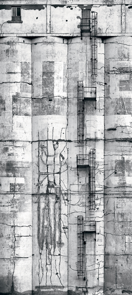
ADM Mill
I found these grain silos a few years ago in Calgary, at one end of ADM Flour Mill. I was attracted to both the fire escape and the cracks in the concrete. The lighting was flat and the image needed more contrast to look interesting. As I ramped up the contrast, I noted that the old lettering, which in real life is very subtle, started to really come out, and an image which had been rather ordinary before the increase in contrast started to shine.
Interestingly, this has been a very popular image amongst young people—suggesting there is hope both for black and white and for non-traditional subject matter. I had interesting reactions when I took a print to the mill (in the vain hope they’d let me photograph inside). The manager was horrified that I’d made their 1914 building look old. The secretary refused to believe there was lettering on the building and immediately took off to check for herself. In fact, you are looking at the remains of “Spillers Flour” from several decades ago.
Like many of my images, I have cropped tightly, emphasizing patterns, textures, and lines over form and location. Others might prefer including the surround in order to give the image a sense of place, but up close you can certainly get a sense of age. It’s like the difference between a head and shoulders portrait vs. an environmental one. To each their own style. Think of it as the difference between telling a story and evoking an emotion, the latter being the tightly framed image with no distractions from the message.
I not only cropped out sky and ground and surrounding buildings, I even cropped out the “penthouse” sitting on top of the building. It fit in fairly well, but in my opinion, the diagonal lines of the roof didn’t match the vertical lines of the rest of the silos.
Get Take Your Best Shot now with the O’Reilly learning platform.
O’Reilly members experience books, live events, courses curated by job role, and more from O’Reilly and nearly 200 top publishers.

