Creating a line chart
A line chart often represents trend over time, and typically requires numeric values plotted as lines over date-related fields.
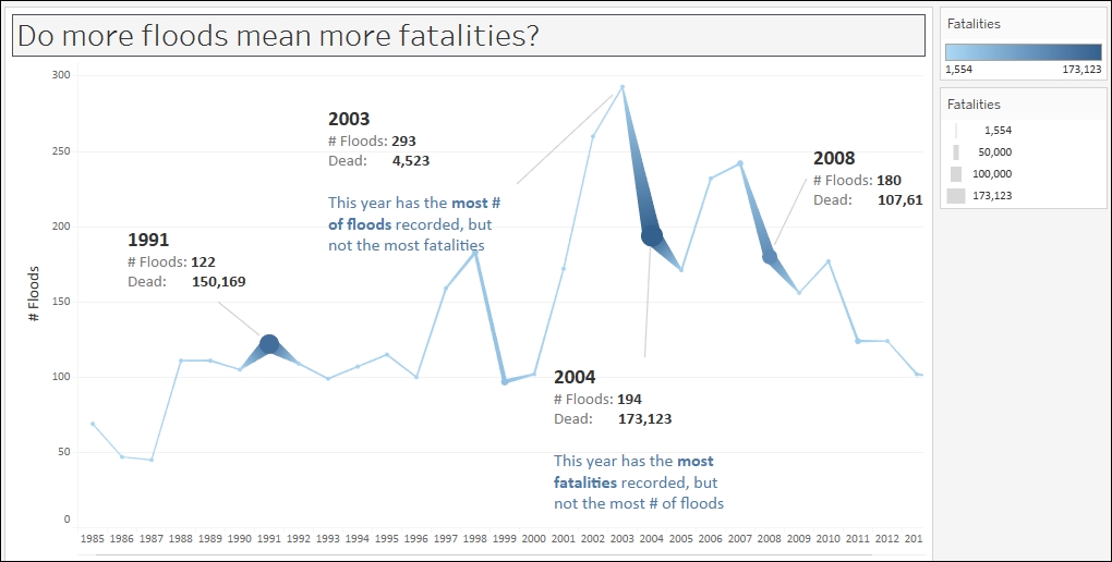
In this recipe, we will create a time series graph (or line chart) that shows the number of floods over time. In addition, we will show the number of fatalities and represent this as the width of the line graph. This will enable us to see more obviously when the most flood-related fatalities occurred.
Getting ready
To follow this recipe, open B05527_01 – STARTER.twbx. Use the worksheet called Line, and connect to the MasterTable (FlooddataMasterListrev) data source.
How to do it...
The following are the ...
Get Tableau 10 Business Intelligence Cookbook now with the O’Reilly learning platform.
O’Reilly members experience books, live events, courses curated by job role, and more from O’Reilly and nearly 200 top publishers.

