Accessibility
The Accessibility pane (formerly Universal Access) is designed for people who type with one hand, find it difficult to use a mouse, or have trouble seeing or hearing.
Accessibility is a huge focus for Apple. In fact, there’s a whole Apple Web site dedicated to explaining all these features: www.apple.com/accessibility. Here, though, is an overview of the noteworthiest features, broken down according to the tabs at the left side.
Display
If you have trouble seeing the screen, then, boy, does OS X have features for you.
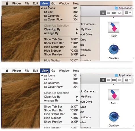
Figure 17-3. When you turn on “Reduce transparency,” those semi-transparent menu bars, window edges, and panes (top) become opaque (bottom). The translucence is a trademark feature of Yosemite, but it doesn’t actually help you use the Mac; plenty of people find opaque menus and windows less visually confusing.
Invert colors swaps the colors of the screen, so that text appears white on black—an effect that some people find easier to read. (This option also freaks out many Mac fans who turn it on by mistake.)
Use grayscale banishes all color from your screen. This is another feature designed to improve text clarity, but it’s also a dandy way to see how a color document will look when printed on a monochrome laser printer.
Differentiate without color is intended for color-blind people, but it’s fairly pointless. The only thing it affects is the “unavailable” status ...
Get Switching to the Mac: The Missing Manual, Yosemite Edition now with the O’Reilly learning platform.
O’Reilly members experience books, live events, courses curated by job role, and more from O’Reilly and nearly 200 top publishers.

