introduction
Bad graphs are everywhere
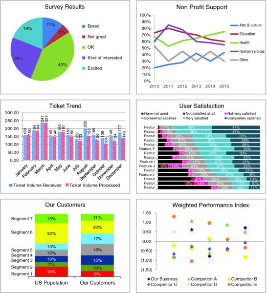
I encounter a lot of less-than-stellar visuals in my work (and in my life—once you get a discerning eye for this stuff, it’s hard to turn it off). Nobody sets out to make a bad graph. But it happens. Again and again. At every company throughout all industries and by all types of people. It happens in the media. It happens in places where you would expect people to know better. Why is that?

FIGURE 0.1 A sampling of ineffective graphs
We aren’t naturally good at storytelling with data
In school, we learn a lot about language and math. On the language side, we learn how to put words together into sentences and into stories. With math, we learn to make sense of numbers. But it’s rare that these two sides are paired: no one teaches us how to tell stories with numbers. Adding to the challenge, very few people feel naturally adept in this space.
This leaves us poorly prepared for an important task that is increasingly in demand. Technology has enabled us to amass greater and greater amounts of data and there is an accompanying growing desire to make sense out of all of this data. Being able to visualize data and tell stories with it is key to turning it into information that can be used to drive better decision making.
In the absence of natural skills or training in this space, we often end up relying on our tools to understand best practices. ...
Get Storytelling with Data: A Data Visualization Guide for Business Professionals now with the O’Reilly learning platform.
O’Reilly members experience books, live events, courses curated by job role, and more from O’Reilly and nearly 200 top publishers.

