chapter 2 choosing an effective visual
There are many different graphs and other types of visual displays of information, but a handful will work for the majority of your needs. When I look back over the 150+ visuals that I created for workshops and consulting projects in the past year, there were only a dozen different types of visuals that I used (Figure 2.1). These are the visuals we’ll focus on in this chapter.
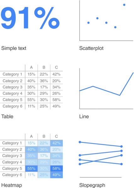
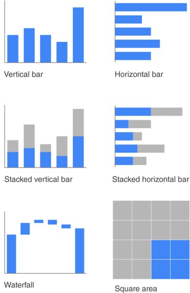
Figure 2.1 The visuals I use most
Simple text
When you have just a number or two to share, simple text can be a great way to communicate. Think about solely using the number—making it as prominent as possible—and a few supporting words to clearly make your point. Beyond potentially being misleading, putting one or only a couple of numbers in a table or graph simply causes the numbers to lose some of their oomph. When you have a number or two that you want to communicate, think about using the numbers themselves.
To illustrate this concept, let’s consider the following example. A graph similar to Figure 2.2 accompanied an April 2014 Pew Research Center report on stay-at-home moms.
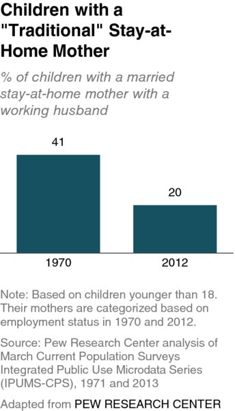
Figure 2.2 Stay-at-home moms original graph
The fact that you have some numbers ...
Get Storytelling with Data: A Data Visualization Guide for Business Professionals now with the O’Reilly learning platform.
O’Reilly members experience books, live events, courses curated by job role, and more from O’Reilly and nearly 200 top publishers.

