Chapter 7
Getting the Lay of the Land with Area Charts
IN THIS CHAPTER
![]() Distinguishing between area charts and line charts
Distinguishing between area charts and line charts
![]() Building an area chart and adding styles
Building an area chart and adding styles
![]() Knowing the advantages of area charts
Knowing the advantages of area charts
Area charts are similar to line charts (described in Chapter 6) but look dramatically different. To replicate this chart type, which you’ve probably seen frequently on TV, you need to understand the unique settings for an area chart type. Without tweaking the settings, they can look overpowering and bold.
In this chapter, you discover how area charts compare to line charts, how to create your own area charts, and the best times to use area charts.
Comparing Area Charts to Line Charts
Area charts shade in the area below the line of closing prices, whereas line charts just connect the closing prices with a line. Area charts are also called mountain charts because they make a strong impression in the foreground against a backdrop, much like mountains against the sky. You can see an area chart in Figure 7-1.
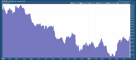
Chart courtesy of StockCharts.com
FIGURE 7-1: An area chart.
Get Stock Charts For Dummies now with the O’Reilly learning platform.
O’Reilly members experience books, live events, courses curated by job role, and more from O’Reilly and nearly 200 top publishers.

