Most of this book, as in most statistics books, is concerned with statistical inference, which is the practice of drawing conclusions about a population using statistics calculated on a sample considered to be representative of that population. However, this particular chapter is concerned with descriptive statistics, meaning the use of statistical and graphic techniques to present information about the data set being studied. Computing descriptive statistics and examining graphic displays of data is an advisable preliminary step in data analysis. You can never be too familiar with your data, and the time you spend examining the actual distribution of the data collected (as opposed to the distribution you expected it to assume) is always time well spent. Descriptive statistics and graphic displays are also the final product in some contexts: for instance, a business may want to monitor total volume of sales for its different locations without any desire to use that information to make inferences about other businesses.
The same data set may be considered as either a population or a sample, depending on the reason for its collection and analysis. For instance, the final exam grades of the students in a class are a population if the purpose of the analysis is to describe the distribution of scores in that class. They are a sample if the purpose of the analysis is to make some inference from those scores to the scores of students in other classes. Analyzing a population means you are performing your calculations on all members of the group in question, while analyzing a sample means you are working with a subset drawn from a larger population. Samples rather than populations are often analyzed for practical reasons, since it may be impossible or prohibitively expensive to study a large population directly.
Notational conventions and terminology differ from one author to
the next, but as a general rule numbers that describe a population are
referred to as parameters and are signified by
Greek letters such as μ and σ, while numbers that describe a sample
are referred to as statistics and are signified by
Latin letters such as ![]() and
s. Sometimes computation formulas for a parameter
and the corresponding statistic are the same, as in the population and
sample mean. However, sometimes they differ: the most famous example is
that of the population and sample variance and standard deviation.
Somewhat confusingly, because most statistical practice is concerned
with inferential statistics, sometimes statistical formulas properly
meant for samples are applied to populations (when the parameter formula
should be used instead). When the formulas differ, both will be provided
in this chapter.
and
s. Sometimes computation formulas for a parameter
and the corresponding statistic are the same, as in the population and
sample mean. However, sometimes they differ: the most famous example is
that of the population and sample variance and standard deviation.
Somewhat confusingly, because most statistical practice is concerned
with inferential statistics, sometimes statistical formulas properly
meant for samples are applied to populations (when the parameter formula
should be used instead). When the formulas differ, both will be provided
in this chapter.
Measures of central tendency, also known as measures of location, are typically among the first statistics computed for the continuous variables in a new data set. The main purpose of computing measures of central tendency is to give you an idea of what is a typical or common value for a given variable. The three most common measures of central tendency are the arithmetic mean, median, and mode.
The Mean
The arithmetic mean, or simply the mean, is
more commonly known as the average of a set of
values. It is appropriate for interval and ratio data, and can also be
used for dichotomous variables that are coded as 0 or 1. For continuous
data, for instance measures of height or scores on an IQ test, the mean
is simply calculated by adding up all the values and dividing by the
number of values. The mean of a population is denoted by the Greek
letter mu (μ) while the mean of a sample is
typically denoted by a bar over the variable symbol: for instance, the
mean of x would be designated ![]() and pronounced “x-bar.” The bar notation
is sometimes adapted for the names of variables also: for instance, some
authors denote “the mean of the variable age” by
and pronounced “x-bar.” The bar notation
is sometimes adapted for the names of variables also: for instance, some
authors denote “the mean of the variable age” by ![]() , which would be pronounced
“age-bar”.
, which would be pronounced
“age-bar”.
For instance, if we have the following values of the variable x :
| 100, 115, 93, 102, 97 |
We calculate the mean by adding them up and dividing by 5 (the number of values):
Statisticians often use a convention called summation notation, introduced in Chapter 1, which defines a statistic by expressing how it is calculated. The computation of the mean is the same whether the numbers are considered to represent a population or a sample: the only difference is the symbol for the mean itself. The mean of a data set, as expressed in summation notation, is:

Where ![]() is the mean of x, n is the
number of cases, and
xi is a
particular value of x. The Greek letter sigma (Σ)
means summation (adding together), and the figures above and below the
sigma define the range over which the operation should be performed. In
this case the notation says to sum all the values of
x from 1 to n. The symbol
i designates the position in the data set, so
x1 is the first value in the
data set, x2 the second
value, and
xn the
last value in the data set. The summation symbol means to add together
or sum the values of x from the first
(x1) to
xn. The
mean is therefore calculated by summing all the data in the data set,
then dividing by the number of cases in the data set, which is the same
thing as multiplying by 1/n.
is the mean of x, n is the
number of cases, and
xi is a
particular value of x. The Greek letter sigma (Σ)
means summation (adding together), and the figures above and below the
sigma define the range over which the operation should be performed. In
this case the notation says to sum all the values of
x from 1 to n. The symbol
i designates the position in the data set, so
x1 is the first value in the
data set, x2 the second
value, and
xn the
last value in the data set. The summation symbol means to add together
or sum the values of x from the first
(x1) to
xn. The
mean is therefore calculated by summing all the data in the data set,
then dividing by the number of cases in the data set, which is the same
thing as multiplying by 1/n.
The mean is an intuitively easy measure of central tendency to understand. If the numbers represented weights on a beam, the mean would be the point where the beam would balance perfectly. However the mean is not an appropriate summary measure for every data set because it is sensitive to extreme values, also known as outliers (discussed further below), and may also be misleading for skewed (nonsymmetrical) data. For instance, if the last value in the data set were 297 instead of 97, the mean would be:
This is not a typical value for this data: 80% of the data (the first four values) are below the mean, which is distorted by the presence of one extremely high value. A good practical example of when the mean is misleading as a measure of central tendency is household income data in the United States. A few very rich households make the mean household income a larger value than is truly representative of the average or typical household.
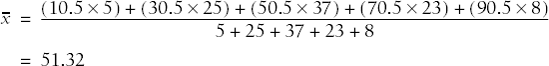
The mean can also be calculated using data from a frequency table, i.e., a table displaying data values and how often each occurs. Consider the following simple example in Table 4-1.
To find the mean of these numbers, treat the frequency column as a weighting variable, i.e., multiply each value by its frequency. The mean is then calculated as:
This is the same result you would reach by adding together each individual score (1+1+1+1+ . . .) and dividing by 26.
The mean for grouped data, in which data has been tabulated by range, is calculated in a similar manner. One additional step is necessary: the midpoint of each range must be calculated, and for the purposes of the calculation it is assumed that all data points in that range have the midpoint as their value. A mean calculated in this way is called a grouped mean. A grouped mean is not as precise as the mean calculated from the original data points, but it is often your only option if the original values are not available. Consider the following tiny grouped data set in Table 4-2.
The mean is calculated by multiplying the midpoint of each interval by its frequency, and dividing by the total frequency:
One way to lessen the influence of outliers is by calculating a trimmed mean. As the name implies, a trimmed mean is calculated by trimming or discarding a certain percentage of the extreme values in a distribution, and calculating the mean of the remaining values. In the second distribution above, the trimmed mean (defined by discarding the highest and lowest values) would be:
This is much closer to the typical values in the distribution than 141.4, the value of the mean of all the values. In a data set with many values, a percentage such as 10 percent or 20 percent of the highest and lowest values may be eliminated before calculating the trimmed mean.
The mean can also be calculated for dichotomous data using 0–1 coding, in which case the mean is equivalent to the percent of values with the number 1. For instance, if we have 10 subjects, 6 males and 4 females, coded 1 for male and 0 for female, computing the mean will give us the percentage of males in the population:
The Median
The median of a data set is the middle value when the values are ranked in ascending or descending order. If there are n values, the median is formally defined as the (n +1)/2th value. If n = 7, the middle value is the (7+1)/2th or fourth value. If there is an even number of values, the median is the average of the two middle values. This is formally defined as the average of the (n /2)th and ((n /2)+1)th value. If there are six values, the median is the average of the (6/2)th and ((6/2)+1)th value, or the third and fourth values. Both techniques are demonstrated below:
| Odd number of values: 1, 2, 3, 4, 5, 6, 7 median = 4 |
| Even number of values: 1, 2, 3, 4, 5, 6 median = (3+4)/2 = 3.5 |
The median is a better measure of central tendency than the mean for data that is asymmetrical or contains outliers. This is because the median is based on the ranks of data points rather than their actual values: 50 percent of the data values in a distribution lie below the median, and 50 percent above the median, without regard to the actual values in question. Therefore it does not matter if the data set contains some extremely large or small values, because they will not affect the median more than less extreme values. For instance, the median of all three distributions below is 4:
| Distribution A: 1, 1, 3, 4, 5, 6, 7 |
| Distribution B: 0.01, 3, 3, 4, 5, 5, 5 |
| Distribution C: 1, 1, 2, 4, 5, 100, 2000 |
The Mode
A third measure of central tendency is the mode, which refers to the most frequently occurring value. The mode is most useful in describing ordinal or categorical data. For instance, imagine that the numbers below reflect the favored news sources of a group of college students, where 1 = newspapers, 2 = television, and 3 = Internet:
| 1, 1, 2, 2, 2, 2, 3, 3, 3, 3, 3, 3, 3 |
We can see that the Internet is the most popular source because 3 is the modal (most common) value in this data set.
In a symmetrical distribution (such as the normal distribution, discussed in Chapter 7), the mean, median, and mode are identical. In an asymmetrical or skewed distribution they differ, and the amount by which they differ is one way to evaluate the skewness of a distribution.
Dispersion refers to how variable or “spread out” data values are: for this reason measures of dispersions are sometimes called “measures of variability” or “measures of spread.” Knowing the dispersion of data can be as important as knowing its central tendency: for instance, two populations of children may both have mean IQs of 100, but one could have a range of 70 to 130 (from mild retardation to very superior intelligence) while the other has a range of 90 to 110 (all within the normal range). Despite having the same average intelligence, the range of IQ scores for these two groups suggests that they will have different educational and social needs.
The Range and Interquartile Range
The simplest measure of dispersion is the range, which is simply the difference between the highest and lowest values. Often the minimum (smallest) and maximum (largest) values are reported as well as the range. For the data set (95, 98, 101, 105), the minimum is 95, the maximum is 105, and the range is 10 (105 - 95). If there are one or a few outliers in the data set, the range may not be a useful summary measure: for instance, in the data set (95, 98, 101, 105, 210), the range is 115 but most of the numbers lie within a range of 10 (95 to 105). Inspection of the range for any variable is a good data screening technique: an unusually wide range, or extreme minimum or maximum values, warrants further investigation. It may be due to a data entry error or to inclusion of a case that does not belong to the population under study (for instance, information from an adult that got mixed in with a data set concerned with children).
The interquartile range is an alternative measure of dispersion that is less influenced by extreme values than the range. The interquartile range is the range of the middle 50% of the values in a data set, which is calculated as the difference between the 75th and 25th percentile values. The interquartile range is easily obtained from most statistical computer programs but may also be calculated by hand using the following rules (n = the number of observations, k the percentile you wish to find):
Rank the observations from smallest to largest.
If (nk)/100 is an integer (a round number with no decimal or fractional part), the k th percentile of the observations is the average of the ((nk)/100th)and ((nk)/100+1)th largest observations.
If (nk)/100 is not an integer, the k th percentile of the observation is the (j +1)th largest measurement, where j is the largest integer less than (nk)/100.
Consider the following data set, with 13 observations:
(1, 2, 3, 5, 7, 8, 11, 12, 15, 15, 18, 18, 20).
First we want to find the 25th percentile, so k = 25.
We have 13 observations, so n = 13.
(nk)/100 = (25 * 13)/100 = 3.25, which is not an integer, so we will use the second method (#3 in the list above).
j = 3 (the largest integer less than (nk)/100, i.e., less than 3.25).
So the 25th percentile is the ( j + 1)th or 4th observation, which has the value 5.
We can follow the same steps to find the 75th percentile:
(nk)/100 = (75*13)/100 = 9.75, not an integer.
j = 9, the smallest integer less than 9.75.
So the 75th percentile is the 9 + 1 or 10th observation, which has the value 15.
Therefore, the interquartile range is (5 to 15) or 10.
The resistance of the interquartile range to outliers should be clear. This data set has a range of 19 (20 - 1) and an interquartile range of 10; however, if the last value was 200 instead of 20, the range would be 199 (200 - 1) but the interquartile range would still be 10, and that number would better represent most of the values in the data set.
The Variance and Standard Deviation
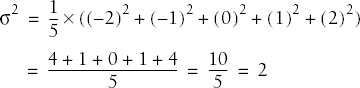
The most common measures of dispersion for continuous data are the variance and standard deviation. Both describe how much the individual values in a data set vary from the mean or average value. The variance and standard deviation are calculated slightly differently depending on whether a population or a sample is being studied, but basically the variance is the average of the squared deviations from the mean, and the standard deviation is the square root of the variance. The variance of a population is signified by σ2 (pronounced “sigma-squared”: σ is the Greek letter sigma) and the standard deviation as σ, while the sample variance and standard deviation are signified by s2 and s, respectively.
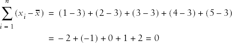
The deviation from the mean for one value in a data set is calculated as (xi - x) where xi is value i from the data set and x is the mean of the data set. Written in summation notation, the formula to calculate the sum of all deviations from the mean for a data set with n observations is:

Unfortunately this quantity is not useful because it will always equal zero. This is not surprising if you consider that the mean is computed as the average of all the values in the data set. This may be demonstrated with the tiny data set (1, 2, 3, 4, 5):
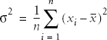
So we work with squared deviations (which are always positive) and divide their sum by n, the number of cases, to get the average deviation or variance for a population:
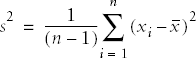
The sample formula for the variance requires dividing by n - 1 rather than n because we lose one degree of freedom when we calculate the mean. The formula for the variance of a sample, notated as s2, is therefore:
Continuing with our tiny data set, we can calculate the variance for this population as:
If we consider these numbers to be a sample, the variance would be computed as:
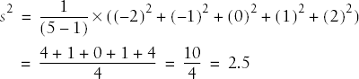
Note that because of the different divisor, the sample formula for the variance will always return a larger result than the population formula, although if the sample size is close to the population size, this difference will be slight. The divisor (n - 1) is used so that the sample variance will be an unbiased estimator of the population variance.
Because squared numbers are always positive (outside the realm of imaginary numbers), the variance will always be equal to or greater than 0. The variance would be zero only if all values of a variable were the same (in which case the variable would really be a constant). However, in calculating the variance, we have changed from our original units to squared units, which may not be convenient to interpret. For instance, if we were measuring weight in pounds, we would probably want measures of central tendency and dispersion expressed in the same units, rather than having the mean expressed in pounds and variance in squared pounds. To get back to the original units, we take the square root of the variance: this is called the standard deviation and is signified by σ for a population and s for a sample.
For a population, the formula for the standard deviation is:
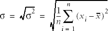
In the example above:
The formula for the sample standard deviation is:
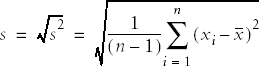
In the above example:
In general, for two variables measured with the same units (e.g., two groups of people both weighed in pounds), the group with the larger variance and standard deviation has more variability among their scores. However, the unit of measure affects the size of the variance: the same population weights, expressed in ounces rather than pounds, would have a larger variance and standard deviation. The coefficient of variation (CV), a measure of relative variability, gets around this difficulty and makes it possible to compare variability across variables measured in different units. The CV is shown here using sample notation, but could be calculated for a population by substituting σ for s. The CV is calculated by dividing the standard deviation by the mean, then multiplying by 100:
For the previous example, this would be:
There is no absolute agreement among statisticians about how to define outliers, but nearly everyone agrees that it is important that they be identified and that appropriate analytical techniques be used for data sets that contain outliers. Basically, an outlier is a data point or observation whose value is quite different from the others in the data set being analyzed. This is sometimes described as a data point that seems to come from a different population, or is outside the typical pattern of the other data points. For instance, if the variable of interest was years of education and most of your subjects had 10–16 years of school (first year of high school through university graduation) but one subject had 0 years and another had 26, those two values might be defined as outliers. Identification and analysis of outliers is an important preliminary step in many types of data analysis, because the presence of just one or two outliers can completely distort the value of some common statistics, such as the mean.
It’s also important to identify outliers because sometimes they represent data entry errors. In the above example, the first thing to do would be to check if the data was entered correctly: perhaps the correct values were 10 and 16, respectively. The second thing to do is to investigate whether the cases in question actually belong to the same population as the other cases: for instance, does the 0 refer to the years of education of a child when the data set was supposed to contain only information about adults?
If neither of these simple fixes solves the problem, the statistician is left to his own judgment as to what to do with them. It is possible to delete cases with outliers from the data set before analysis, but the acceptability of this practice varies from field to field. Sometimes a standard statistical fix already exists, such as the trimmed mean described above, although the acceptability of such fixes also varies from one field to the next. Other possibilities are to transform the data (discussed in Chapter 7) or use nonparametric statistical techniques (discussed in Chapter 11), which are less influenced by outliers.
Various rules of thumb have been developed to make the identification of outliers more consistent. One common definition of an outlier, which uses the concept of the interquartile range (IQR), is that mild outliers are those lower than the 25th quartile minus 1.5×IQR, or greater than the 75th quartile plus 1.5×IQR. Cases this extreme are expected in about 1 in 150 observations in normally distributed data. Extreme outliers are similarly defined with the substitution of 3×IQR for 1.5×IQR; values this extreme are expected about once per 425,000 observations in a normal distribution.
There are innumerable graphic methods to present data, from the basic techniques included with spreadsheet software such as Microsoft Excel to the extremely specific and complex methods developed in the computer language R. Entire books have been written on the use and misuse of graphics in presenting data: the leading (if also controversial) expert in this field is Edward Tufte, a Yale professor (with a Master’s degree in statistics and a PhD in political science). His most famous work is The Visual Display of Quantitative Information (listed in Appendix C), but all of Tufte’s books are worthwhile for anyone seriously interested in the graphic display of data. This section concentrates on the most commonly used graphic methods for presenting data, and discusses issues concerning each. It is assumed throughout this section that graphics are a tool used in the service of communicating information about data rather than an end in themselves, and that the simplest presentation is often the best.
Frequency Tables
The first question to ask when considering a graphic method of presentation is whether one is needed at all. It’s true that in some circumstances a picture may be worth a thousand words, but at other times frequency tables do a better job than graphs at presenting information. This is particularly true when the actual values of the numbers in different categories, rather than the general pattern among the categories, are of primary interest. Frequency tables are often an efficient way to present large quantities of data and represent a middle ground between text (paragraphs describing the data values) and pure graphics (such as a histogram).
Suppose a university is interested in collecting data on the general health of their entering classes of freshmen. Because obesity is a matter of growing concern in the United States, one of the statistics they collect is the Body Mass Index (BMI), calculated as weight in kilograms divided by squared height in meters. Although not without controversy, the ranges for the BMI shown in Table 4-3, established by the Centers for Disease Control and Prevention (CDC) and the World Health Organization (WHO), are generally accepted as useful and valid.
Table 4-3. WHO/CDC categories for BMI
BMI range | Categories |
|---|---|
< 18.5 | Underweight |
18.5–24.9 | Normal weight |
25.0–29.9 | Overweight |
30.0 and above | Obese |
So consider Table 4-4, an entirely fictitious list of BMI classifications for entering freshmen.
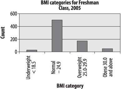
Table 4-4. Distribution of BMI in the freshman class of 2005
BMI range | Number |
|---|---|
< 18.5 | 25 |
18.5–24.9 | 500 |
25.0–29.9 | 175 |
30.0 and above | 50 |
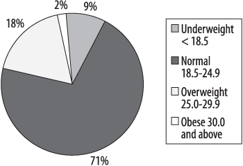
This is a useful table: it tells us that most of the freshman are normal body weight or are moderately overweight, with a few who are underweight or obese. The BMI is not an infallible measure: for instance athletes often measure as either underweight (distance runners, gymnasts) or overweight or obese (football players, weight throwers). But it’s an easily calculated measurement that is a reliable indicator of a healthy or unhealthy body weight for many people. This table presents raw numbers or counts for each category, which are sometimes referred to as absolute frequencies : they tell you how often each value appears, not in relation to any other value. This table could be made more useful by adding a column for relative frequency, which displays the percent of the total represented by each category. The relative frequency is calculated by dividing the number of cases in each category by the total number of cases (750), and multiplying by 100. Table 4-5 shows the column for relative frequency.
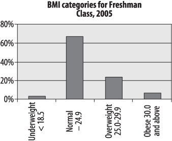
Table 4-5. Relative frequency of BMI in the freshmen class of 2005
BMI range | Number | Relative frequency |
|---|---|---|
< 18.5 | 25 | 3.3% |
18.5–24.9 | 500 | 66.7% |
25.0–29.9 | 175 | 23.3% |
30.0 and above | 50 | 6.7% |
Note that relative frequency should add up to approximately 100%, although it may be slightly off due to rounding error.
We can also add a column for cumulative frequency, which adds together the relative frequency for each category and those above it in the table, reading down Table 4-6. The cumulative frequency for the final category should always be 100% except for rounding error.
Table 4-6. Cumulative frequency of BMI in the freshman class of 2005
BMI range | Number | Relative frequency | Cumulative frequency |
|---|---|---|---|
< 18.5 | 25 | 3.3% | 3.3% |
18.5–24.9 | 500 | 66.7% | 70.0% |
25.0–29.9 | 175 | 23.3% | 93.3% |
30.0 and above | 50 | 6.7% | 100% |
Cumulative frequency allows us to tell at a glance, for instance, that 70% of the entering class is normal weight or underweight. This is particularly useful in tables with many categories, as it allows the reader to quickly ascertain specific points in the distribution such as the lowest 10%, the median (50% cumulative frequency), or the top 5%.
You can also construct frequency tables to make comparisons between groups, for instance, the distribution of BMI in male and female freshmen, or for the class that entered in 2005 versus the entering classes of 2000 and 1995. When making comparisons of this type, raw numbers are less useful (because the size of the classes may differ) and relative and cumulative frequencies more useful. Another possibility is to create graphic presentations such as the charts described in the next section, which make such comparisons possible at a glance.
The bar chart is particularly appropriate for displaying discrete data with only a few categories, as in our example of BMI among the freshman class. The bars in a bar chart are customarily separated from each other so they do not suggest continuity: although in this case our categories are based on categorizing a continuous variable, they could equally well be completely nominal categories, such as favorite sport or major field of study. Figure 4-1 shows the freshman BMI information presented in a bar chart (unless otherwise noted, the charts presented in this chapter were created using Microsoft Excel).
Absolute frequencies are useful when you need to know the number of people in a particular category: for instance, the number of students who are likely to need obesity counseling and services each year. Relative frequencies are more useful when you need to know the relationship of the numbers in each category, particular when comparing multiple groups: for instance, whether the proportion of obese students is rising or falling. The student BMI data is presented as relative frequencies in the chart in Figure 4-2. Note that the two charts are identical, except for the y -axis (vertical axis) labels, which are frequencies in Figure 4-1 and percentages in Figure 4-2.
The concept of relative frequencies becomes even more useful if we compare the distribution of BMI categories over several years. Consider the entirely fictitious frequency information in Table 4-7.
Table 4-7. Absolute and relative frequencies of BMI for three entering classes
BMI range | 1995 | 2000 | 2005 | |||
|---|---|---|---|---|---|---|
Underweight < 18.5 | 50 | 8.9% | 45 | 6.8% | 25 | 3.3% |
Normal 18.5–24.9 | 400 | 71.4% | 450 | 67.7% | 500 | 66.7% |
Overweight 25.0–29.9 | 100 | 17.9% | 130 | 19.5% | 175 | 23.3% |
Obese 30.0 and above | 10 | 1.8% | 40 | 6.0% | 50 | 6.7% |
Total | 560 | 100.0% | 665 | 100.0% | 750 | 100.0% |
Because the class size is different in each year, the relative frequencies (%) are most useful in observing trends in weight category distribution. In this case, there has been a clear decrease in the proportion of underweight students and an increase in the number of overweight and obese students. This information can also be displayed using a bar chart, as in Figure 4-3.
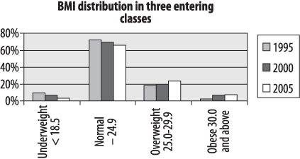
This is a grouped bar chart, which shows that there is a small but definite trend over 10 years toward fewer underweight and normal weight students and more overweight and obese students (reflecting changes in the American population at large). Bear in mind that creating a chart is not the same thing as conducting a statistical test, so we can’t tell from this chart alone whether these differences are statistically significant.
Another type of bar chart, which emphasizes the relative distribution of values within each group (in this case, the relative distribution of BMI categories in three entering classes), is the stacked bar chart, illustrated in Figure 4-4.
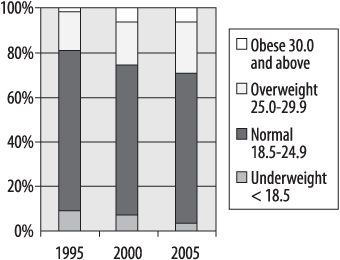
In this type of chart, the bar for each year totals 100 percent, and the relative percent in each category may be compared by the area within the bar allocated to each category. There are many more types of bar charts, some with quite fancy graphics, and some people hold strong opinions about their usefulness. Edward Tufte’s term for graphic material that does not convey information is “chartjunk,” which concisely conveys his opinion. Of course the standards for what is considered “junk” vary from one field of endeavor to another: Tufte also wrote a famous essay denouncing Microsoft PowerPoint, which is the presentation software of choice in my field of medicine and biostatistics. My advice is to use the simplest type of chart that clearly presents your information, while remaining aware of the expectations and standards within your profession or field of study.
Pie Charts
The familiar pie chart presents data in a manner similar to the stacked bar chart: it shows graphically what proportion each part occupies of the whole. Pie charts, like stacked bar charts, are most useful when there are only a few categories of information, and when the differences among those categories are fairly large. Many people have particularly strong opinions about pie charts: while they are still commonly used in some contexts (business presentations come to mind), they have also been aggressively denounced in other contexts as uninformative at best and potentially misleading at worst. So you can make your own decision based on context and convention; I will present the same BMI information in pie chart form and you may be the judge of whether it is useful (Figure 4-5). Note that this is a single pie chart showing one year of data, but other options are available including side-by-side charts (similar to Figure 4-4, to allow comparison of the proportions of different groups) and exploded sections (to show a more detailed breakdown of categories within a segment).
Pareto Charts
The Pareto chart or Pareto diagram combines the properties of a bar chart, displaying frequency and relative frequency, with a line displaying cumulative frequency. The bar chart portion displays the number and percentage of cases, ordered in descending frequency from left to right (so the most common cause is the furthest to the left and the least common the furthest to the right). A cumulative frequency line is superimposed over the bars. Consider the hypothetical data set shown in Table 4-8, which displays the number of defects traceable to different aspects of the manufacturing process in an automobile factory.
Table 4-8. Manufacturing defects by department
Department | Number of defects |
|---|---|
Accessory | 350 |
Body | 500 |
Electrical | 120 |
Engine | 150 |
Transmission | 80 |
Figure 4-6 shows the same information presented in a Pareto chart, produced using SPSS.
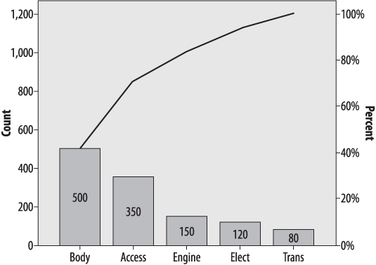
This chart tells us immediately that the most common causes of defects are in the Body and Accessory manufacturing processes, which together account for about 75% of defects. We can see this by drawing a straight line from the “bend” in the cumulative frequency line (which represents the cumulative number of defects from the two largest sources, Body and Accessories, to the right-hand y -axis. This is a simplified example and violates the 80:20 rule because only a few major causes of defects are shown: typically there might be 30 or more competing causes and the Pareto chart is a simple way to sort them out and decide which processes to focus improvement efforts on. This simple example does serve to display the typical characteristics of a Pareto chart: the bars are sorted from highest to lowest, the frequency is displayed on the left y -axis and the percent on the right, and the actual number of cases for each cause are displayed within each bar.
The Stem-and-Leaf Plot
The types of charts discussed so far are most appropriate for displaying categorical data. Continuous data has its own set of graphic display methods. One of the simplest is the stem-and-leaf plot, which can easily be created by hand and presents a quick snapshot of the distribution of the data. To make a stem-and-leaf plot, divide your data into intervals (using your common sense and the level of detail appropriate to your purpose) and display each case using two columns. The “stem” is the leftmost column and contains one value per row, while the “leaf” is the rightmost column and contains one digit for each case belonging to that row. This creates a plot that displays the actual values of the data set but also assumes a shape that indicates which ranges of values are most common. The numbers can represent multiples of other numbers (for instance, units of 10,000 or of 0.01) as appropriate to the values in the distribution.
Here’s a simple example. Suppose we have the final exam grades for 26 students and want to present them graphically. These are the grades:
| 61, 64, 68, 70, 70, 71, 73, 74, 74, 76, 79, 80, 80, 83, 84, 84, 87, 89, 89, 89, 90 92, 95, 95, 98, 100 |
The logical division is units of 10 points, e.g., 60–69, 70–79, etc. So we construct the “stem” of the digits 6, 7, 8, 9 (the “tens place” for those of you who remember your grade school math) and create the “leaf” for each number with the digit in the “ones place,” ordered left to right from smallest to largest. Figure 4-7 shows the final plot.
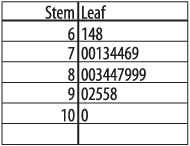
This display not only tells us the actual values of the scores and their range (61 to 100) but the basic shape of their distribution as well. In this case, most scores are in the 70s and 80s, with a few in the 60s and 90s, and one is 100. The shape of the “leaf” side is in fact a crude sort of histogram, rotated 90 degrees, with the bars being units of 10; the shape in this case is approaching normality (given that there are only five bars to work with).
The Boxplot
The boxplot, also known as the “hinge plot” or the “box and whiskers plot,” was devised by the statistician John Tukey as a compact way to summarize and display the distribution of a set of continuous data. Although boxplots can be drawn by hand (as can many other graphics, including bar charts and histograms), in practice they are nearly always created using software. Interestingly, the exact methods used to construct a boxplot vary from one software program to another, but they are always constructed to highlight five important characteristics of a data set: the median, the first and third quartiles (and hence the interquartile range as well), and the minimum and maximum. The central tendency, range, symmetry, and presence of outliers in a data set can be seen at a glance in a boxplot, and side-by-side boxplots make it easy to make comparisons among different distributions of data. Figure 4-8 is a boxplot of the final exam grades used in the stem-and-leaf plot above.
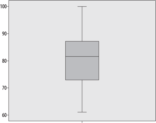
The dark line represents the median value, in this case 81.5. The shaded box encloses the interquartile range, so the lower boundary is the first quartile (25th percentile) of 72.5 and the upper boundary is the third quartile or 75th percentile of 87.75. Tukey called these quartiles “hinges,” hence the name “hinge plot.” The short horizontal lines at 61 and 100 represent the minimum and maximum values, and together with the lines connecting them to the interquartile range “box” are called “whiskers,” hence the name “box and whiskers plot.” We can see at a glance that this data set is basically symmetrical, because the median is approximately centered within the interquartile range, and the interquartile range is located approximately centrally within the complete range of the data.
This data set contains no outliers, i.e., no numbers that are far outside the range of the other data points. In order to demonstrate a boxplot that contains outliers, I have changed the score of 100 in this data set to 10 and renamed the data set “error.” Figure 4-9 shows the boxplots of the two datasets side by side (the boxplot for the correct data is labeled “final”).
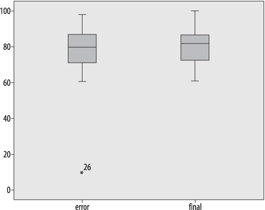
Note that except for the single outlier value, the two data sets look very similar: this is because the median and interquartile range are resistant to influence by extreme values. The outlying value is designated with an asterisk and labeled with its case number (26): the latter feature is not included in every statistical package.
A more typical use of the boxplot is to compare two or more real data sets side by side. Figure 4-10 shows a comparison of two years of final exam grades from 2007 and 2008, labeled “final2007” and “final2008”, respectively.
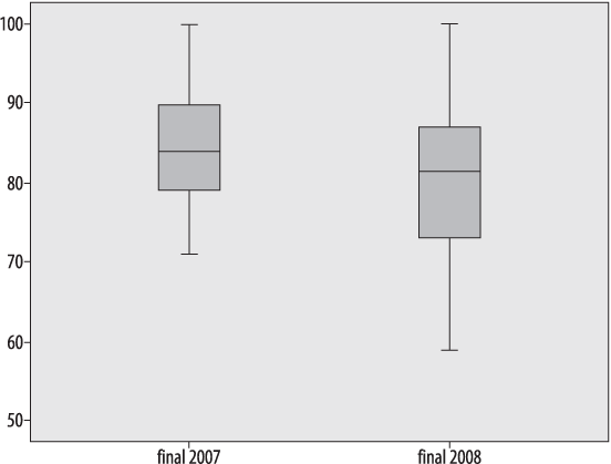
Without looking at any of the actual grades, I can see several differences between the two years:
The highest scores are the same in both years.
The lowest score is much lower in 2008.
There is a greater range of scores in 2008, both in the interquartile range (middle 50% of the scores) and overall.
The median is slightly lower in 2008.
The fact that the highest score was the same in both years is not surprising: the exam had a range of 0–100 and the highest score was achieved in both years. This is an example of a ceiling effect, which exists when scores by design can be no higher than a particular number, and people actually achieve that score. The analogous condition, if a score can be no lower than a specified number, is called a floor effect : in this case, the exam had a floor of 0 (the lowest possible score) but because no one achieved that score, no floor effect is present in the data.
The Histogram
The histogram is another popular choice for displaying continuous data. A histogram looks similar to a bar chart, but generally has many more individual bars, which represent ranges of a continuous variable. To emphasize the continuous nature of the variable displayed, the bars (also known as “bins,” because you can think of them as bins into which values from a continuous distribution are sorted) in a histogram touch each other, unlike the bars in a bar chart. Bins do not have to be the same width, although frequently they are. The x -axis (vertical axis) represents a scale rather than simply a series of labels, and the area of each bar represents the percentage of values that are contained in that range.
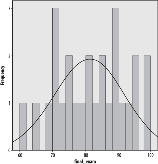
Figure 4-11 shows the final exam data, presented as a histogram created in SPSS with four bars of width ten, and with a normal distribution superimposed, which looks quite similar to the shape of the stem-and-leaf plot.
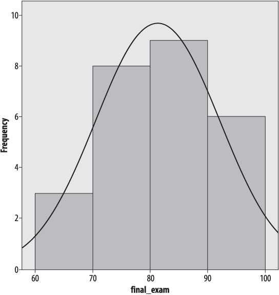
The normal distribution is discussed in detail in Chapter 7; for now, suffice it to say that it is a commonly used theoretical distribution that assumes the familiar bell shape shown here. The normal distribution is often superimposed on histograms as a visual reference so we may judge how closely a data set fits a normal distribution.
For better or for worse, the choice of the number and width of bars can drastically affect the appearance of the histogram. Usually histograms have more than four bars; Figure 4-12 shows the same data with eight bars of width five.
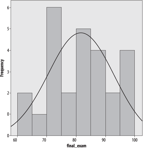
It’s the same data, but it doesn’t look nearly as normal, does it? Figure 4-13 shows the same data with a bin width of two.
So how do you decide how many bins to use? There are no absolute answers, but there are some rules of thumb. The bins need to encompass the full range of data values. Beyond that, a common rule of thumb is that the number of bins should equal the square root of the number of points in the data set. Another is that the number of bins should never be less than about six: these rules clearly conflict in our data set, because √26 = 5.1, which is definitely less than 6. So common sense also comes into play, as does trying different numbers of bins and bin widths: if the choice drastically changes the appearance of the data, further investigation is in order.
Charts that display information about the relationship between two variables are called bivariate charts : the most common example is the scatterplot. Scatterplots define each point in a data set by two values, commonly referred to as x and y, and plot each point on a pair of axes. Conventionally the vertical axis is called the y -axis and represents the y -value for each point, and the horizontal axis is called the x -axis and represents the x -value. Scatterplots are a very important tool for examining bivariate relationships among variables, a topic further discussed in Chapter 9.
Scatterplots
Consider the data set shown in Table 4-9, which consists of the verbal and math SAT (Scholastic Aptitude Test) scores for a hypothetical group of 15 students.
Table 4-9. SAT scores for 15 students
Math | Verbal |
|---|---|
750 | 750 |
700 | 710 |
720 | 700 |
790 | 780 |
700 | 680 |
750 | 700 |
620 | 610 |
640 | 630 |
700 | 710 |
710 | 680 |
540 | 550 |
570 | 600 |
580 | 600 |
790 | 750 |
710 | 720 |
Other than the fact that most of these scores are fairly high (the SAT is calibrated so that the median score is 500, and most of these scores are well above that), it’s difficult to discern much of a pattern between the math and verbal scores from the raw data. Sometimes the math score is higher, sometimes the verbal score. However, creating a scatterplot of the two variables, as in Figure 4-14, with math SAT score on the y -axis (vertical axis) and verbal SAT score on the x -axis (horizontal) makes their relationship clear.
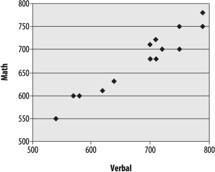
Despite some small inconsistencies, verbal and math scores have a strong linear relationship: people with high verbal scores tend to have high math scores and vice versa, and those with lower scores in one area tend to have lower scores in the other. Not all relationships between two variables are linear, however: Figure 4-15 shows a scatterplot of variables that are highly related but for which the relationship is quadratic rather than linear.
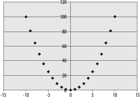
In the data presented in this scatterplot, the x -values in each pair are the integers from −10 to 10, and the y -values are the squares of the x-values. As noted above, scatterplots are a simple way to examine the type of relationship between two variables, and patterns like the quadratic are easy to differentiate from the linear pattern.
Line Graphs
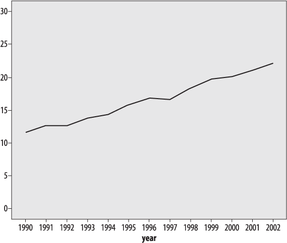
Line graphs are also often used to display the relationship between two variables, often between time on the x -axis and some other variable on the y -axis. One requirement for a line graph is that there can only be one y -value for each x -value, so it would not be an appropriate choice for data such as the SAT data presented above. Consider the data in Table 4-10, from the U.S. Centers for Disease Control and Prevention (CDC), showing the percentage of obesity among U.S. adults, measured annually over a 13-year period.
Table 4-10. Percentage of obesity among U.S. adults, 1990-2002 (source: CDC)
1990 | 11.6 |
|---|---|
1991 | 12.6 |
1992 | 12.6 |
1993 | 13.7 |
1994 | 14.4 |
1995 | 15.8 |
1996 | 16.8 |
1997 | 16.6 |
1998 | 18.3 |
1999 | 19.7 |
2000 | 20.1 |
2001 | 21 |
2002 | 22.1 |
What we can see from this table is that obesity has been increasing at a steady pace; occasionally there is a decrease from one year to the next, but more often there is a small increase (1–2 percent). This information can also be presented as a line chart, as in Figure 4-16.
Although the line graph makes the overall pattern of steady increase clear, the visual effect of the graph is highly dependent on the scale and range used for the y -axis (which in this case shows percentage of obesity). Figure 4-16 is a sensible representation of the data, but if we wanted to increase the effect we could choose a larger scale and smaller range for the y -axis (vertical axis), as in Figure 4-17.
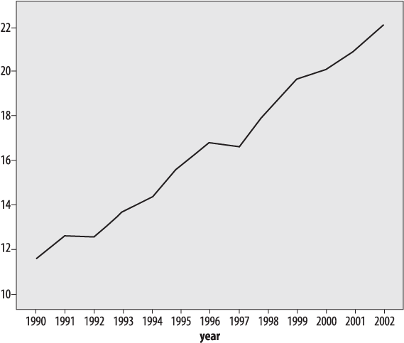
Figure 4-17. Obesity among U.S. adults, 1990-2002 (CDC), using a restricted range to inflate the visual impact of the trend
Figure 4-17 presents exactly the same data as Figure 4-16, but a smaller range was chosen for the y -axis (10%-22.5%, versus 0%-30%). The narrower range makes the differences between years look larger: choosing a misleading range is one of the time-honored ways to “lie with statistics.”
The same trick works in reverse: if we graph the same data using a wide range for the vertical axis, the changes over the entire period seem much smaller, as in Figure 4-18.
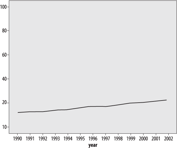
Figure 4-18. Obesity among U.S. adults, 1990-2002 (CDC), using a large range to decrease the visual impact of the trend
Figure 4-18 presents the same obesity data as Figures 4-16 and 4-17, with a large range on the vertical axis (0%-100%) to decrease the visual impact of the trend.
So which scale should be chosen? There is no perfect answer to this question: all present the same information, and none strictly speaking are incorrect. In this case, if I were presenting this chart without reference to any other graphics, the scale would be 5–16 because it shows the true floor for the data (0%, which is the lowest possible value) and includes a reasonable range above the highest data point. One principle that should be observed is that if multiple charts are compared to each other (for instance, charts showing the percent obesity in different countries over the same time period, or charts of different health risks for the same period), they should all use the same scale to avoid misleading the reader.
Like any other aspect of statistics, learning the techniques of descriptive statistics requires practice. The data sets provided are deliberately simple, because if you can apply a technique correctly with 10 cases, you can also apply it with 1,000.
My advice is to try solving the problems several ways, for instance, by hand, using a calculator, and using whatever software is available to you. Even spreadsheet programs like Excel have many simple mathematical and statistical functions available, and now would be a good time to investigate those possibilities. In addition, by solving a problem several ways, you will have more confidence that you are using the software correctly.
Most graphic presentations are created using software, and while each package has good and bad points, most will be able to produce most if not all of the graphics presented in this chapter, and quite a few other types of graphs as well. So the best way to become familiar with graphics is to investigate whatever software you have access to and practice graphing data you work with (or that you make up). Always keep in mind that graphic displays are a form of communication, and therefore should clearly indicate whatever you think is most important about a given data set.
Question
When is each of the following an appropriate measure of central tendency? Think of some examples for each from your work or studies.
| Mean |
| Median |
| Mode |
Answer
The mean is appropriate for interval or ratio data that is continuous, symmetrical, and does not contain significant outliers.
The median is appropriate for continuous data that may be skewed (asymmetrical), based on ranks, or contain extreme values.
The mode is most appropriate for categorical variables, or for continuous data sets where one value dominates the others.
Question
What is the median of this data set?
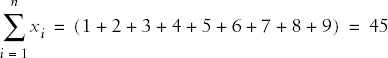
| 1 2 3 4 5 6 7 8 9 |
Answer
5: The data set has 9 values, which is an odd number; the median is therefore the middle value when the values are arranged in order. To look at this question more mathematically, since there are n = 9 values, the median is the (n + 1)/2th value, and thus the median is the (9 + 1)/2th or fifth value.
Question
What is the median of this data set?
| 1 2 3 4 5 6 7 8 |
Answer
4.5: The data set has 8 values, which is an even number; the median is therefore the average of the middle two values, in this case 4 and 5. To look at this question more mathematically, the median for an even-numbered set of values is the average of the (n /2)th and (n /2)th + 1 value; n = 8 in this case, so the median is the average of the (8/2)th and (8/2)th + 1 values, i.e., the fourth and fifth values.
Question
What is the mean of the following data set?
| 1 2 3 4 5 6 7 8 9 |
Answer
The mean is:

In this case, n = 9 and
Question
What are the mean and median of the following (admittedly bizarre) data set?
| 1, 7, 21, 3, −17 |
Answer
The mean is ((1 + 7 + 21 + 3 + (−17))/5 = 15/5 = 3.
The median, since there are an odd number of values, is the (n + 1)/2th value, i.e., the third value. The data values in order are (-17, 1, 3, 7, 21), so the median is the third value or 3.
Question
What are the variance and standard deviation of the following data set? Calculate this using both the population and sample formulas.
| 1 3 5 |
Answer
The population formula to calculate variance is:

And the sample formula is:
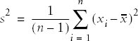
In this case, n = 3, x = 3, and the sum of the squared deviation scores = (-2)2 + 02 + 22 = 8. The population variance is therefore 8/3 or 2.67, and the population standard deviation is the square root of the variance or 1.63. The sample variance is 8/2 or 4, and the sample standard deviation is the square root of the variance or 2.
Get Statistics in a Nutshell now with the O’Reilly learning platform.
O’Reilly members experience books, live events, courses curated by job role, and more from O’Reilly and nearly 200 top publishers.

