Chapter 22
Ten Things (Twelve, Actually) That Just Didn’t Fit in Any Other Chapter
IN THIS CHAPTER
Visualizing variability
Going over the odds and ends of probability
Looking for independence
Working with logs
Sorting
I wrote this book to show you all of Excel’s statistical capabilities. My intent was to tell you about them in the context of the world of statistics, and I had a definite path in mind.
Some of the capabilities don’t neatly fit along that path. I still want you to be aware of them, however, so here they are.
Graphing the Standard Error of the Mean
When you create a graph and your data are means, it’s a good idea to include the standard error of each mean in your graph. This gives the viewer an idea of the spread of scores around each mean.
Figure 22-1 gives an example of a situation where this arises. The data are (fictional) test scores for four groups of people. Each column header indicates the amount of preparation time for the eight people within the group. I used Excel’s graphics capabilities (refer to Chapter 3) to draw the graph. Because the independent variable is quantitative, a line graph is appropriate. (refer to Chapter 21 for a rant on my biggest peeve.)
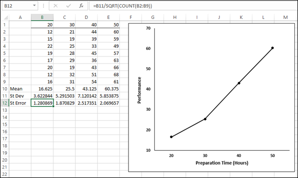
FIGURE 22-1: Four groups, their means, standard deviations, and standard errors. The graph shows the group means.
For each group, I used AVERAGE to calculate the mean and STDEV.S to calculate the ...
Get Statistical Analysis with Excel For Dummies, 4th Edition now with the O’Reilly learning platform.
O’Reilly members experience books, live events, courses curated by job role, and more from O’Reilly and nearly 200 top publishers.

