Displaying alerts on a map
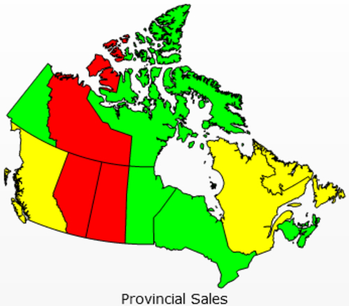
A map on a dashboard allows us to visually identify how different regions are doing using a picture instead of a table or chart. With alerts on the map, we can provide even more value. For example, look at the following image. We can see that different regions of the map can be colored differently depending on their value. This allows users to identify at a glance, whether a region is doing well or poorly.
Getting ready
Insert a Canadian map object onto the canvas and bind data to the map. We will use the same example from the recipe Using maps to select data of an area or country.
Tip
You may also refer to the data prepared ...
Get SAP BusinessObjects Dashboards 4.0 Cookbook now with the O’Reilly learning platform.
O’Reilly members experience books, live events, courses curated by job role, and more from O’Reilly and nearly 200 top publishers.

