Adding alerts to a column chart
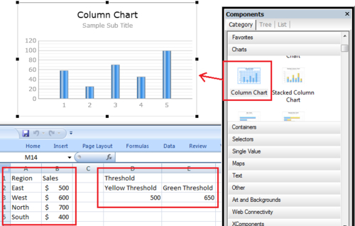
When looking at a bar chart, we may want to see which items are below or above a particular threshold. In this recipe, we will learn how to add alerts to a bar chart. Our example will consist of a column chart with a list of regions and their sales. Each region column will be colored appropriately, depending on their sales value vs. threshold.
Getting ready
Make sure you set up the sales data and threshold values, as shown in the following screenshot. You'll also need to insert a Column Chart component onto the canvas.
How to do it...
- First we'll need to bind the sales data to the chart, as shown next:
- Go to the Alerts ...
Get SAP BusinessObjects Dashboards 4.0 Cookbook now with the O’Reilly learning platform.
O’Reilly members experience books, live events, courses curated by job role, and more from O’Reilly and nearly 200 top publishers.

