Sorting series
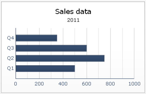
A chart does not always look like what you had in mind. In some cases, you may want to see data sorted from high to low values, while in other situations, you want to see the categories to be displayed in a more logical order. For example, in the following bar chart, the quarters are sorted from last (Q4) to first (Q1). To change this, you can of course adjust the data model in the spreadsheet, like we did in the Using the OHLC chart and Candlestick chart recipe. An easier and better way is to use the Sorting settings for the bar chart component.
Note
Sorting is available in the following components: line chart, pie chart, column chart, ...
Get SAP BusinessObjects Dashboards 4.0 Cookbook now with the O’Reilly learning platform.
O’Reilly members experience books, live events, courses curated by job role, and more from O’Reilly and nearly 200 top publishers.

