Using the bubble chart
A bubble chart can display values that consist of three variables. The only difference with the XY chart is that the size of the points in the bubble charts is adjustable. Next to the value on the X and Y-axes this is the third variable that can be illustrated with this chart.
Getting ready
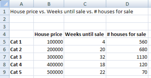
You can reuse the dashboard from the Using the XY chart recipe and add the values in the D-column as shown in the following screenshot:
How to do it...
- Drag a Bubble Chart component into the canvas.
- Bind the data By Range to spreadsheet cells B5 through D9.
- Bind the Chart field to cell A1 and delete the subtitle.
- Bind the Value (X) Axis
Get SAP BusinessObjects Dashboards 4.0 Cookbook now with the O’Reilly learning platform.
O’Reilly members experience books, live events, courses curated by job role, and more from O’Reilly and nearly 200 top publishers.

