Using the pie chart
The pie chart is circular chart divided in one or more slices. Each slice represents the proportion of a value to the total of all values. Pie charts can be used to show the impact of a value in contrast to other values or the grand total. However, it may be hard to compare the size of slices within a pie chart when there are more than three slices, or across other pie charts. Therefore, if you need to compare data, we recommend using the bar chart instead.
Getting ready
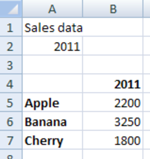
Open a new Dashboard Design file and enter the data into the spreadsheet, as shown in the following screenshot:
How to do it...
- Drag a Pie Chart component onto ...
Get SAP BusinessObjects Dashboards 4.0 Cookbook now with the O’Reilly learning platform.
O’Reilly members experience books, live events, courses curated by job role, and more from O’Reilly and nearly 200 top publishers.

