Visualizing a generalized additive model
In this recipe, we demonstrate how to add a gam fitted regression line to a scatter plot. In addition, we visualize the gam fit using the plot function.
Getting ready
Complete the previous recipe by assigning a gam fitted model to the fit variable.
How to do it...
Perform the following steps to visualize the generalized additive model:
- Generate a scatter plot using the
noxanddisvariables:> plot(nox, dis)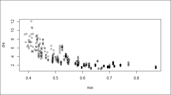
Scatter plot of variable nox against dis
- Add the regression to the scatter plot:
> x = seq(0, 1, length = 500)
> y = predict(fit, data.frame(nox = x))
> lines(x, y, col = "red", lwd = 2)
Fitted regression of ...
Get R: Recipes for Analysis, Visualization and Machine Learning now with the O’Reilly learning platform.
O’Reilly members experience books, live events, courses curated by job role, and more from O’Reilly and nearly 200 top publishers.

