Generating a candlestick plot
Candlestick plots have been widely used to display time series data related to financial markets. They are a combination of line charts and bar plots. They look very similar to box plots (discussed later in this chapter), but in reality, they do not share any similarity. A single candlestick is used to display the high, low, opening, and closing prices for a single security for a given time.
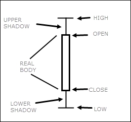
The difference between the open and close is shown by the size of the body. The highest and lowest traded prices are indicated by the upper and lower wick respectively. A wick is the straight bar at the top and the bottom of the ...
Get R: Recipes for Analysis, Visualization and Machine Learning now with the O’Reilly learning platform.
O’Reilly members experience books, live events, courses curated by job role, and more from O’Reilly and nearly 200 top publishers.

