Generating a very basic pyramid plot
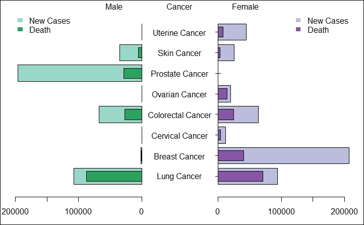
You might have seen these plots in news or journal articles and wondered how to create them quickly. This recipe will help you accomplish this task. Pyramid plots are horizontal bar plots and they are often used to display gender differences in a dataset. I have created this plot based on a New York Times infographic discussing the deaths by different types of cancer among men and women. The data was extracted from the Centers of Disease Control and Prevention website.
Getting ready
We require the following packages:
plotrixRColorBrewer
How to do it…
The install.packages() and library() functions can be used to install ...
Get R: Recipes for Analysis, Visualization and Machine Learning now with the O’Reilly learning platform.
O’Reilly members experience books, live events, courses curated by job role, and more from O’Reilly and nearly 200 top publishers.

