Constructing a fan plot
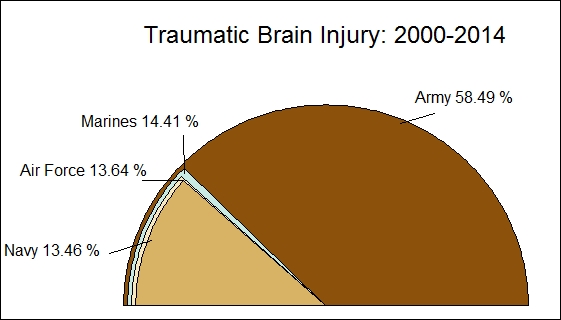
Fan plots are very similar to pie charts; the different sectors/slices in a fan plot overlap. The slice with the highest value is placed at the back and subsequent slices are plotted on top of it. In our example, Army has the highest percentage, followed by Marines, Air Force, and Navy. Note that Air Force and Navy overlap each other as the values are very close.
Getting ready
To construct a fan plot, we use the following two packages:
plotrixRColorBrewer
How to do it…
The fan plot is implemented using the plotrix package; hence we need to install and load this in our R session. We have used the colors from RColorBrewer and hence ...
Get R: Recipes for Analysis, Visualization and Machine Learning now with the O’Reilly learning platform.
O’Reilly members experience books, live events, courses curated by job role, and more from O’Reilly and nearly 200 top publishers.

