A simple line plot
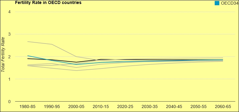
Line plots are simply lines connecting all the x and y dots. They are very easy to interpret and are widely used to display an upward or downward trend in data. In this recipe, we will use the googleVis package and create an interactive R line plot. We will learn how we can emphasize on certain variables in our data. The following line plot shows fertility rate:
Getting ready
We will use the googleVis package to generate a line plot.
How to do it…
In order to construct a line chart, we will install and load the googleVis package in R. We would also import the fertility data using the read.csv() function:
install.packages("googleVis") ...Get R: Recipes for Analysis, Visualization and Machine Learning now with the O’Reilly learning platform.
O’Reilly members experience books, live events, courses curated by job role, and more from O’Reilly and nearly 200 top publishers.

