Chapter 9. Controlling the Overall Appearance of Graphs
In this chapter I’ll discuss how to control the overall appearance of graphics made by ggplot2. The grammar of graphics that underlies ggplot2 is concerned with how data is processed and displayed—it’s not concerned with things like fonts, background colors, and so on. When it comes to presenting your data, there’s a good chance that you’ll want to tune the appearance of these things. ggplot2’s theming system provides control over the appearance of non-data elements. I touched on the theme system in the previous chapter, and here I’ll explain a bit more about how it works.
Setting the Title of a Graph
Problem
You want to set the title of a graph.
Solution
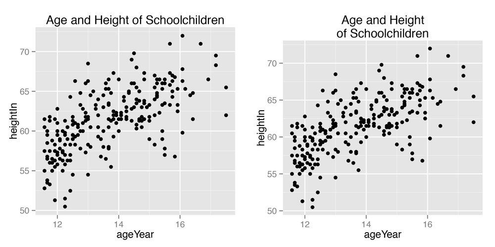
Set title with ggtitle(), as shown in
Figure 9-1:
library(gcookbook)# For the data setp<-ggplot(heightweight,aes(x=ageYear,y=heightIn))+geom_point()p+ggtitle("Age and Height of Schoolchildren")# Use \n for a newlinep+ggtitle("Age and Height\nof Schoolchildren")
Discussion
ggtitle() is equivalent to
using labs(title = "Title
text").
If you want to move the title inside the plotting area, you can
use one of two methods, both of which are a little bit of a hack (Figure 9-2). The first method is to use
ggtitle() with a negative vjust value. The drawback of this method is that it still reserves ...
Get R Graphics Cookbook now with the O’Reilly learning platform.
O’Reilly members experience books, live events, courses curated by job role, and more from O’Reilly and nearly 200 top publishers.

