Chapter 5. Scatter Plots
Scatter plots are used to display the relationship between two continuous variables. In a scatter plot, each observation in a data set is represented by a point. Often, a scatter plot will also have a line showing the predicted values based on some statistical model. This is easy to do with R and ggplot2, and can help to make sense of data when the trends aren’t immediately obvious just by looking at it.
With large data sets, it can be problematic to plot every single observation because the points will be overplotted, obscuring one another. When this happens, you’ll probably want to summarize the data before displaying it. We’ll also see how to do that in this chapter.
Making a Basic Scatter Plot
Problem
You want to make a scatter plot.
Solution
Use geom_point(), and
map one variable to x
and one to y.
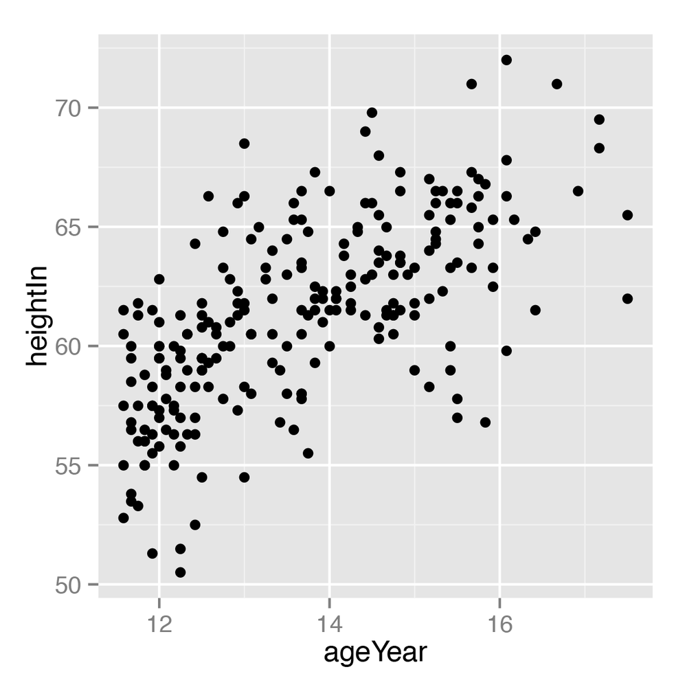
In the heightweight data
set, there are a number of columns, but we’ll only use two in this
example (Figure 5-1):
library(gcookbook)# For the data set# List the two columns we'll useheightweight[,c("ageYear","heightIn")]ageYear heightIn11.9256.312.9262.312.7563.3...13.9262.012.5859.3
ggplot(heightweight,aes(x=ageYear,y=heightIn))+geom_point()
Discussion
To use different shapes in a scatter plot, set shape. A common alternative to the default
solid circles (shape #16) is hollow ones (#21), as seen in Figure 5-2 (left): ...
Get R Graphics Cookbook now with the O’Reilly learning platform.
O’Reilly members experience books, live events, courses curated by job role, and more from O’Reilly and nearly 200 top publishers.

