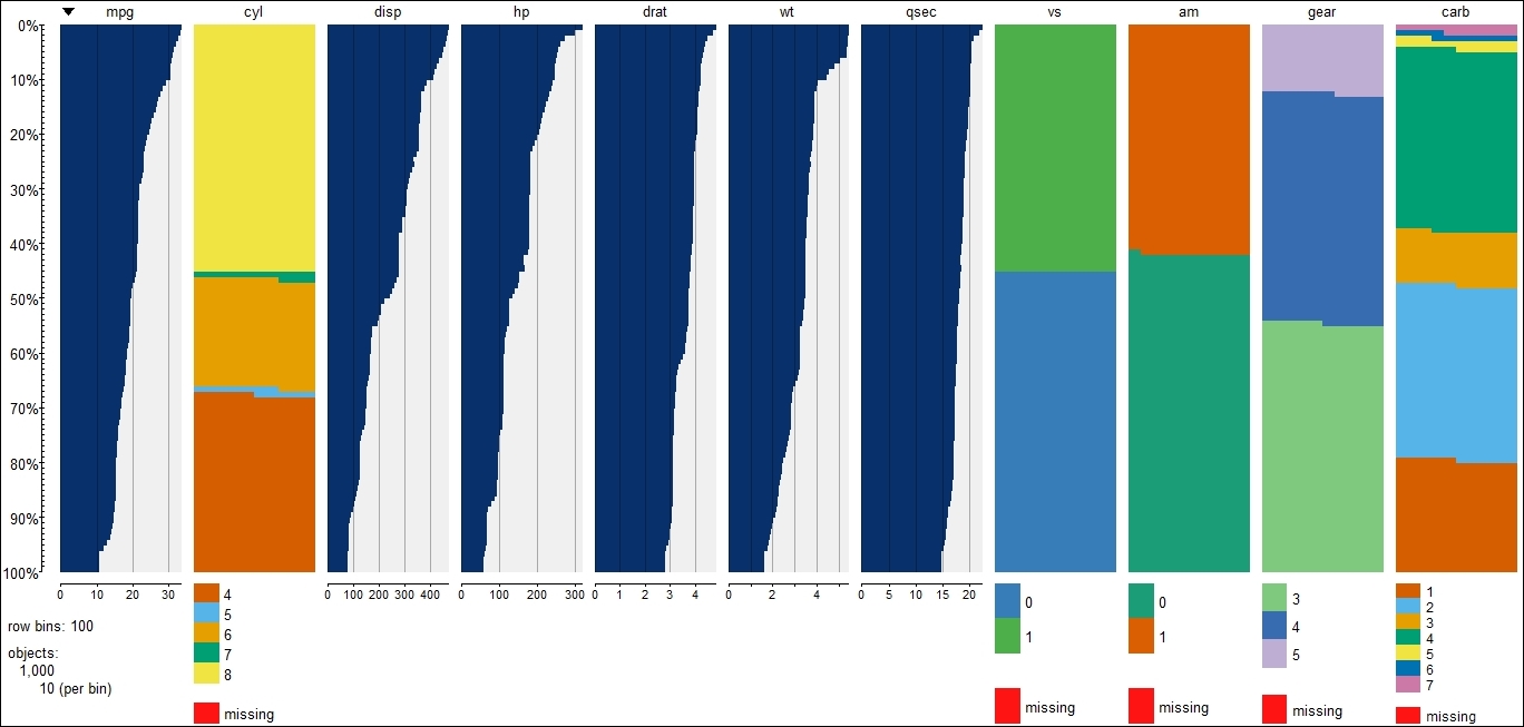
Visualizing mixed data
In this recipe, we will see the visualization of mixed data where both continuous and factor variables are present.
Getting ready
For this plot, we will use our modified mtcars data that we created earlier.
How to do it…
The command is similar as with continuous and categorical data; here is the code to create the plot:
tableplot(modified_mtcars)
Get R: Data Analysis and Visualization now with the O’Reilly learning platform.
O’Reilly members experience books, live events, courses curated by job role, and more from O’Reilly and nearly 200 top publishers.

