Adjusting x and y axes' limits
In this recipe, we will learn how to adjust the x and y limits of plots, which is useful in adjusting a graph to suit your presentation needs and adding additional data to the same plot.
How to do it...
We will modify our first scatter plot example to demonstrate how to adjust axes limits:
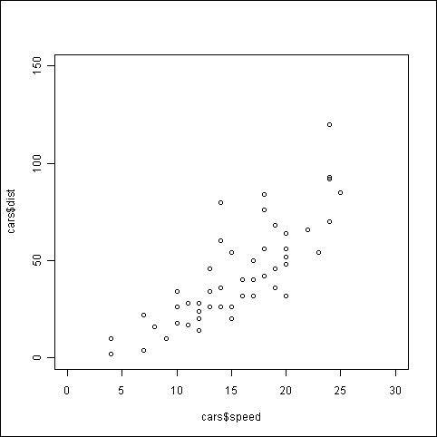
plot(cars$dist~cars$speed,
xlim=c(0,30),
ylim=c(0,150))
How it works...
In our original scatter plot in the first recipe of this chapter, the x axis limits were set to just below 5 up to 25 and the y axis limits were set from 0 to 120. In this example, we set the x axis limits from 0 to 30 and the y axis limits to 0 to 150 using the ...
Get R: Data Analysis and Visualization now with the O’Reilly learning platform.
O’Reilly members experience books, live events, courses curated by job role, and more from O’Reilly and nearly 200 top publishers.

