Making charts more readable
Occasionally, we have used Borchester Models' data to demonstrate certain ideas and features. Have a look at this script fragment:
Stock:
LOAD [Shop No],
     [Product Code],
     [On Hand]
FROM
[QlikView Unlocked Data.xlsx]
(ooxml, embedded labels, table is Stock);
What is required here is a chart showing stock levels by product across all shops. However, if we just let QlikView do the sorting, it will use Product Code, and we will see something similar to this:
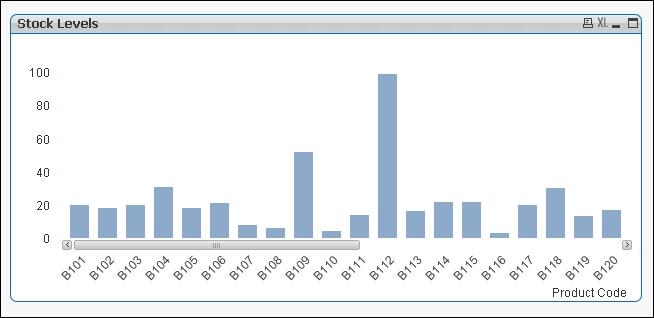
This is okay, but it's not really helpful. As there's a scroll bar, we can't see what we have the most stock of—it might be B112, but unless we scroll across, we won't know. ...
Get QlikView Unlocked now with the O’Reilly learning platform.
O’Reilly members experience books, live events, courses curated by job role, and more from O’Reilly and nearly 200 top publishers.

