Staggering labels in a pie chart
I am not a big fan of using pie charts for many segments. The more segments that there are, the less easy it is to see the data. As the segments get smaller, even the labels get smudged into each other.
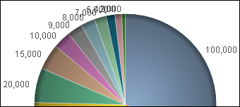
If you absolutely, positively must create this type of chart, you need to have a better strategy for the labels.
Getting ready
Load the following script:
LOAD * INLINE [
    Country, Sales
    USA, 100000
    Canada, 50000
    Mexico, 25000
    UK, 70000
    Germany, 20000
    Brazil, 15000
    France, 10000
    Japan, 9000
    China, 8000
    Australia, 7000
    South Korea, 5000
    New Zealand, 4000
    Italy, 2000
];
How to do it…
Follow these steps to create a pie chart ...
Get QlikView for Developers Cookbook now with the O’Reilly learning platform.
O’Reilly members experience books, live events, courses curated by job role, and more from O’Reilly and nearly 200 top publishers.

