Creating a scatter chart
Scatter charts are a good way to show relationships between measures.
When creating a scatter chart you need to specify measures for the x-axis and y-axis, and a third measure Z to display the bubble size. In this chart, we will visualize the relationship between Freight and Sales for ProductLines:
- Use
QlikViewEssentials_Presentation.qvw. - Right-click on the empty space on the
Dashboardsheet. Select New Sheet Object and then Chart. Select the Scatter Chart, which is the first chart in the second row of chart types.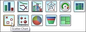
- On the General tab, unselect Show Title in Chart.
- Click on Next. Select ProductLineDesc as Dimensions. Click on ...
Get QlikView Essentials now with the O’Reilly learning platform.
O’Reilly members experience books, live events, courses curated by job role, and more from O’Reilly and nearly 200 top publishers.

