Chapter 4. The App Bar
We know that Windows 8/Windows RT represents a reimagining of Windows, and part of that work is to move Windows away from a windows, icons, menus, and pointer (WIMP) paradigm, and to one designed to be used by touch. In this chapter we’re going to start looking at one of the tactics used to remove WIMP—specifically, the app bar.
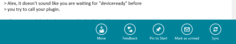
Figure 4-1 shows an example of the app bar from the built-in Mail app.
The app bar is designed to expose application commands to the user, but to move away from the tap-and-hold UI paradigm that was used in Windows Mobile and other early-generation touch interfaces.
If you go back a decade or so, mobile OS designers needed to implement a way of “right-clicking” on UI elements to display a context menu. A stylus has no modality in the way that a mouse does—the concept of “done with left” and “done with right” makes no sense when using a stylus or finger. The way that mobile OS designers “fixed” this was that if you tapped and held an item with your stylus or finger, a pop-up context menu appeared.
There are two problems with tap and hold. In the first instance, you are asking users to put their life on hold while the timeout period elapses for the operation. That is very much a “come on, come on!” moment for the user. The second instance is that there’s no way of indicating to the user that something is right-clickable/tap-and-holdable. To put it another way, the discoverability of tap-and-hold functions is horrible. (For what it’s worth, you get discovery issues with all gesture inputs.)
Note
Although in the WinRT documentation you will find events that let you handle tap-and-hold, the UX principles ask that they not be used.
The replacement to tap-and-hold is the app bar. First, the app bar instantly reacts in a way that tap-and-hold does not, providing straightforward access to options without the wait. (Half the battle with UX lies in managing psychology.) Second, there is always an app bar, which reduces frustration. (Of course, you can still create confusion by the way you present the options. Also, games may not have app bars.)
Note
The app bar is the first example of a UI feature common to all Windows Store apps. In later chapters we’ll see other examples.
Like all things in software engineering, none of this is quite as easy as it sounds. While Microsoft has done a fantastic job of reducing the complexity of the APIs used to access Windows Store app functionality, making the app bar behave like it does in the built-in apps is not as straightforward as it could be. Also getting the button images that you want onto the app bar as opposed to the stock icons is strangely complex.
Adding a Simple App Bar
You’ll find that when you’re building apps the basic behaviors that are required to achieve the desired UX are generally easy to implement, and app bars are no exception. Apart from a weird detail that we’ll come to, getting your app bars to work like the ones in the built-in apps is straightforward.
In terms of implementation, the Page component exposes properties for TopAppBar and BottomAppBar. You are expected to place AppBar instances into these directly. (Although
you can put them anywhere on the page, unless you put them in the two
provided properties/locations-within-the-markup you will run into strange
animation problems.)
You can put any control that you like into the app bar, but as you can imagine there are rules governing the controls that you should put in.
The top app bar should be dedicated to navigational functions, and at this point in the book we don’t have any pages other than the Reports page that we built in the last chapter—hence, we won’t be using a top app bar.
The bottom app bar should contain functions that act either on the page in general, the app, or the selected item/items.
In this section, we’re going to add a button and rig it to refresh the page. In the next section, we’ll go into far more detail on app bar behavior and rules about how app bars should be used.
Getting Started with an App Bar
To get started with an app bar, it’s best to define one directly
in XAML rather than using the toolbox to drop an instance onto the
design surface. If you drop an instance, it won’t go into the TopAppBar or BottomAppBar property, which (as I just
mentioned) is a requirement, so you’ll have to move it.
To add an app bar, open up the XAML editor for the page, and anywhere on the page add the app bar as shown here:
    <Page.Resources>

        <!-- Collection of items displayed by this page -->
        <CollectionViewSource
            x:Name="itemsViewSource"
            Source="{Binding Items}"/>

    </Page.Resources>

    <Page.BottomAppBar>
        <AppBar>
         </AppBar>
    </Page.BottomAppBar>
Note
If you want, you can make the designer spring into life at this
point. If you’re in split mode and put the caret on the <AppBar> reference in the code, the
designer will show the app bar with a deep black background as opposed
to the dark gray of the remainder of the design surface.
It’s typical with an app bar to put controls on the left and right
sides. (We’ll talk about this more later.) To this end, it makes sense
to configure a grid together with StackPanel instances to act as separate left
and right control containers. Here’s the modified app bar with a
grid:
   <Page.BottomAppBar>
        <AppBar>
            <Grid>
                <Grid.ColumnDefinitions>
                    <ColumnDefinition Width="*"/>
                    <ColumnDefinition Width="*"/>
                </Grid.ColumnDefinitions>
            <StackPanel Orientation="Horizontal">
</StackPanel>
            <StackPanel HorizontalAlignment="Right" Orientation="Horizontal"
Grid.Column="2">
</StackPanel>
            </Grid>
        </AppBar>
    </Page.BottomAppBar>
Note
I’m going a little slowly here for those without much WPF/Silverlight experience.
Now that we have those two panels, we can put controls onto them. We’ll create nicer-looking buttons later—for now, we’ll just use a normal button.
Specifically, we’re going to add a Refresh button. To make this
button do anything, we need to create a command in the view-model. Make
this change to IReportsPageViewModel
first:
// Add member to IReportsPageViewModel...publicinterfaceIReportsPageViewModel:IViewModel{ICommandRefreshCommand{get;}ObservableCollection<ReportItem>Items{get;}}
The command itself is easy to build—we created the DoRefresh function in Chapter 3, so all we need is to rig the command
to call it. Here’s the change (I’ve omitted some code for
brevity):
publicclassReportsPageViewModel:ViewModel,IReportsPageViewModel{publicObservableCollection<ReportItem>Items{get;privateset;}publicICommandRefreshCommand{get;privateset;}publicReportsPageViewModel(IViewModelHosthost):base(host){// setup...this.Items=newObservableCollection<ReportItem>();// commands...this.RefreshCommand=newDelegateCommand(async(e)=>{awaitthis.DoRefresh(true);});}// code omitted...}
The final step is to add the button to the app bar, together with the command binding. Here’s the code:
<Page.BottomAppBar>
<AppBar>
<Grid>
<Grid.ColumnDefinitions>
<ColumnDefinition Width="50*"/>
<ColumnDefinition Width="50*"/>
</Grid.ColumnDefinitions>
<StackPanel Orientation="Horizontal" Visibility="{Binding
HasSelectedItems, Converter={StaticResource VisibilityConverter}}">
</StackPanel>
<StackPanel HorizontalAlignment="Right" Orientation="Horizontal"
Grid.Column="2">
<Button Content="Refresh"
Command="{Binding RefreshCommand}" />
</StackPanel>
</Grid>
</AppBar>
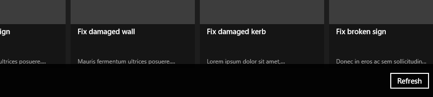
</Page.BottomAppBar>You can now run the app and summon the app bar. We’re going to talk about touch and mouse interaction much more in the next section, but for now, in order to get the app bar to display, right-click on the blank area at the top of the page. (If you right-click on the grid, the app bar will not display.) If you have touch hardware, swipe your finger in from the top or bottom edges. Figure 4-2 illustrates the result.
App Bar Behavior
Since the very first versions of Windows, software developers have looked to mimic the operation of standard apps and controls. After all, it’s logical to assume that if Microsoft puts out apps that work in a certain way, that way must be correct. (The exception to this rule is the perpetually broken copy and paste behavior in Excel!) Observing standard behavior from Microsoft’s built-in apps and treating them as exemplars is just as important as reading the documentation.
The Mail app has a ListView for
showing items, not a GridView like our
app, but the principle of how the app bar works in the app should be the
same regardless of how items are being presented.
Looking at the mouse first, if you use the left button and click on items on the list in the Mail app, you get single selection behavior. This mimics the standard Windows behavior. Likewise, you can use the Control button to select a single item and Shift to select a group. However, if you make a multiple selection, the app bar will automatically appear. Go back to zero or one selected items, and the app bar will disappear.
If you click with the right button, this emulates the behavior of a Ctrl+click operation in all but one case. If you right-click on a single selected item, the app bar will appear. The app bar will also appear if you click anywhere outside of the grid. This is as per the behavior of the app bar that we built in the last section.
You’ll find this behavior—having the app bar appear when you click on anything in the app—throughout the built-in apps. Pick any at random; for example, right-click on the Weather app and the app bar will appear, even though you can’t actually select things in that app.
Rigging the app bar to appear on right-click is a good way of getting around the problem of having a touch-centric OS running on nontouch hardware.
So it appears we know the rules. Now go and look at the Store app and navigate to the “Your apps” section. (Swipe in from the top, and you’ll get a top app bar because you’re going somewhere.) In the grid of apps that appears, the app bar is always visible—which shouldn’t be the case, as the app bar is supposed to go away when it’s not needed. (The app bar is being used here to fix a workflow problem—the user needs access to the Install Updates button, but this actually shouldn’t be on the app bar because workflow-related activities should be on the main form.)
But in terms of the grid of items you have, you don’t need to Ctrl+click or use the right button to multiselect. The modality of that page is predicated on multiple selection, whereas the modality of the Mail app is predicated on viewing a single mail item (i.e., it’s more normal to select multiple items on the Store, whereas multiple items on the Mail app is an edge case).
Note
We’ll see in a moment how we can choose between these two multiple selection modes.
But what happens when we look at Calendar? That behaves like neither. I would expect that when you click items on the calendar, they appear as selected and then we can bring up the app bar. However, in actuality clicking on any item or on any blank space brings up an item details view, or a “new item” view. Personally, I think the Calendar app has the wrong design, so we’ll place that app outside the discussion.
So what about the actual rules that Microsoft has laid out? There are lots of them, but these are the salient ones:
Grouping should be such that items related to the selected item(s) are on the left, while items related to the whole page are on the right.
A page can have a top app bar and a bottom app bar. The top one should be used for navigation, and the bottom for commands/options.
The app bar should persist if whatever the user is doing calls for frequent access to the commands. There’s a “right way” and a “wrong way” of doing this. You should always err toward hiding the app bar unless it creates a choppy user experience. For example, if the user is cropping and colorizing an image, having the options available probably makes sense. In most cases, it doesn’t make sense to force the app bar to be visible. (You’d do this by setting the
IsStickyproperty on the app bar, which has to be done before you force it to show withIsOpen, something that we’ll do later.)That said, if the user has made multiple selections, showing the app bar is logical because this means the user is likely actually doing something as opposed to looking for something. Again, this is one of the options you’ll need to feel your way through, but reflect on how the Mail app always shows the app bars when multiple selections have been made.
Options pertaining to workflow should appear on the form, not on the app bar. A classical workflow in this scenario would be an ecommerce cart checkout.
The guidelines do not call out specific rules about right-clicking, but I like the way the Mail app does it (i.e., simulating Ctrl+left-click).
Now that we know the rules, let’s see what happens in our app with its default behavior.
App Bar with Single-Select Grid
In this section, we’ll look at app bar behavior with a single-select grid, which happens to be the selection mode of the grid we are given by Visual Studio when we add a grid page.
Leaving aside the built-in apps and going back to our app, we know that we can show the app bar with a swipe, and we also know that we can right-click on an area of the page not occupied with the grid.
If you click an item with the left button, you can select an item, but by default you can’t deselect that item with the left button. If you click an item with the right button, the selection toggles between selected and deselected. In neither case does the app bar appear.
For me, what’s broken here is that if you can right-click outside of the grid to display the app bar, right-clicking on an item in the grid should also show the app bar. Having it work when you click on void space and not work when you click on real items is horribly inconsistent.
If we want that behavior, we’d need to override the default behavior of the grid. But before we look at that, let’s see what happens when we have a multiselect grid.
App Bar with Multiselect Grid
The GridView control has two
multiselect modes, one called Multiple and one called Extended.
Multiple is the operation shown
in the Store app—that is, left-clicking on items toggles between
selected and deselected. Extended
behaves like the Mail app: left-clicking changes the selection, but you
can use Ctrl+left-click to select multiple items. Likewise,
right-clicking emulates Ctrl+left-click behavior.
By default, neither of them will display an app bar when multiple items are displayed, but in most cases it’s likely that displaying the app bar with a multiple selection is a desirable behavior.
Your choice between Multiple
and Extended is most likely driven by
whether you need multiselect accessible when the user is in touch mode.
In Extended mode, multiple selections
are possible only if you have a Ctrl key or a right mouse button—or you
do the hard-to-discover gesture of flicking lightly vertically on the
item. Extended mode makes sense for
the Mail app, as you can usually work with email with single
selections—the multiselect capability is a “nice to have” bonus.
Conversely, with the Store app, making users work hard to perform the
same action on multiple loaded apps is asking too much of them; hence,
multiple options is the default.
To choose between the two, reflect on the touch experience that
you are looking to achieve (i.e., design such that the only input device
you have is a finger). Don’t be lulled by the assumption that Microsoft
tablets have keyboards—to be a “proper” post-PC device, the only thing
that you know you have is a screen with touch digitizer. If the modality
of the operation suggests that the user will typically want to work with
one item, use Extended. If the
modality suggests that manipulating multiple items in one operation is
the norm, use Multiple.
Extended mode makes some form
of multiselection without a mouse a practical impossibility. In some
edge cases, having a “multiselect mode” in touch apps—whereby you can
let the user make multiple selections without a mouse—might be
appropriate. There’s actually a version of this on iOS; on its Mail app,
for example, if you go into “delete mode,” checkboxes appear next to
each item. However, remember that in Modern style, checkboxes appear on
the top-right corner of selected items; therefore, rendering checkboxes
next to each item will run against expected behavior. I’ll leave it to
you as individuals, and the greater community, to work out the details
on this!
Thus, when it comes to it, the only thing that’s missing is the ability to automatically show the app bar when multiple selections are made. Also relatively easy is the modification to show the app bar on right-click. In the next section, we’ll consider a more “full-on” implementation of our app bar.
A More Complex App Bar Implementation
In this section, we’re going to look at the following app bar implementation:
We want our app bar to show when the user right-clicks on any grid option.
We want our app bar to be able to display context-sensitive options.
We want our app bar to automatically display when multiple selections are made, and hide when the selection is reduced.
We want all of this to be compatible with the MVVM rules that we laid down in Chapters 1 and 2.
The question to answer first relates to the last point there—do we want to try to wire this behavior up as a one-off within the view/view-model, or do we want to make something more reusable?
In fact, wiring up the behavior within the view/view-model is
actually quite difficult. The first problem is that the property that
returns the set of multiple selection items—SelectedItems—is not data-bindable; hence, you
need to address it directly from the codebehind in the view itself. This
breaks the rule of having zero code within the view. (You can bind to the
SelectedItem property, but that only
holds zero or one items.) The approach I’m proposing here is that we can
create a specialized version of GridView through inheritance and then bake our
enhanced behavior into that. That will allow us to reuse this behavior
whenever we fancy.
The first thing we’ll look at is how to pass through this selection to the view-model, and then we’ll see how to show the app bar.
Showing the App Bar on Multiple Selections
For those who are unfamiliar with WPF/Silverlight, I need to explain the idea behind dependency properties. If you’re familiar with them, you can skip the next few paragraphs.
As hinted at, dependency properties were a WPF/Silverlight invention, but they’ve found their way down into WinRT’s XAML implementation. Understanding what they are and how they work can unlock a lot of the weirdness in WPF/Silverlight/XAML. (I’ll now stop referring to WPF/Silverlight and just refer to XAML.)
If you go back to the original versions of Visual Basic (VB), the
idea was that you would have a control, such as a button, and a set of
properties on the control, such as Text. In VB, and in Windows Forms and ASP.NET
Web Forms, such properties are generally backed by a private field. (I’m
simplifying a bit here.)
In XAML, the idea is that control/component properties are not
backed by private fields but are instead held in a dictionary of some
sort. So, if you want to create a Text property on class Button, you tell XAML that you want to create
a dependency property for that, well, property. This dependency property
acts as a backing store, which you expose usually a normal CLR
property.
So what’s the meaning behind the name dependency
property? I did a bit of digging on this and couldn’t find a
particularly compelling answer. The official version is along the line
of “because other things depend on them.” In XAML you can have styles,
templates, bindings, and other things that can change your property
underneath you. What this means is that you could set your Text property to "Foo", but something else could change that
property to something else by the time you retrieve it. Although glib,
it might be useful to think of a dependency property in terms of
“you can’t depend on it still having the value that
you set.”
Note
Later in the chapter we’ll see how property values can change underneath us. Generally, don’t worry about it—properties have their value changed for the greater good of the app’s functionality, and this sort of operation normally won’t come back and bite you.
In terms of our actual implementation, we need to create a new,
specialized implementation of a GridView and then add OpenAppBarsOnMultipleSelection and SelectionCommand dependency properties.
Extending controls through inheritance is an idea as old as time,
so I won’t go into detail on this. The first step is to create a new
class that extends GridView and then
we can add in the properties.
Whenever we have a dependency property, we need two things:
A static read-only field containing the metadata of the property
An instance read-write property that gets or sets the value as appropriate
There is also a strange wrinkle with dependency properties in that you need to include a callback anonymous method within the metadata of the property that defers to the instance method. This is needed to support data binding. The data binding subsystem understands how to dereference and work with the static dependency property metadata, but doesn’t know how to deference and work with the instance properties.
Here’s the code showing the two properties together inside the new control:
publicclassMyGridView:GridView{publicstaticreadonlyDependencyPropertySelectionCommandProperty=DependencyProperty.Register("SelectionCommand",typeof(ICommand),typeof(MyGridView),newPropertyMetadata(null,(d,e)=>((MyGridView)d).SelectionCommand=(ICommand)e.NewValue));publicstaticreadonlyDependencyPropertyOpenAppBarsOnMultipleSelectionProperty=DependencyProperty.Register("OpenAppBarsOnMultipleSelection",typeof(bool),typeof(MyGridView),newPropertyMetadata(true,(d,e)=>((MyGridView)d).OpenAppBarsOnMultipleSelection=(bool)e.NewValue));publicMyGridView(){}publicICommandSelectionCommand{get{return(ICommand)GetValue(SelectionCommandProperty);}set{SetValue(SelectionCommandProperty,value);}}publicboolOpenAppBarsOnMultipleSelection{get{return(bool)GetValue(OpenAppBarsOnMultipleSelectionProperty);}set{SetValue(OpenAppBarsOnMultipleSelectionProperty,value);}}}
At the moment, the XAML in the ReportsPage is rigged to use the standard
GridView control. If we want to use
our new control, we just have to change the declaration from GridView to local:MyGridView.
If you’re unfamiliar with XML namespaces, GridView is declared in the default namespace
and hence doesn’t need a prefix. By default, the base XAML created by
Visual Studio when we create the page contains an XML namespace
declaration called local that maps to
the default namespace of the project, which in my case happens to be
StreetFoo.Client.UI. Thus local:MyGridView resolves to StreetView.Client.UI.MyGridView.
The modified XAML snippet looks like this (I’ve omitted the surrounding container code):
        <!-- Horizontal scrolling grid used in most view states -->
        <local:MyGridView
            x:Name="itemGridView"
            AutomationProperties.AutomationId="ItemsGridView"
            AutomationProperties.Name="Items"
            TabIndex="1"
            Margin="0,137,0,-1"
            Padding="116,0,116,46"
            ItemsSource="{Binding Source={StaticResource itemsViewSource}}"
            ItemTemplate="{StaticResource ReportItem250x250Template}"
            SelectionMode="Multiple"
            Grid.RowSpan="2"
              />
Note that I have gone ahead and changed the SelectionMode as well.
You can run the project at this point if you like. You won’t see
any different behavior from before in terms of the actual operation of
the app bar. We’ve yet to build the new behavior into the grid. To do
that, we need to subscribe to the SelectionChanged event within the MyGridView control itself.
Back in the world of .NET, controls/components were always
designed to have an OnEventName
property that you could override whenever an event was declared. XAML
appears to be more hit and miss—certainly OnSelectionChanged is not an overrideable
method in GridView, and hence the
only way to receive notifications is to subscribe.
When the selection does change, we want to do two things. First,
we must decide whether we want to raise our SelectionCommand command based on whether we
have a value for it, and whether the command is in a state where it can
be executed. Second, we want to show the app bar. This is all pretty
simple; here’s the code, along with a stub that we’ll fill out in a
moment:
// modified constructor and related handler in MyGridView...publicMyGridView(){// wire up the selection changes...this.SelectionChanged+=MyGridView_SelectionChanged;}voidMyGridView_SelectionChanged(objectsender,SelectionChangedEventArgse){if(this.SelectionCommand==null)return;// pass it on...varselected=newList<object>(this.SelectedItems);if(this.SelectionCommand.CanExecute(selected))this.SelectionCommand.Execute(selected);// do we care about multiple items?if(this.OpenAppBarsOnMultipleSelection&&selected.Count>1)this.OpenAppBarsOnPage(true);elseif(this.OpenAppBarsOnMultipleSelection&&selected.Count==0)this.HideAppBarsOnPage();}
The OpenAppBarsOnPage method is
not implemented, so we have a choice: we can either implement it as a
one-off inside our control, or we can implement it as a helper method. I
propose implementing it as a helper method via the expedient of an
extension method.
Extension methods are one of my favorite .NET features, and they are fantastic in this kind of scenario where you want to extend multiple classes without affecting the chain of inheritance. Although we want to open (and ultimately close) app bars on the grid view in this instance, we might want to be able to do this from other controls that we build or extend.
The control/component hierarchy in XAML is understandably complex,
but near the base of the hierarchy is a component called FrameworkElement. This contains the baseline
implementation for components that are supposed to have some presence on
the UI. We’ll add our extension methods to this.
First off, a standard rule of the UX is that you cannot toggle the
top and bottom app bars independently—swipe in from the top or the
bottom, and both will display. (For example, I, for some unknown reason,
have a habit of swiping in from the top to get access to the bottom app
bar.) The methods that we’ll build will need to show or hide both the
top and bottom app bars each time. Second, we’ll need a method that,
given a FrameworkElement instance,
can find its containing page. We can easily achieve this by walking up
the Parent properties until we find
one with an appropriate type.
The third and final consideration relates to “sticky” app bars. The idea of a sticky app bar is that it doesn’t hide when you click off of the app bar, whereas a nonsticky/normal app bar does. To stop the app bar from flicking around, we’ll provide an option to display it in sticky mode.
Here’s the code for FrameworkElementExtender:
internalstaticclassFrameworkElementExtender{internalstaticPageGetParentPage(thisFrameworkElementelement){DependencyObjectwalk=element;while(walk!=null){if(walkisPage)return(Page)walk;if(walkisFrameworkElement)walk=((FrameworkElement)walk).Parent;elsebreak;}// nothing...returnnull;}internalstaticvoidOpenAppBarsOnPage(thisFrameworkElementelement,boolsticky){// get...varpage=element.GetParentPage();if(page==null)return;if(page.TopAppBar!=null){page.TopAppBar.IsSticky=sticky;page.TopAppBar.IsOpen=true;}if(page.BottomAppBar!=null){page.BottomAppBar.IsSticky=sticky;page.BottomAppBar.IsOpen=true;}}internalstaticvoidHideAppBarsOnPage(thisFrameworkElementelement){varpage=element.GetParentPage();if(page==null)return;if(page.TopAppBar!=null){page.TopAppBar.IsOpen=false;page.TopAppBar.IsSticky=false;}if(page.BottomAppBar!=null){page.BottomAppBar.IsOpen=false;page.BottomAppBar.IsSticky=false;}}}
Note
If you want to set an app bar to be sticky, you need to set the
IsSticky property before setting
IsOpen.
Now you can actually run your project and it should work. Go into the Reports page and click items on or off; your app bar should automatically show and hide them.
Checking Touch Operations
One of the challenges of being an early adopter in Windows 8/Windows RT is that you are supposed to be building touch-centric apps on old-style, WIMP-optimized hardware. For this reason it’s very important that you check that your app’s functionality works well without a mouse.
You don’t have to buy a tablet, though. Visual Studio 2012 comes with a simulator that lets you simulate touch operations. This is accessible through Visual Studio. You can do essentially what you can with your full machine, although I found many of the built-in apps failed to run, as they could not load in time. (Windows will kill off Windows Store apps if they are slow to load. We’ll talk about this more in Chapter 15 when we look at validating apps for the store.) The point of the simulator is that it has a touch mode that simulates the mouse.
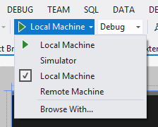
To run the simulator, in Visual Studio you will find a drop-down control next to the Run toolbar button. Typically this shows Local Machine, as illustrated in Figure 4-3. You can drop this down to select Simulator.
By default, the simulator just forwards the mouse events. On the righthand “bezel,” you will find an option for Basic Touch Mode. Check this on, and you’ll get a crosshair with a circle around it. You’ve now lost the ability to right-click, but gained the ability to drag in off the edges in the normal way. Figure 4-4 illustrates (as well as I can without having video to show!).

Confirm for yourself that the operation of the form is roughly within the parameters you expect. Next, we’ll look at how to show context options.
Showing the App Bar on Right-Click
Determining how to actually handle a right-click requires a bit of
digging around in the APIs, which makes sense if you consider that it’s
the old-style way of interaction compared to the new-style,
touch-centric way. You can do it by responding to the PointerPressed event and digging around for a
PointerPoint instance. This has
properties on it to tell you what happened. (As a side note, you’ll find
throughout WinRT a level of agnosticism about what type of input device
was used to initiate each event.)
We’ll need a new dependency property so that the developer could turn off the behavior if desired. But apart from that, it’s pretty simple. Here’s the code—note that I have omitted some of the code we built in the last section:
// Add new members to MyGridView...publicclassMyGridView:GridView{publicstaticreadonlyDependencyPropertySelectionCommandProperty=DependencyProperty.Register("SelectionCommand",typeof(ICommand),typeof(MyGridView),newPropertyMetadata(null,(d,e)=>((MyGridView)d).SelectionCommand=(ICommand)e.NewValue));publicstaticreadonlyDependencyPropertyOpenAppBarsOnMultipleSelectionProperty=DependencyProperty.Register("OpenAppBarsOnMultipleSelection",typeof(bool),typeof(MyGridView),newPropertyMetadata(true,(d,e)=>((MyGridView)d).OpenAppBarsOnMultipleSelection=(bool)e.NewValue));publicstaticreadonlyDependencyPropertyOpenAppBarsOnRightClickProperty=DependencyProperty.Register("OpenAppBarsOnRightClick",typeof(bool),typeof(MyGridView),newPropertyMetadata(true,(d,e)=>((MyGridView)d).OpenAppBarsOnRightClick=(bool)e.NewValue));publicMyGridView(){// wire up the selection changes...this.SelectionChanged+=MyGridView_SelectionChanged;}spublicboolOpenAppBarsOnRightClick{get{return(bool)GetValue(OpenAppBarsOnRightClickProperty);}set{SetValue(OpenAppBarsOnRightClickProperty,value);}}protectedoverridevoidOnPointerPressed(PointerRoutedEventArgse){// do we care?if(this.OpenAppBarsOnRightClick&&e.GetCurrentPoint(this).Properties.IsRightButtonPressed)this.OpenAppBarsOnPage(false);// base...base.OnPointerPressed(e);}// code omitted for brevity...}
Now if you run the project, you’ll find that you can use the right-mouse button to bring up the app bar, albeit in a slightly different way than the operation exemplified in the Mail app.
Showing Context Options
At the moment, our app bar is just displaying one option. What we want to look at now is how we can show and hide options on the app bar depending on the selection. We’ll add a button that will display a message. (We don’t have much business logic that we can hook into at this point, and doing anything more inventive than a message would complicate the discussion.)
The (slightly) tricky element is that we need to show or hide context options depending on the selection state. We’ve already built a command so that the view can tell us when the selection changes. What we need to do is get the view-model to signal that app bar−based commands are available.
The way that we’ll do this will be to put a StackPanel on the app bar and then put our
context options in that. We can then rig a property (HasSelection) and set up data binding so that
StackPanel is shown or hidden
depending on that value. That’s the simple, clunky route.
We’re going to build commands called SelectionCommand and DumpSelection, plus a HasSelectedItems property in the IReportsPageViewModel interface. Here’s the
code:
// Add properties to IReportsPageViewModel...publicinterfaceIReportsPageViewModel:IViewModel{ICommandRefreshCommand{get;}ICommandDumpSelectionCommand{get;}ICommandSelectionCommand{get;}ObservableCollection<ReportItem>Items{get;}boolHasSelectedItems{get;}}
For the actual implementation, we just have to build handlers for those two commands:
We’ll need a property for holding a list of the selected items called
SelectedItems.When we respond to
SelectionCommand, we’ll take theIEnumerable<object>instance that we’ll be given, assume it containsReportIteminstances, and replace whatever is already held inSelectedItems.When we do respond to
SelectionCommand, we’ll be changing the meaning of theHasSelectedItemsproperty. A “gotcha” on this is that we’ll have to raise an appropriateINotifyPropertyChangedsignal when we respond toSelectionCommandso that the XAML data binding subsystem knows that we’ve changed the value ofHasSelectedItems. A corollary point is that for completeness we should tell it thatSelectedItemshas also changed.Finally, when we respond to
DumpSelectionCommand, we’ll render a message.
This is straightforward code, so I’ll just present it. Here are
the changes required for ReportsPageViewModel (I’ve omitted some of the
other code for brevity):
publicclassReportsPageViewModel:ViewModel,IReportsPageViewModel{publicObservableCollection<ReportItem>Items{get;privateset;}privateList<ReportItem>SelectedItems{get;set;}publicICommandRefreshCommand{get;privateset;}publicICommandDumpSelectionCommand{get;privateset;}publicICommandSelectionCommand{get;privateset;}publicReportsPageViewModel(IViewModelHosthost):base(host){// setup...this.Items=newObservableCollection<ReportItem>();this.SelectedItems=newList<ReportItem>();// commands...this.RefreshCommand=newDelegateCommand(async(e)=>{awaitthis.DoRefresh(true);});// update any selection that we were given...this.SelectionCommand=newDelegateCommand((args)=>{// update the selection...this.SelectedItems.Clear();foreach(ReportItemitemin(IEnumerable<object>)args)this.SelectedItems.Add(item);// raise...this.OnPropertyChanged("SelectedItems");this.OnPropertyChanged("HasSelectedItems");});// dump the state...this.DumpSelectionCommand=newDelegateCommand(async(e)=>{if(this.SelectedItems.Count>0){varbuilder=newStringBuilder();foreach(variteminthis.SelectedItems){if(builder.Length>0)builder.Append("\r\n");builder.Append(item.Title);}// show...awaitthis.Host.ShowAlertAsync(builder.ToString());}elseawaitthis.Host.ShowAlertAsync("(No selection)");});}publicboolHasSelectedItems{get{returnthis.SelectedItems.Count>0;}}}
To wire this up, we just need to change the XAML. First, we need
to alter the app bar so that the StackPanel control on the left side is bound
to the HasSelectedItems property on
the view-model. Second, we need to rig the SelectionCommand property on the MyGridView instance to call into the handler
on the view-model.
I won’t reproduce both together, as it’ll be hard to see what’s happening. First off, here’s the change to the app bar:
    <!-- Modify markup related to the app bar -->
    <Page.BottomAppBar>
        <AppBar>
            <Grid>
                <Grid.ColumnDefinitions>
                    <ColumnDefinition Width="50*"/>
                    <ColumnDefinition Width="50*"/>
                </Grid.ColumnDefinitions>
            <StackPanel Orientation="Horizontal" Visibility="{Binding
             HasSelectedItems, ConverterBooleanTo={StaticResource
             VisibilityConverter}}">
                <Button Content="Dump Selection" Command="{Binding
                 DumpSelectionCommand}" />
            </StackPanel>
            <StackPanel HorizontalAlignment="Right" Orientation="Horizontal"
Grid.Column="2">
                <Button x:Name="buttonRefresh" Style="{StaticResource
RefreshAppBarButtonStyle}" Command="{Binding RefreshCommand}" />
            </StackPanel>
            </Grid>
        </AppBar>
    </Page.BottomAppBar>
The last step is to rig up the binding for the command. This is
just a matter of binding up SelectionCommand:
<!-- Horizontal scrolling grid used in most view states -->
<local:MyGridView
x:Name="itemGridView"
AutomationProperties.AutomationId="ItemsGridView"
AutomationProperties.Name="Items"
TabIndex="1"
Margin="0,137,0,-1"
Padding="116,0,116,46"
ItemsSource="{Binding Source={StaticResource itemsViewSource}}"
ItemTemplate="{StaticResource ReportItem250x250Template}"
SelectionMode="Multiple"
Grid.RowSpan="2"
SelectionCommand="{Binding SelectionCommand}"
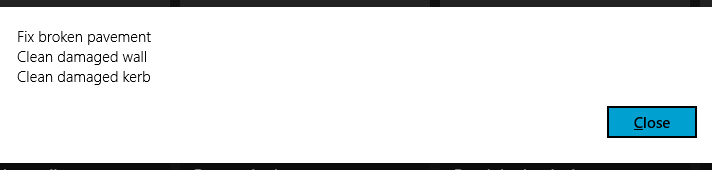
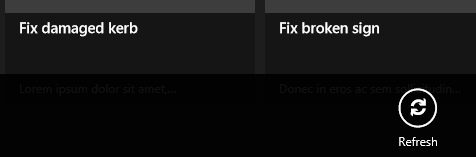
/>That’s all there is to it! If you run the project, you should find that the Dump Selection button is not available without a selection, but as soon as a selection is made it will become available. Clicking the button will result in a message being displayed, as illustrated in Figure 4-5.
App Bar Images
Adding images to the app bar is an absolute requirement, but it’s irritatingly difficult to achieve in the version of the tooling on which this book is based. Hopefully it will become easier, and perhaps it already is if you’re using a later version of the tools.
On paper, the way images are done on the app bar sounds brilliant. Windows 8/Windows RT comes with a font called Segoe UI Symbol—a version of the standard Segoe font used in Windows Store apps, but with a whole bunch of glyphs that can be used as icons. You get, out of the box, a couple of hundred icons that you can use.
The genius of using fonts instead of images for icons is that they are vectorized, meaning that you can render them on any background and in any size, and they look exactly right. The downside of using fonts instead of images is that you can’t change the set of icons that you have.
The Visual Studio template provides a set of styles that you can apply to buttons to produce an icon, but for some reason this tooling only works with the icons stored in font libraries. This means it’s extremely limited. It also means that it’s not straightforward to use your own icons, which in everything but the most basic of apps is going to be the case.
What we’re going to do in this section is look at the way Visual Studio does it first, specifically by changing the Refresh button that we built previously to use the built-in Refresh icon. We’ll then look at creating a parallel implementation of Visual Studio’s implementation that will work with PNG files.
The Glyph Method
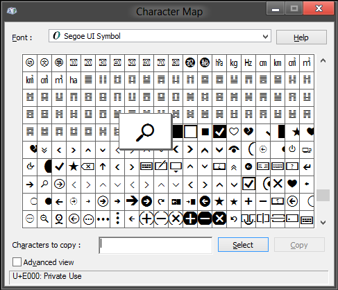
You can see the icons that you get out of the box by using the
Windows charmap.exe utility. If you
start charmap.exe from the Run dialog
and change the font to Segoe UI Symbol, you’ll find the icons starting
in the 0xE000 range. (In fact, 0xE000, as shown in Figure 4-6, is the standard
“search” icon.)
I mentioned earlier that in the Windows 8 tooling, each project got given a large StandardStyles.xaml file. Among other things, this file contained the declarations of a massive collection of app bar buttons, based on the glyphs that we’ve been discussing. In the new Windows 8.1 tooling, for some reason there is no equivalent (at least as of the time of writing), so my proposal is to bring those styles forward manually into our new StandardStyles.xaml. There is an awful lot of it, but they do ultimately create a good effect. Here’s the code:
<!-- Add to StandardStyles.xaml… -->
<Style x:Key="AppBarButtonStyle" TargetType="Button">
<Setter Property="Foreground" Value="{StaticResource
AppBarItemForegroundThemeBrush}"/>
<Setter Property="VerticalAlignment" Value="Stretch"/>
<Setter Property="FontFamily" Value="Segoe UI Symbol"/>
<Setter Property="FontWeight" Value="Normal"/>
<Setter Property="FontSize" Value="20"/>
<Setter Property="AutomationProperties.ItemType" Value="App Bar Button"/>
<Setter Property="Template">
<Setter.Value>
<ControlTemplate TargetType="Button">
<Grid x:Name="RootGrid" Width="100" Background="Transparent">
<StackPanel VerticalAlignment="Top" Margin="0,12,0,11">
<Grid Width="40" Height="40" Margin="0,0,0,5"
HorizontalAlignment="Center">
<TextBlock x:Name="BackgroundGlyph"
Text="" FontFamily="Segoe UI Symbol"
FontSize="53.333" Margin="-4,-19,0,0"
Foreground="{StaticResource
AppBarItemBackgroundThemeBrush}"/>
<TextBlock x:Name="OutlineGlyph" Text=""
FontFamily="Segoe UI Symbol" FontSize="53.333"
Margin="-4,-19,0,0"/>
<ContentPresenter x:Name="Content"
HorizontalAlignment="Center" Margin="-1,-1,0,0"
VerticalAlignment="Center"/>
</Grid>
<TextBlock
x:Name="TextLabel"
Text="{TemplateBinding
AutomationProperties.Name}"
Foreground="{StaticResource
AppBarItemForegroundThemeBrush}"
Margin="0,0,2,0"
FontSize="12"
TextAlignment="Center"
Width="88"
MaxHeight="32"
TextTrimming="WordEllipsis"
Style="{StaticResource BasicTextStyle}"/>
</StackPanel>
<Rectangle
x:Name="FocusVisualWhite"
IsHitTestVisible="False"
Stroke="{StaticResource
FocusVisualWhiteStrokeThemeBrush}"
StrokeEndLineCap="Square"
StrokeDashArray="1,1"
Opacity="0"
StrokeDashOffset="1.5"/>
<Rectangle
x:Name="FocusVisualBlack"
IsHitTestVisible="False"
Stroke="{StaticResource
FocusVisualBlackStrokeThemeBrush}"
StrokeEndLineCap="Square"
StrokeDashArray="1,1"
Opacity="0"
StrokeDashOffset="0.5"/>
<VisualStateManager.VisualStateGroups>
<VisualStateGroup x:Name="ApplicationViewStates">
<VisualState x:Name="FullScreenLandscape"/>
<VisualState x:Name="Filled"/>
<VisualState x:Name="FullScreenPortrait">
<Storyboard>
<ObjectAnimationUsingKeyFrames
Storyboard.TargetName="TextLabel"
Storyboard.TargetProperty="Visibility">
<DiscreteObjectKeyFrame KeyTime="0"
Value="Collapsed"/>
</ObjectAnimationUsingKeyFrames>
<ObjectAnimationUsingKeyFrames
Storyboard.TargetName="RootGrid"
Storyboard.TargetProperty="Width">
<DiscreteObjectKeyFrame KeyTime="0"
Value="60"/>
</ObjectAnimationUsingKeyFrames>
</Storyboard>
</VisualState>
<VisualState x:Name="Snapped">
<Storyboard>
<ObjectAnimationUsingKeyFrames
Storyboard.TargetName="TextLabel"
Storyboard.TargetProperty="Visibility">
<DiscreteObjectKeyFrame KeyTime="0"
Value="Collapsed"/>
</ObjectAnimationUsingKeyFrames>
<ObjectAnimationUsingKeyFrames
Storyboard.TargetName="RootGrid"
Storyboard.TargetProperty="Width">
<DiscreteObjectKeyFrame KeyTime="0"
Value="60"/>
</ObjectAnimationUsingKeyFrames>
</Storyboard>
</VisualState>
</VisualStateGroup>
<VisualStateGroup x:Name="CommonStates">
<VisualState x:Name="Normal"/>
<VisualState x:Name="PointerOver">
<Storyboard>
<ObjectAnimationUsingKeyFrames
Storyboard.TargetName="BackgroundGlyph"
Storyboard.TargetProperty="Foreground">
<DiscreteObjectKeyFrame KeyTime="0"
Value="{StaticResource AppBarItem
PointerOverBackgroundThemeBrush}"/>
</ObjectAnimationUsingKeyFrames>
<ObjectAnimationUsingKeyFrames
Storyboard.TargetName="Content"
Storyboard.TargetProperty="Foreground">
<DiscreteObjectKeyFrame KeyTime="0"
Value="{StaticResource AppBarItem
PointerOverForegroundThemeBrush}"/>
</ObjectAnimationUsingKeyFrames>
</Storyboard>
</VisualState>
<VisualState x:Name="Pressed">
<Storyboard>
<ObjectAnimationUsingKeyFrames
Storyboard.TargetName="OutlineGlyph"
Storyboard.TargetProperty="Foreground">
<DiscreteObjectKeyFrame KeyTime="0"
Value="{StaticResource AppBarItem
ForegroundThemeBrush}"/>
</ObjectAnimationUsingKeyFrames>
<ObjectAnimationUsingKeyFrames
Storyboard.TargetName="BackgroundGlyph"
Storyboard.TargetProperty="Foreground">
<DiscreteObjectKeyFrame KeyTime="0"
Value="{StaticResource AppBarItem
ForegroundThemeBrush}"/>
</ObjectAnimationUsingKeyFrames>
<ObjectAnimationUsingKeyFrames
Storyboard.TargetName="Content"
Storyboard.TargetProperty="Foreground">
<DiscreteObjectKeyFrame KeyTime="0"
Value="{StaticResource AppBarItem
PressedForegroundThemeBrush}"/>
</ObjectAnimationUsingKeyFrames>
</Storyboard>
</VisualState>
<VisualState x:Name="Disabled">
<Storyboard>
<ObjectAnimationUsingKeyFrames
Storyboard.TargetName="OutlineGlyph"
Storyboard.TargetProperty="Foreground">
<DiscreteObjectKeyFrame KeyTime="0"
Value="{StaticResource AppBarItem
DisabledForegroundThemeBrush}"/>
</ObjectAnimationUsingKeyFrames>
<ObjectAnimationUsingKeyFrames
Storyboard.TargetName="Content"
Storyboard.TargetProperty="Foreground">
<DiscreteObjectKeyFrame KeyTime="0"
Value="{StaticResource AppBarItem
DisabledForegroundThemeBrush}"/>
</ObjectAnimationUsingKeyFrames>
<ObjectAnimationUsingKeyFrames
Storyboard.TargetName="TextLabel"
Storyboard.TargetProperty="Foreground">
<DiscreteObjectKeyFrame KeyTime="0"
Value="{StaticResource AppBarItem
DisabledForegroundThemeBrush}"/>
</ObjectAnimationUsingKeyFrames>
</Storyboard>
</VisualState>
</VisualStateGroup>
<VisualStateGroup x:Name="FocusStates">
<VisualState x:Name="Focused">
<Storyboard>
<DoubleAnimation
Storyboard.TargetName=
"FocusVisualWhite"
Storyboard.TargetProperty=
"Opacity"
To="1"
Duration="0"/>
<DoubleAnimation
Storyboard.TargetName=
"FocusVisualBlack"
Storyboard.TargetProperty=
"Opacity"
To="1"
Duration="0"/>
</Storyboard>
</VisualState>
<VisualState x:Name="Unfocused" />
<VisualState x:Name="PointerFocused" />
</VisualStateGroup>
</VisualStateManager.VisualStateGroups>
</Grid>
</ControlTemplate>
</Setter.Value>
</Setter>
</Style>When we want a new button, we create a new style that uses the templates. Add this style for a refresh button to StandardStyles.xaml:
<Style x:Key="RefreshAppBarButtonStyle" TargetType="Button" BasedOn="
{StaticResource AppBarButtonStyle}">
<Setter Property="AutomationProperties.AutomationId"
Value="RefreshAppBarButton"/>
<Setter Property="AutomationProperties.Name" Value="Refresh"/>
<Setter Property="Content" Value=""/>
</Style>The Content entry does the
magic of setting the font. 0xE117
refers to the Refresh icon, which you can confirm for yourself in
charmap.exe if you want. The AutomationProperties.Name entry is used for
the label that will appear in the icon.
Using these is very simple. Here’s the XAML for our existing
Refresh button, but with the Content
value removed and Style value
added:
    <Page.BottomAppBar>
        <AppBar>
            <Grid>
                <Grid.ColumnDefinitions>
                    <ColumnDefinition Width="50*"/>
                    <ColumnDefinition Width="50*"/>
                </Grid.ColumnDefinitions>
            <StackPanel Orientation="Horizontal" Visibility="{Binding
             HasSelectedItems, Converter={StaticResource
             VisibilityConverter}}">
                <Button Content="Dump Selection" Command="{Binding
                 DumpSelectionCommand}" />
            </StackPanel>
            <StackPanel HorizontalAlignment="Right" Orientation="Horizontal"
             Grid.Column="2">
                <Button Style="{StaticResource RefreshAppBarButtonStyle}"
                 Command="{Binding RefreshCommand}" />
            </StackPanel>
            </Grid>
        </AppBar>
    </Page.BottomAppBar>
Run the app, and you’ll see the “iconified” button on the app bar. Figure 4-7 illustrates.
You can likely see how fantastically straightforward this is. It’s just a shame it’s so limited—but we’ll get to that.
Using Images
Going through how to use images with your buttons is helpful in its own right, but for those of you new to WPF/Silverlight/XAML, it also serves as a way of going through styles and templates. If you are familiar with styles and templates, however, please keep reading, as we’ll segue into looking at our own image implementation without a clean break.
Styles in XAML
Have a look again at the style definition for our Refresh button:
<Style x:Key="RefreshAppBarButtonStyle" TargetType="Button" BasedOn=
"{StaticResource AppBarButtonStyle}">
<Setter Property="AutomationProperties.AutomationId" Value=
"RefreshAppBarButton"/>
<Setter Property="AutomationProperties.Name" Value="Refresh"/>
<Setter Property="Content" Value=""/>
</Style>In XAML, styles are a group of property set instructions
expressed in XML. You can see here how we have three properties to
set: AutomationProperties.AutomationId, AutomationProperties.Name, and Content. In fact, there’s more than that
because the style definition has a BasedOn attribute that tells XAML to go and
set that style first before this one. The upshot is that just by our
applying a style, XAML will change a whole load of our properties.
This gets back to our conversation on dependency properties—you can’t
“depend” on the value you set directly staying current because, in
this case, the style can co-opt the properties for its own
purposes.
Where this gets a bit wacky is that the base style—AppBarButtonStyle—contains a directive that
sets the Template property. I’ve
chosen not to reproduce all of AppBarButtonStyle here, as we saw
previously. Here instead is the top part of the Template setter declaration in AppBarButtonStyle:
<Style x:Key="AppBarButtonStyle" TargetType="Button">
<Setter Property="Foreground" Value="{StaticResource
AppBarItemForegroundThemeBrush}"/>
<Setter Property="VerticalAlignment" Value="Stretch"/>
<Setter Property="FontFamily" Value="Segoe UI Symbol"/>
<Setter Property="FontWeight" Value="Normal"/>
<Setter Property="FontSize" Value="20"/>
<Setter Property="AutomationProperties.ItemType"
Value="App Bar Button"/>
<Setter Property="Template">
<Setter.Value>
<ControlTemplate TargetType="Button">
<Grid x:Name="RootGrid" Width="100"
Background="Transparent">
<StackPanel VerticalAlignment="Top" Margin="0,12,0,11">
<Grid Width="40" Height="40" Margin="0,0,0,5"
HorizontalAlignment="Center">
<TextBlock x:Name="BackgroundGlyph"
Text="" FontFamily="Segoe UI Symbol" FontSize="53.333"
Margin="-4,-19,0,0"
Foreground="{StaticResource AppBarItemBackgroundThemeBrush}"/>
<TextBlock x:Name="OutlineGlyph"
Text="" FontFamily="Segoe UI Symbol" FontSize="53.333"
Margin="-4,-19,0,0"/>
<ContentPresenter x:Name="Content"
HorizontalAlignment="Center" Margin="-1,-1,0,0" VerticalAlignment="Center"/>
</Grid>
<TextBlock
x:Name="TextLabel"
Text="{TemplateBinding AutomationProperties.Name}"
Foreground="{StaticResource AppBarItemForegroundThemeBrush}"
Margin="0,0,2,0"
FontSize="12"
TextAlignment="Center"
Width="88"
MaxHeight="32"
TextTrimming="WordEllipsis"
Style="{StaticResource BasicTextStyle}"/>
</StackPanel>
<!-- etc... -->
</Style>I’ve highlighted some of the important parts here. Ultimately
what this is doing is setting up a stack of overlapping controls to
form the image. The first two TextBlock controls are using the symbol font
to render two circles, an outline circle and a solid circle. The solid
circle is colored to match the background, the idea being that when
clicked that color can be changed to give the user some visual
feedback. The ContentPresenter
control takes the Content property
of the button and “re-presents” it.
Actually, that’s an important point. In XAML, the templates work
by totally replacing the rendering instructions of the base control—in
this case, a button. This is a slightly odd concept to anyone who’s
done any UI programming from Win16 onward, as in most cases you extend
behavior as opposed to presentation. If you’re new to this, the key
thing to remember is that with the Template property set, the Button control is no longer in charge of its
rendering.
The last control to consider is the TextBlock control positioned underneath the
image grid. This is used to render the caption under the icon.
You may have noticed references to AutomationProperties in there. If you’re
familiar with COM/ActiveX and unfamiliar with XAML, you may assume
these are related to COM Automation. They are not—in fact, they have
to do with automated testing and are a feature brought over from WPF.
The principle is that they provide a more formally defined set of
hooks for automated test harnesses. They can also be used for
accessibility functions. What’s relevant to us here is that we don’t
want to break this stuff when we add our images. The easiest thing to
do with them is just not fiddle with that part of the existing
implementation and steer clear.
So how do we add our images? Actually, the answer is pretty straightforward—we just need to replace the elements that render a glyph with elements that render an image. Let’s see how.
Creating images for app bar buttons
You’ll need an image editor to create the images for the app bar. In fact, you’ll generally need an image editor in your day-to-day work as a software engineer; it’s a good thing to have in your toolkit. There are lots of them out there, but I happen to use Adobe Fireworks, and I’d go so far as to say that it would be my recommendation for web work, legacy desktop work, and Windows Store app development work.
Note
At the time of writing, I could not find any hard rules about the configuration of the images for app bars. I could for Windows Phone— it calls for a 48×48 image with a 26×26 area in the middle containing the actual image. Windows Phone also has this “circle surrounding the icon” look. The image is supposed to be big enough to accommodate the circle, meaning that the square in the middle is where you put your actual icon. Here, we’ll pull the same trick with making the images large enough to accommodate the circle.
I took a screenshot of the Refresh button and measured the size. I then created a 40×40 image (which happens to be the size of the containing grid for the button declared in the template) and created a 24×24 “important part” in the middle. Figure 4-8 shows you what I got. (This jumps ahead to the part we haven’t built yet—that is, actually being able to render an image in a button.)
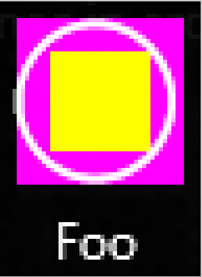
What’s throwing that off is the inexactness of the symbol font. It’s all lining up, but it’s not quite right in that it’s skewed to the right and not aligned on the left. Another factor is that XAML will stretch the image to make it fit—in my experiments, it was impossible to do any better than that. (And if you actually zoom into the standard Refresh button, it’s not evenly spaced or particularly neat.) Thus, my proposal is that for a “good enough” image, create a 40×40 box with a 24×24 area in the middle for the icon.
To make something more attractive for the download, I created a PNG based on one of the fonts in Segoe UI Symbol. By the way, there is a fantastic library of icons at the Noun Project. I would have used one of those but did not, as some of them are copyrighted and it’s easier not to risk using one of those in print.
When you create images, you need to render them on white and alias them onto a transparent background. This will give the renderer the best chance of making it look good regardless of the final app bar background color. You can see this for yourself in the code download. (It’s difficult to render a white-on-transparent image in a book!)
To add the image to your project, all you have to do is add it to the Assets folder in the project. Make sure that you actually include the file in your project; otherwise, the AppX packager doesn’t know to include it. You don’t need to mark it as Embedded Resource, as it’s not a resource in the traditional sense. The file should instead be marked as Content.
Note
This packaging trick/feature is the same one used with sqlite3.dll in Chapter 3.
Creating a template that uses an image
The magic part of the template is the ContentPresenter. All we have to do is
override the default behavior so that it uses an image. (The default
behavior renders the text stored in the Content property of the button.)
Specifically, we want to pass the ContentPresenter an Image control. If we set the Content property of the button to the URL of
an image, with ContentPresenter
rigged to use an Image control,
everything should just work. (If that’s not making much sense now, go
with it—once you see this happen, it’ll all become clear.)
This is the first time we’ve worked with images in the book. In my opinion, this is one of the standout great bits of WinRT development.
Just like every version of Windows from v1 onward, you can
package static resources. Whereas in the past, these have always been
baked into a single file, in WinRT they go into an AppX package, which
is exploded onto the disk on installation. (We’ll talk more about
packaging in Chapter 15.) From
within our apps, we can use URLs to refer to files included in the
original package. Specifically, we can use the ms-appx: protocol handler.
Thus, if we have an image called Foo.png placed within the ~/Assets folder of our project, we can refer to it with the URL ms-appx:///Assets/Foo.png. This is fantastically consistent with normal URI addressing and also very straightforward.
All we have to do then is create the following hierarchy:
At the top we’ll keep our
AppBarButtonStyleas is.In the middle we’ll create an
AppBarImageButtonStyle. This will replace theTemplateproperty created byAppBarButtonStylewith one that renders an image rather than a glyph.At the bottom we’ll create our button-specific styles, as per the existing behavior in the template. We’ll create a
FooAppBarButtonStyle.
We’ll do this in reverse order. You’ll need to make these
changes within StandardStyles.xaml. First, here is the
definition of FooAppBarButtonStyle:
    <!-- Add to StandardStyles.xaml -->
      <Style x:Key="FooAppBarButtonStyle" TargetType="Button" BasedOn=
       "{StaticResource AppBarImageButtonStyle}">
        <Setter Property="AutomationProperties.AutomationId" Value=
         "FooAppBarButtonStyle"/>
        <Setter Property="AutomationProperties.Name" Value="Foo"/>
        <Setter Property="Content" Value="ms-appx:///Assets/Foo.png"></Setter>
    </Style>
You can see the ms-appx:
protocol in play in that Content
property setter. Hopefully it’s obvious how the URL addressing is
working.
Note
Note that we don’t call this FooAppBarImageButtonStyle. Consumers
shouldn’t care about the underlying implementation—whether it uses
an image or a glyph isn’t directly relevant from their
perspective.
AppBarImageButtonStyle is
fairly easy (but long). I’ve highlighted where the ContentPresenter is modified to use an
Image instance, and also the base
element where we tell it that it’s based on AppBarButtonStyle.
<Style x:Key="AppBarImageButtonStyle" TargetType="Button" BasedOn= "{StaticResource AppBarButtonStyle}"> <Setter Property="Template"> <Setter.Value> <ControlTemplate TargetType="Button"> <Grid x:Name="RootGrid" Width="100" Background="Transparent"> <StackPanel VerticalAlignment="Top" Margin="0,12,0,11"> <Grid Width="40" Height="40" Margin="0,0,0,5" HorizontalAlignment="Center"> <ContentPresenter> <ContentPresenter.Content> <Image Source="{TemplateBinding Content}"></Image> </ContentPresenter.Content> </ContentPresenter> <TextBlock x:Name="OutlineGlyph" Text="" FontFamily="Segoe UI Symbol" FontSize="53.333" Margin="-4,-19,0,0"/> </Grid> <TextBlock x:Name="TextLabel" Text="{TemplateBinding AutomationProperties.Name}" Foreground="{StaticResource AppBarItemForegroundThemeBrush}" Margin="0,0,2,0" FontSize="12" TextAlignment="Center" Width="88" MaxHeight="32" TextTrimming="WordEllipsis" Style="{StaticResource BasicTextStyle}"/> </StackPanel> <Rectangle x:Name="FocusVisualWhite" IsHitTestVisible="False" Stroke="{StaticResource FocusVisualWhiteStrokeThemeBrush}" StrokeEndLineCap="Square" StrokeDashArray="1,1" Opacity="0" StrokeDashOffset="1.5"/> <Rectangle x:Name="FocusVisualBlack" IsHitTestVisible="False" Stroke="{StaticResource FocusVisualBlackStrokeThemeBrush}" StrokeEndLineCap="Square" StrokeDashArray="1,1" Opacity="0" StrokeDashOffset="0.5"/> </Grid> </ControlTemplate> </Setter.Value> </Setter> </Style>
You can now go ahead and add the new button to your app bar that
uses that style. My Foo button
raises the refresh command, but you
can make the button do whatever you like. Here’s the modified app
bar:
<Page.BottomAppBar>
<AppBar>
<Grid>
<Grid.ColumnDefinitions>
<ColumnDefinition Width="50*"/>
<ColumnDefinition Width="50*"/>
</Grid.ColumnDefinitions>
<StackPanel Orientation="Horizontal" Visibility="{Binding
HasSelectedItems, Converter={StaticResource
VisibilityConverter}}">
<Button Content="Dump Selection" Command="{Binding
DumpSelectionCommand}" />
</StackPanel>
<StackPanel HorizontalAlignment="Right" Orientation="Horizontal"
Grid.Column="2">
<Button Style="{StaticResource FooAppBarButtonStyle}"
Command="{Binding RefreshCommand}" />
<Button Style="{StaticResource RefreshAppBarButtonStyle}"
Command="{Binding RefreshCommand}" />
</StackPanel>
</Grid>
</AppBar>
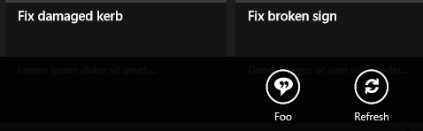
</Page.BottomAppBar>That’s it! Run the project, and you’ll now have an image. Figure 4-9 illustrates.
Get Programming Windows Store Apps with C# now with the O’Reilly learning platform.
O’Reilly members experience books, live events, courses curated by job role, and more from O’Reilly and nearly 200 top publishers.

