Buttons
There are four basic button types of controls: Button, LinkButton, RadioButton, and CheckBox. Although each type behaves similarly, they have different
intended uses. Figure 7-2 shows instances of
each type.
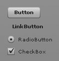
Figure 7-2. Button components
Of the four types, Button and
LinkButton are the most similar in use.
In fact, the primary difference between Button and LinkButton is purely cosmetic: buttons have
borders and backgrounds and link buttons do not. However, you’ll typically
use both types for similar purposes—generally to initiate some behavior
when the user clicks on the button or link button. Buttons are typically
more common than link buttons.
By default, buttons and link buttons respond to every click in the
same way. However, you can set the toggle property of a button or link button to
true, in which case the button will
have two states—selected and deselected—and it will toggle between those
states each time the user clicks it.
Radio buttons are quite different in use from standard buttons.
Radio buttons are typically used in groups. Radio buttons can be selected
or deselected, and only one button can be selected per group. For this
reason, radio buttons are often used when you want to allow the user to
select just one from a group of options. You should typically first create
a RadioButtonGroup instance when using radio buttons. Then, assign the ID of the group to the ...
Get Programming Flex 3 now with the O’Reilly learning platform.
O’Reilly members experience books, live events, courses curated by job role, and more from O’Reilly and nearly 200 top publishers.

